Using Custom Themes
Smartface IDE provides theming feature for UI editor components.
This allows you to set default properties of each component with classes just like CSS. These classes can be overridden by other classes as well, which will be explained later. Reusing components with themes across projects is also possible with this way.
Multiple themes can also be defined under the same project and different styles (properties) can be set for each component.
This documentation cover the technical implementations of themes. If you also need an example based documentation, refer to class documentation here:
Using Style and ClassesWhen You Will Need Themes
If you want to use any component on other projects, you don't need to set its properties one by one each time. Just define a class under your theme, set your style properties once, then use it multiple times!
How To Use Themes
When you create your workspace, a theme named defaultTheme will be present under themes folder. There must be at least one theme in your project.
Theme defaultTheme is a special theme and must be kept.
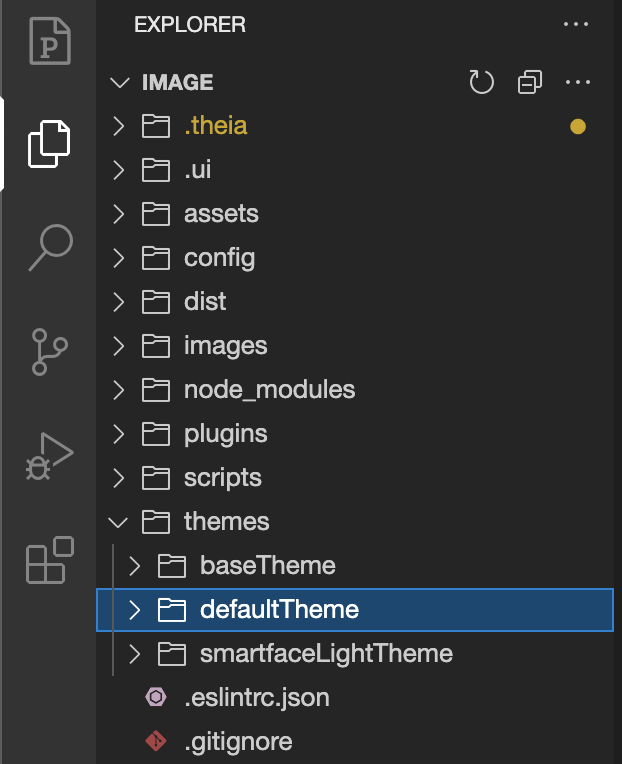
Each folder under themes represents a theme which you can give any name you want. Under your theme folder, there is a file called index.json which stores the configuration of the related theme. This file may include Defaults section.
Defaults must include all existing components with their default class names. Those class names must be unique for each component and defined in separate files called style files.
Each style file must denote one class.
Sample index is as follows:
{
  "Defaults": {
    "ActivityIndicator": ".activityIndicator",
    "Button": ".button",
    "FlexLayout": ".flexLayout",
    "HeaderBar": ".headerBar",
    "ImageView": ".imageView",
    "Label": ".label",
    "ListView": ".listView",
    "MapView": ".mapView",
    "Page": ".page",
    "SearchView": ".searchView",
    "Slider": ".slider",
    "StatusBar": ".statusBar",
    "Switch": ".switch",
    "TextBox": ".textBox",
    "TextArea": ".textArea",
    "VideoView": ".videoView",
    "WebView": ".webView",
    "ScrollView": ".scrollView",
    "ListViewItem": ".listViewItem"
  },
  "Paths": {
    "defaults": "/styles/defaults",
    "pages": "/styles/pages"
  },
  "parent": "parentThemeName"
}
Style File Template
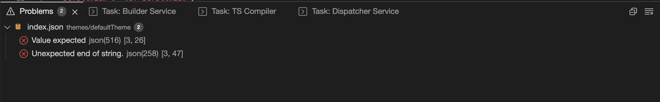
Under the styles folder there are style files defined for each component. These files must be in JSON format. If you end up with an invalid file, an error popup will be generated to guide you.
Properties must be always on above of class names. If not classes can not be inherited the properties below.
Sample style file for a Button component is as follows:
{
  ".button": {
    "width": 250,
    "height": 70,
    "touchEnabled": true,
    "text": "Button",
    "visible": true,
    "backgroundColor": "#00A1F1",
    "alpha": 1,
    "borderColor": "rgba(0,0,0,1)",
    "borderWidth": 0,
    "textColor": "#FFFFFF",
    "textAlignment": "MIDCENTER",
    "font": {
      "size": 16,
      "bold": false,
      "italic": false,
      "family": "Arial"
    },
    "flexProps": {
      "positionType": "RELATIVE",
      "alignSelf": "AUTO"
    },
    "&-small": {
      "width": 100
    },
    "&-medium": {
      "width": 250
    },
    "&-large": {
      "width": 350
    },
    "&-warning": {
      "backgroundColor": "#9F6000"
    },
    "&-error": {
      "backgroundColor": "#D8000C"
    },
    "&-success": {
      "backgroundColor": "#4F8A10"
    }
  }
}
Being a valid JSON
Wrapped with a default class name (such as .button)
positionType, flexDirection, flexGrow, flexWrap, alignContent, alignItems, alignSelf, direction, justifyContent, overflow, flexShrink
size, bold, italic, family
Class Names
Each component comes with a class name. When a component first created, class name is retrieved from index.json. For example, when a Button is created, it comes with class name of .button.
A component can get any class you want. You can choose from existing ones or create a new one by just clicking the plus button.
Autocomplete is also supported.
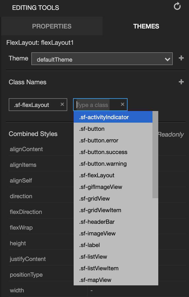
When you select a class tag, all of it's properties are listed. You can add, edit or remove properties.
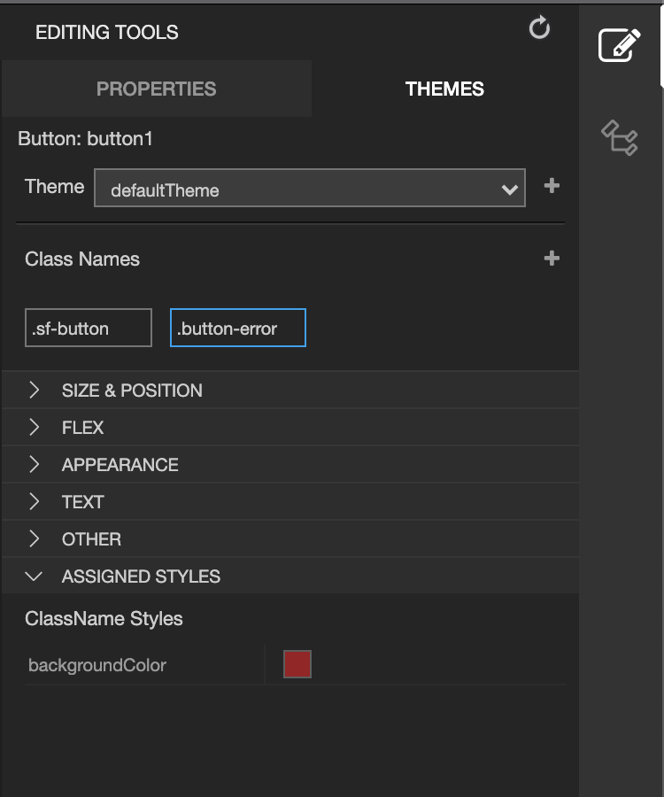
Class tags are draggable. Changing order will update properties due to new class ordering. Last tag will have highest precedence.
Reordering the Class Names
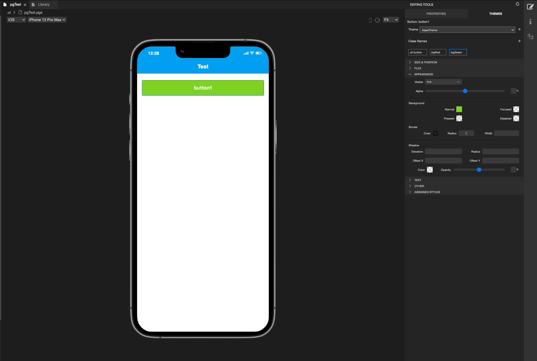
In our example, button component has .button and .button-error classes. They both have backgroundColor property. But .button-error has higher precedence so in result, our button will have backgroundColor of red.
If no class name is selected, then combined properties are shown. That is, ultimate result of properties to be shown on design area.
Combined properties are a combination of both:
- Properties of classes
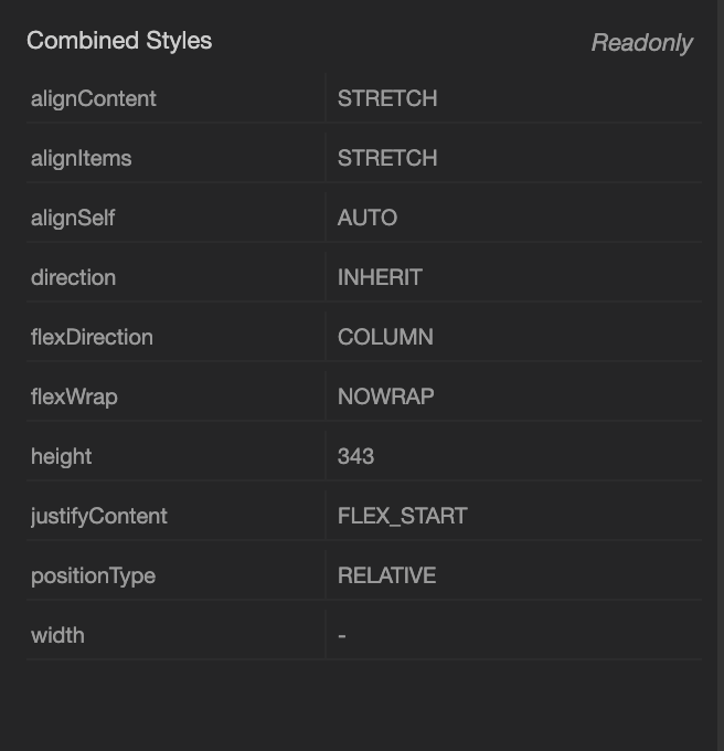
Properties
Properties are properties that set by user from Properties. These properties contain the element specific properties that you can set on the element without using any css classes.
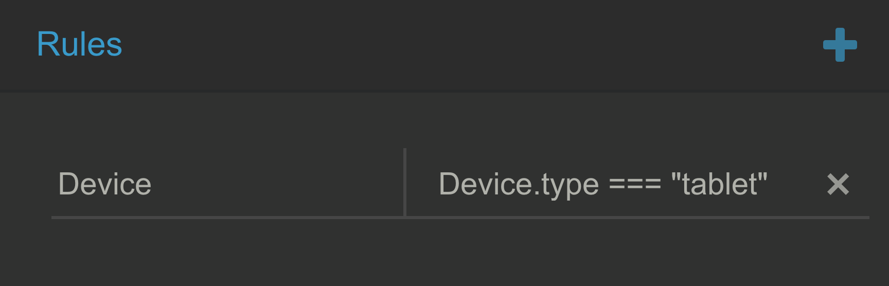
Rules
Some properties can be set when a specified condition is met. For example, user can specify backgroundColor of page to be blue only if the device is a tablet.
Currently rules can be specified under Device object. Available properties are below:
Device: {
    screen: {
        width: 0,
        height: 0,
        dpi: 0,
        ppi: 0
    },
    os: "iOS" || "Android",
    osVersion: "version",
    type: "tablet" || "phone",
    orientation: "landscape" || "portrait",
    language: "EN"
}
Adding a rule
- Select a class name
- Press add sign next to Rules section
- Select Device from dropdown as rule type.
- For second area, type your condition. (In our example,
Devce.type === "tablet")
- Select the command.
- To add a new property, press add sign.
- And you can type any available property to your rule.
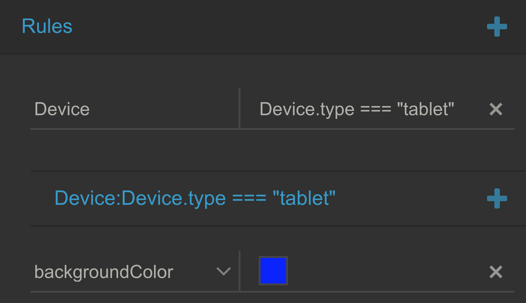
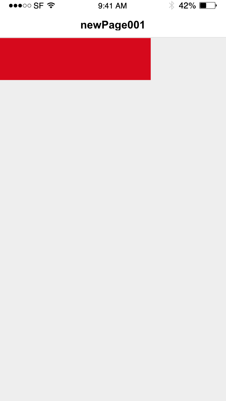
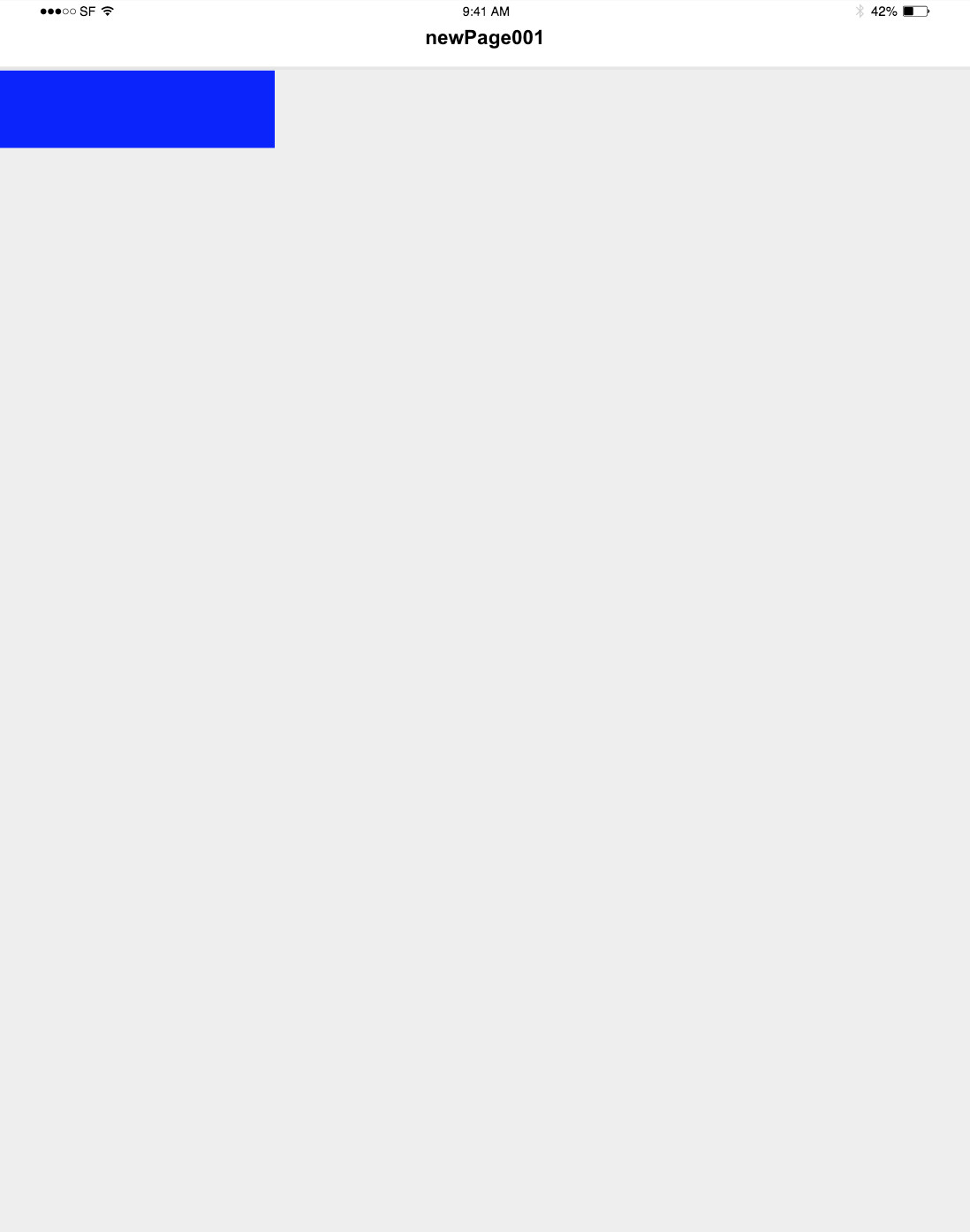
- Styles will be rendered on phones and tablets differently.
Phone:
Tablet:
Variables
It is possible to use variables for your themes which maximizes the reusability of the application styles.
Assume you have a theme called myAppTheme which is located under /themes/myAppTheme. Just right click and create a file named variables.json
If the developer wants to use variables for a specific theme, then variables.json must be located as /themeName/variables.json. Naming of the file is important.
Sample variables file
It is nothing more than a key value mapping. Values are treated as variables.
{
  "black": "rgba(0,0,0,1.0)",
  "white": "#FFFFFF",
  "backgroundMain": "#00A1F1",
  "genericImage": "smartface.png"
}
Usage
Instead of setting hardcoded styles from your styles file, use variables. See the sample button.json file:
{
  ".sf-button": {
    "backgroundColor": "${backgroundMain}",
    "textColor": "${white}",
    "width": 100,
    "height": 50
  }
}
Theme Inheritance
All workspaces include defaultTheme and a base theme. Name of base theme varies workspace to workspace. If you have workspace named demo you will have base theme named demoTheme.
By default, base theme inherits defaultTheme and all other themes created by user inherit base theme. But this behavior could be overridden.
Parent of a theme could be specified on theme's index file such:
{
  "parent": "bar"
}
In this case related theme will inherit bar.
Inheritance with variables
It is possible to have themes with only variables. That way, you can set your styles on the parent theme, allowing theme switch to be easier.
With this approach, your app will have a base theme and may have lots of simple themes to support different themes. And this way, adding a new theme becomes surprisingly easy!
Type of variables must be string. Other than string types are not supported currently such as boolean, number.
Here is a little sample to demonstrate the usage:
- Light Theme
- Dark Theme
- Style Usage
- Theme Inheritance
    "backgroundMain": "#FFFFFF",
    "backgroundSecondary": "#FEFEFE",
    "boxColor": "rgba(255,255,255,1.0)",
    "genericImage": "smartface.png",
    "navbar": "rgba(34,34,34,1.0)",
    "mainTextColor": "rgba(245,245,245, 1.0)"
    "backgroundMain": "rgba(40,85,172,1.0)",
    "backgroundSecondary": "#656565",
    "boxColor": "rgba(28,28,28,1.0)",
    "genericImage": "icon.png"
    "navbar": "rgba(55,55,55, 1.0)",
    "mainTextColor": "rgba(189,189,189,1.0)"
{
  ".buttonRegular": {
    "backgroundColor": "${backgroundMain}",
    "textColor": "${mainTextColor}",
    "width": 100,
    "height": 50
  }
}
{
  "Paths": {
    "defaults": "/styles/defaults",
    "pages": "/styles/pages",
    "components": "/styles/components"
  },
  "parent": "lightTheme"
}
See when you inherit a theme, define your styles on the parent theme just for once then the only thing to do for theming is declaring variables to be used in those styles for each theme. This way your styling experience will get super easy and consistent across your project.
Using Themes Programmatically
Creating theme context is handled in your theme.ts file just like below:
import Data from "@smartface/native/global/data";
import Application from "@smartface/native/application";
import { config } from "settings.json";
import { ThemeService } from "@smartface/styling-context/lib/ThemeService";

const themeConfig = config.theme;
const currentTheme =
  Data.getStringVariable("currentTheme") || themeConfig.currentTheme;
const themeSources = themeConfig.themes.map((name) => ({
  name,
  rawStyles: require(`./generated/themes/${name}`),
  isDefault: currentTheme === name,
}));

export const themeService = new ThemeService(themeSources);
Application["theme"] = ThemeService.instance;
Switching Between Themes
import Button from "@smartface/native/ui/button";
import { themeService } from "theme";
myButton.on('press', () => {
  // "Style1" is new theme to be switched to
  themeService.changeTheme("Style1");
});
The above code is showing a simple way to change your theme on the run, but to make it more robust there are a few things to watch out for. Let's have a look at them and improve our code accordingly.
ThemeService.changeThemefunction is executed on main thread, therefore it is sync.
To prevent this we can set a timeout for the function call. Let's have a look at the code now:
import Button from "@smartface/native/ui/button";
import { themeService } from "theme";
myButton.on('press', () => {
  setTimeout(() => {
    themeService.changeTheme("Style1");
  }, 100);
});
This way your theme switching will be executed 100 ms after the button is pressed. During that time if you want users to be aware that they pressed the button properly, you may place a loading sign before and after the code. This will also help you to prevent users' multiple press actions sequentially on the button so you won't need to worry about it. To learn more about screen-wide loading signs you can refer to:
DialogKeeping the users' preferred theme on device storage is a good practice.
To decide which theme to be used on the app's startup for the user's choice, keeping the last used theme or the user's favorite theme on the device's storage would be a good option. Let's see how to achieve this on the code:
import Button from "@smartface/native/ui/button";
import { themeService } from "theme";
import Data from "@smartface/native/global/data";

myButton.on('press', () => {
  setTimeout(() => {
    const currentTheme = Data.getStringVariable("currentTheme");
    // Assume that we only have two themes to be switched to,
    // and switch to the other theme whenever the button is clicked.
    const targetTheme =
      currentTheme === "lightTheme" ? "darkTheme" : "lightTheme";
    themeService.changeTheme(targetTheme);
    Data.setStringVariable("currentTheme", targetTheme);
  }, 100);
});
To achieve keeping the current theme on the device's local storage we have used Data. To learn more about this you can refer to:
While using the currentTheme as the key for the Data module, since scripts/theme.ts file uses this key by default to get the preferred theme choice on the app's startup we also configured which theme to be used when the app starts running.
If you want to use a different key for storing current theme info on the Data module, don't forget to change the one used in the scripts/theme.ts file as well.
Changing styles in the runtime
In runtime, it is possible to set classes to components due to some conditioning. Please see example below.
if (state === "active") {
  myButton.dispatch({
    type: "pushClassNames",
    classNames: ".item.active",
  });
} else {
  myButton.dispatch({
    type: "removeClassName",
    className: ".item.active",
  });
}
pushClassNames Pushes new class names to the related component's list of class names then it will be rendered with the new properties.
removeClassName Removes a class name from the related component's list of class names then it will be rendered with the new properties.
Although being a handy concept, overusing removeClassName could cause performance issues.
This file is auto generated. You shouldn't modify its contents. When you change your current theme via the "Themes" panel, this file is updated automatically.
Reacting to theme changes
To programmatically act on a theme change, themeService.onChange function does the trick for you.
Changing bottom tabbar colors on theme change
To do this, in the place where you define your BottomTabBarRouter you can define an onChange event for theme service, and change the style of bottomTabBar accordingly. Let's see the usage:
import BottomTabBarController from "@smartface/native/ui/bottomtabbarcontroller";
import { themeService } from "theme";
import { BottomTabBarRouter } from "@smartface/router";

themeService.onChange(() => {
  const { backgroundColor, itemColor } = themeService.getNativeStyle(".tabs");
  const rootController = bottomTabBarRouter._renderer._rootController;
  if (rootController instanceof BottomTabBarController) {
    rootController.tabBar.backgroundColor = backgroundColor;
    rootController.tabBar.itemColor = itemColor;
  }
});

const bottomTabBarRouter = BottomTabBarRouter.of({
  // ... rest of your code
});
Style File Management
Class names created by user will be saved on different files performing following steps:
- Get root of class name (For example root of .button-small is button)
- If root denotes a
smartface/nativecomponent (For button it does) properties of related class name will be saved under related theme's styles/defaults folder. (as button.json in this example)- styles/defaults path is configurable.
- If root denotes a page name (Our class may be #myPage-red) properties of related class name will be saved under related theme's styles/pages folder. (as MyPage.json in this example)
- styles/pages path is configurable.
- If root does not match either a page name or a
smartface/nativecomponent then class name must be generic. (For example .foo) In that case properties of related class name will be saved under related theme's styles/common.json.- styles/common.json path is not configurable.
Path configuration can be performed on related theme's index.json fie such:
{
  "Paths": {
    "defaults": "/styles/defaults",
    "pages": "/styles/pages"
  }
}
If no Paths field is provided on index.json, /styles folder will be considered for both paths.
Advanced
When your component's styles are changed, for example, if you set different styles for different rotations for your component using rules and you rotated your device, then subscribeContext is called to inform you that styles have changed regarding your component's class name. In this example note the .flexLayout:
- Typescript
import { createSFCoreProp } from "@smartface/styling-context/lib/sfCorePropFactory";

page.dispatch(
  type: "addChild",
  {
      subscribeContext: function (e) {
        if (e.rawStyle.backgroundColor) {
          // Get color object
          const backgroundColor = createSFCoreProp(
            "backgroundColor",
            e.rawStyle.backgroundColor
          );
        }
      },
  },
  ".flexLayout"
);
- Do not call dispatch before onLoad method of page is called. (For example in constructor it cannot be called)
- defaults property of the Library components no longer exists
For more information and advanced usage please refer to the Contxjs documentation
Limitations
Currently iOS and Android specific properties cannot be set by the style files.