Using ListView or GridView with UI Editor
Overview
This guide is applicable for using UI editor on both ListView and GridView. It is advised to check them for more detailed guide.
If you are new to Smartface, make sure to check out basic usage of UI Editor on this document:
UI Editor BasicsCreating a ListView or GridView
Since ListView and GridView are using recycling methodology which is used on mobile systems widely, they cannot be used on the same fashion with the other components.
Add your ListView / GridView normally as you would do with any other component. Make sure to check out UI Editor Basics documentation if you don't know how to add a component in Page.
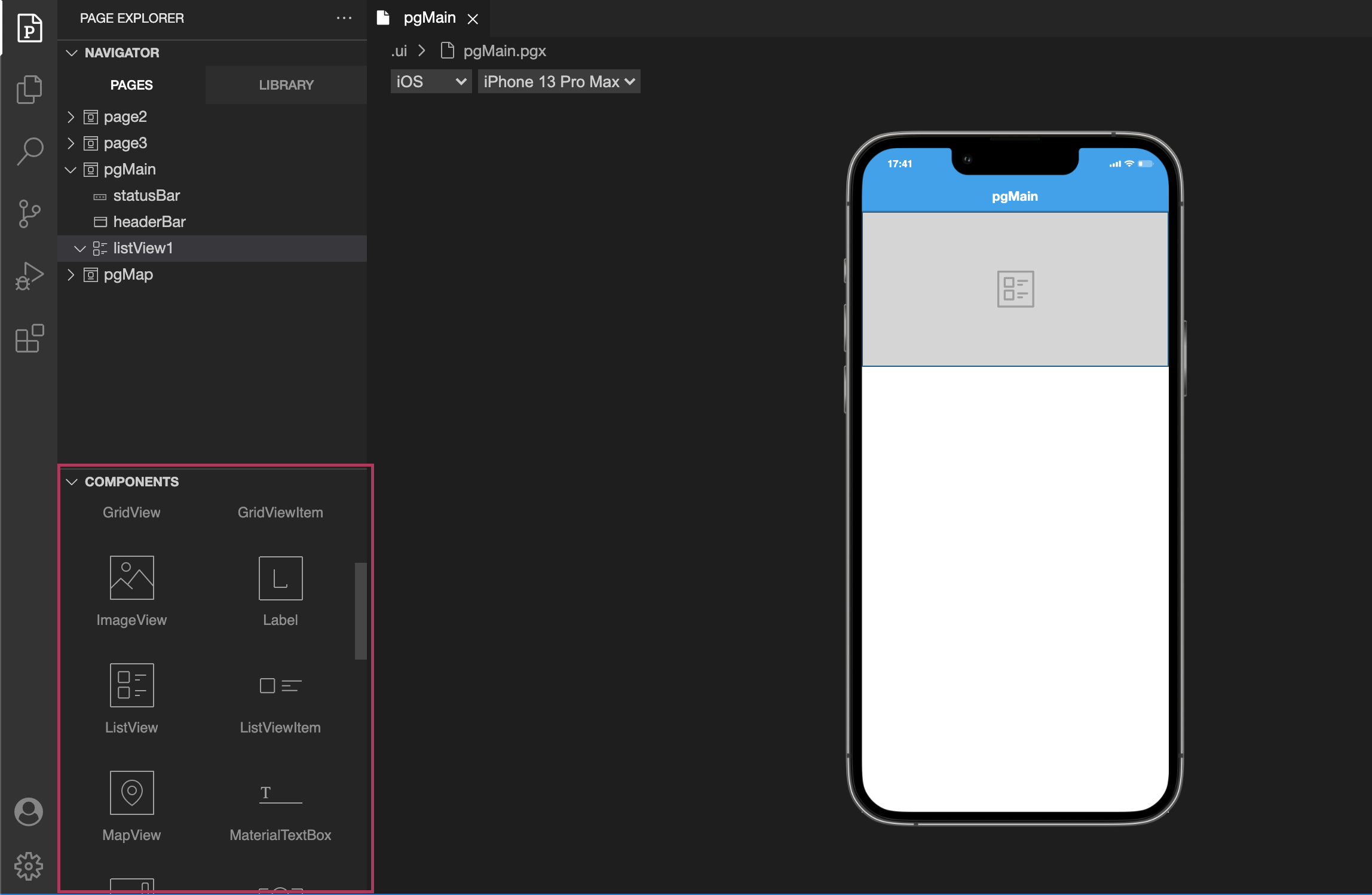
After this, we need to create our ListViewItem/GridViewItem on Library Components.
Creating ListViewItem
ListViewItem and GridViewItem components can only be created inside of library as root component. They cannot be added directly to Pages or inside of a container other than library.
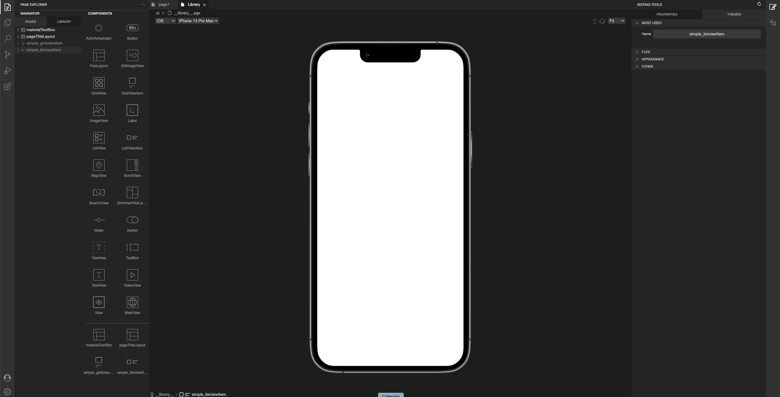
Go to the toolbox, drag & drop a ListViewItem and perform your design inside that component. For more information please refer to the documentation below:
Reusable ComponentsUsing ListViewItem or GridViewItem
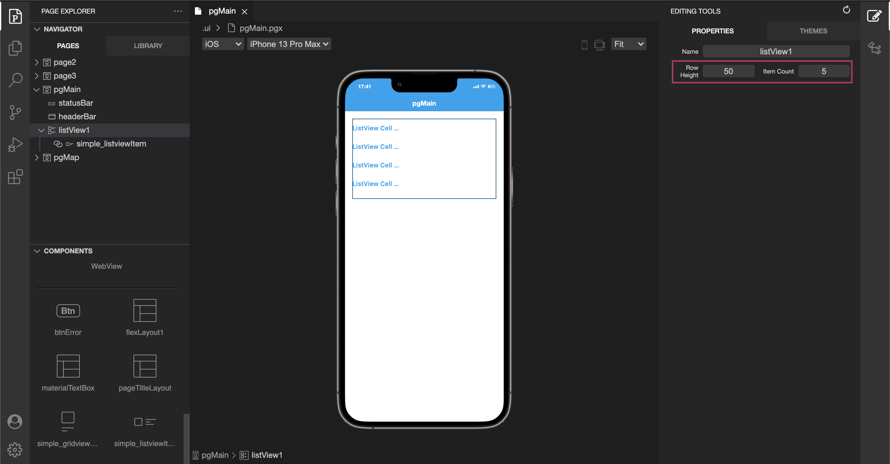
Once our ListView and ListViewItem is ready, we can add them inside of out newly created ListView. The process isn't different from dragging a component inside of a container.
On UI Editor, Smartface IDE only supports using one UI.ListViewItem type by Drag & Drop.
After Dragging & Dropping your UI.ListViewItem, adjust rowHeight and itemCount to your needs.
Do not forget to call refreshData function before making any changes to the ListView or GridView.
Adapting ListView to ListViewItem
itemCount determines how many items is going to be shown on UI.ListView, therefore this property needs to be changed when related dataset changes.
contentInset and contentOffset
Since padding will not work on UI.ListViewItem, you might want to leave extra space only on the latest or the first item. You can use contentInset or contentOffset on such cases.
Using UI editor with class is recommended by Smartface, to keep the code clean.
When defining contentInset and contentOffset , make sure that you define both bottom and top, even if you are not using one of them. Only defining one of them might cause unexpected behaviors.
Coding ListViewItem
- When a component is created on library pane by using Reusable Component Libraries a file that contains component code like
scripts/components/ListViewItem1.tsis created. - While using your newly added layouts ( e.g. changing text ), it is crucial to encapsulate inner layouts and define them as properties by using getter and setters. This will help page code to be clean, improve extendibility and maximize reusability.
import ListViewItem1Design from "generated/my-components/ListViewItem1";

export default class ListViewItem1 extends ListViewItem1Design {
  pageName?: string | undefined;
  private __titleText = ""; // Alternative method to assign variable
  constructor(props?: any, pageName?: string) {
    // Initalizes super class for this scope
    super(props);
    this.pageName = pageName;
  }
  get titleText(): string {
    return this.label1.text || "";
    //return this.__titleText;
  }
  set titleText(value: string) {
    this.label1.text = typeof value === "string" ? value : "";
    // E.g. you can check its type to avoid wrong assignments
    this.__titleText = typeof value === "string" ? value : "";
  }
}
Initializing ListViewItem or GridViewItem on Page Code
After the properties and codes are created, it is time to use it on Actual page.
When UI.ListViewItem is added by UI Editor, using onRowCreate callback is not necessary, this will help to keep the code clean.
UI.ListView needs to be initialized, then the data should be defined properly.
By default, Smartface sets rowHeight and itemCount value to something reasonable. To change that, simply set those values inside of initListView() function.
To use more than one Type, use onRowCreate function and add your types from the code. Refer the ListView Guide for details.
- Page Code
- ListViewItem - Code
- ListViewItem - Style
import ListViewItem1 from "components/ListViewItem1";
import { Route, Router } from "@smartface/router";

export default class Page1 extends Page1Design {
  constructor(private router?: Router, private route?: Route) {
    super({});
  }
  initListView() {
    this.listView1.rowHeight = ListViewItem1.getHeight();
    this.listView1.onRowBind = (listViewItem: ListViewItem1, index: number) => {
      listViewItem.titleText = this.dataSet[index].title; // Recommended way
    };
    this.listView1.onPullRefresh = async () => {
      try {
        await apiCall();
        this.refreshListView();
      } finally {
        this.listView1.stopRefresh();
      }
    };
  }
  refreshListView() {
    this.listView1.itemCount = this.dataSet.length;
    this.listView1.refreshData(); // This is important
  }

  onShow() {
    super.onShow();
    this.refreshListView();
  }

  onLoad() {
    super.onLoad();
    this.dataSet = [
      {
        title: "Smartface1",
      },
      {
        title: "Smartface2",
      },
    ];
    this.initListView();
  }
}
import ListViewItem1Design from "generated/my-components/ListViewItem1";
import { themeService } from "theme";

export default class ListViewItem1 extends ListViewItem1Design {
  pageName?: string | undefined;
  private __titleText = ""; // Alternative method to assign variable
  constructor(props?: any, pageName?: string) {
    // Initalizes super class for this scope
    super(props);
    this.pageName = pageName;
  }
  get titleText(): string {
    return this.label1.text || "";
    //return this.__titleText;
  }
  set titleText(value: string) {
    this.label1.text = typeof value === "string" ? value : "";
    // E.g. you can check its type to avoid wrong assignments
    this.__titleText = typeof value === "string" ? value : "";
  }
  static getHeight(): number {
    return themeService.getStyle(".listViewItem1").height || 0;
  }
}
{
  ".listViewItem1": {
    "height": 80
  }
}
Implementing onRowCreate or onItemCreate
Note that this is only required if your ListView has more than one type of ListViewItem's.
var itemIndex = 0;

myListView.onRowCreate = function() {
    var myListViewItem = new MyLibraryComponent();
    this.dispatch({
      type: 'addChild',
      component: myListViewItem,
      name: `item${++itemIndex}`
    });
    return myListViewItem;
});
Tips & Tricks
- Since the dimensions of UI.ListViewItem is handled differently than the other layouts, assigning dimensional properties like margin, width or height will be ignored and those are handled by UI.ListView. Use a wrapper to cover entire UI.ListViewItem when needed.
- You can also define any functions you want inside of a component.
- For ease of usage, it is advised to set height of UI.ListView by a theme via Using Themes in Apps. Then, you can use themeService.getStyle() to access their style from the code. This will also ease the implementation UI.ListView which has multiple types.
import ListViewItem1Design from "generated/my-components/ListViewItem1";

export default class ListViewItem1 extends ListViewItem1Design {
  pageName?: string | undefined;
  private __titleText = ""; // Alternative method to assign variable
  constructor(props?: any, pageName?: string) {
    // Initalizes super class for this scope
    super(props);
    this.pageName = pageName;
  }
  clearText() {
    this.label1.text = "";
  }
}
Best Practice for ListViewItem and GridViewItem
The created ListViewItem and GridViewItem components can not be used outside of their respective ListView or GridView. Therefore, when you are implementing them, instead of having your components like this,
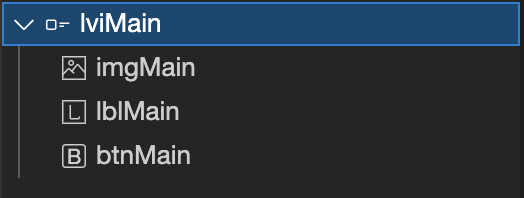
Wrap them in a FlexLayout and nest them within the ListViewItem or GridViewItem like this:
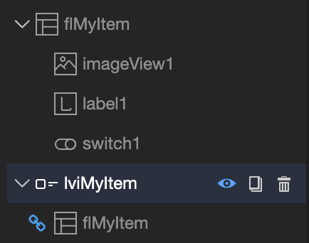
Together with organized way to collect the components, this has two main benefits:
- Since ListViewItem and GridViewItem are special components, when supporting multiple themes they might not be updated property during the theme switch. However, underlying components will not have this problem.
- If you want to use the same component in e.g. ScrollView, you don't need to redesign it anymore, you can simply use the inner component directly.
The caveat is, when writing component code you have to define functions two times for both FlexLayout and ListViewItem code. You can achieve this by calling the underlying component function in the parent function. E.g. if we want to change the text of the label:
- FlexLayout Code
- ListViewItem Code
import FlMyItemDesign from "generated/my-components/FlMyItem";

export default class FlMyItem extends FlMyItemDesign {
  pageName?: string | undefined;
  constructor(props?: any, pageName?: string) {
    // Initalizes super class for this scope
    super(props);
    this.pageName = pageName;
  }
  setLabelText(text: string): void {
    this.label1.text = text;
  }
}
import LviMyItemDesign from "generated/my-components/LviMyItem";

export default class LviMyItem extends LviMyItemDesign {
  pageName?: string | undefined;
  constructor(props?: any, pageName?: string) {
    // Initalizes super class for this scope
    super(props);
    this.pageName = pageName;
  }
  setLabelText(text: string) {
    this.flMyItem.setLabelText(text);
  }
}
Now, you can use the same function in both situations.
Type-Safe Approach
The example above serves the purpose but it isn't an ideal solution if you want your functions to be type-safe and use a model-like approach. You can create a file like myItem.d.ts and declare your interface there.
It is better to gather those file in a single folder. A good folder name can be models.
declare interface IMyItem {
  setLabelText(text: string): void;
  setImageURL(URL: string): void;
}
After that, we can implement our new IMyItem interface like this:
- FlexLayout Code
- ListViewItem Code
import FlMyItemDesign from "generated/my-components/FlMyItem";

export default class FlMyItem extends FlMyItemDesign implements IMyItem {
  pageName?: string | undefined;
  constructor(props?: any, pageName?: string) {
    // Initalizes super class for this scope
    super(props);
    this.pageName = pageName;
  }
  setLabelText(text: string): void {
    this.label1.text = text;
  }
}
import LviMyItemDesign from "generated/my-components/LviMyItem";

export default class LviMyItem extends LviMyItemDesign implements IMyItem {
  pageName?: string | undefined;
  constructor(props?: any, pageName?: string) {
    // Initalizes super class for this scope
    super(props);
    this.pageName = pageName;
  }
  setLabelText(text: string) {
    this.flMyItem.setLabelText(text);
  }
}
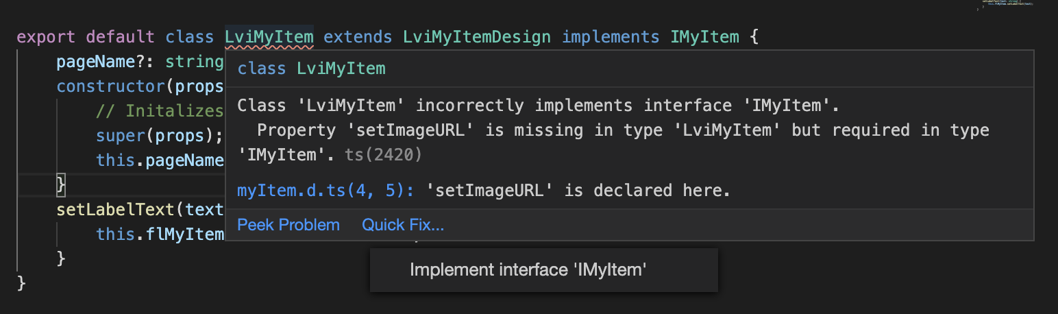
After we implement this, the Typescript compiler will raise error because we didn't implement our new function yet. Simply use Quick Fix.. method to add missing functions.
If you need to have custom types as typing parameters, you need to export the interface and import in both LviMyItem.ts and FlMyItem.tsfiles.
You can find the best practices about declaration on DefinitelyTyped Best Practices