RangeSlider
API Reference: UI.RangeSlider
RangeSlider is a double thumb on the track slider that allows sliding through possible values between the desired range.
snapStepSize property is the minimum step between a range, thus it must be less than the maxValue and defined after the minValue & maxValue.
maxValue should not be less than minValue.
Range slider support single thumb as well by rangeEnabled property
The components in the example are added from the code for better showcase purposes. To learn more about the subject you can refer to:
Adding Component From CodeAs a best practice, Smartface recommends using the WYSIWYG editor in order to add components and styles to your page or library. To learn how to use UI Editor better, please refer to this documentation
UI Editor BasicsthumbImage is not supported in Android.
import PageSampleDesign from "generated/pages/page3";
import { Route, Router } from "@smartface/router";
import { styleableComponentMixin } from '@smartface/styling-context';
import RangeSlider from "@smartface/native/ui/rangeslider";
import Color from "@smartface/native/ui/color";
import Image from "@smartface/native/ui/image";

class StyleableRangeSlider extends styleableComponentMixin(RangeSlider) {}

//You should create new Page from UI-Editor and extend with it.
export default class Sample extends PageSampleDesign {
    myRangeSlider: RangeSlider;

  constructor(private router?: Router, private route?: Route) {
    super({});
  }

  // The page design has been made from the code for better
  // showcase purposes. As a best practice, remove this and
  // use WYSIWYG editor to style your pages.
  centerizeTheChildrenLayout() {
    this.dispatch({
        type: "updateUserStyle",
        userStyle: {
            flexProps: {
              flexDirection: 'ROW',
              justifyContent: 'CENTER',
              alignItems: 'CENTER'
            }
        }
    })
  }

  onShow() {
    super.onShow();
    const { headerBar } = this;
  }

  onLoad() {
    super.onLoad();
    this.centerizeTheChildrenLayout();

    this.myRangeSlider = new StyleableRangeSlider({
        trackColor: Color.create("#00A1F1"),
        outerTrackColor: Color.create("#eaedf2"),
        minValue: 0,
        maxValue: 200,
        trackWeight: 20,
        snapStepSize: 5,
        rangeEnabled: true,
        isTrackRounded: true,
        android: {
          thumbColor: Color.BLUE,
          thumbBorderColor: Color.GREEN,
          thumbBorderWidth: 1,
          thumbSize: 15,
          outerTrackWeight: 15,
        },
        ios: {
          isHapticSnap: true,
          showsThumbImageShadow: true,
          thumbImage: Image.createFromFile("images://slider_icon.png"),
        },
        onValueChange: (value) => {
          console.log("Value : " + value);
        },
      });

      this.addChild(this.myRangeSlider, "myRangeSlider", null, {
        width: 350,
        height: 200,
      });
  }
}
images://slider_icon.png is generated from the image file in the images/automated folder.


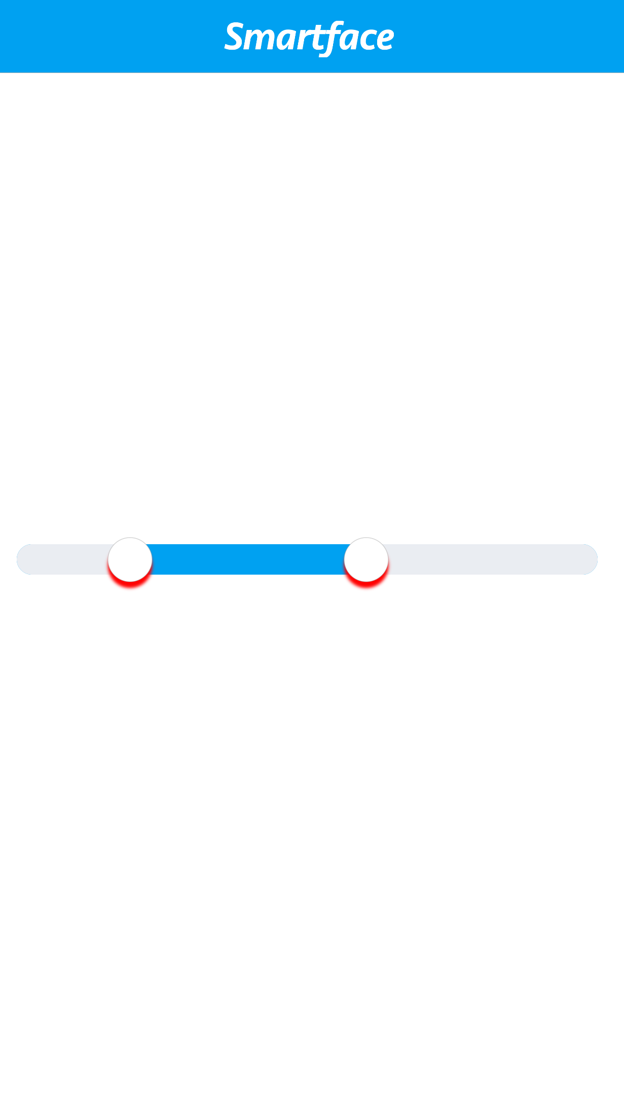
Thumb Shadow in iOS:
The color, opacity and radius of the rangeSlider thumb shadow can be modified.
thumb shadow changes are not applied until applyThumbViewChanges() is calledout.
import PageSampleDesign from "generated/pages/page3";
import { Route, Router } from "@smartface/router";
import { styleableComponentMixin } from '@smartface/styling-context';
import RangeSlider from "@smartface/native/ui/rangeslider";
import Color from "@smartface/native/ui/color";
import Image from "@smartface/native/ui/image";

class StyleableRangeSlider extends styleableComponentMixin(RangeSlider) {}

//You should create new Page from UI-Editor and extend with it.
export default class Sample extends PageSampleDesign {
    myRangeSlider: RangeSlider;

  constructor(private router?: Router, private route?: Route) {
    super({});
  }

  // The page design has been made from the code for better
  // showcase purposes. As a best practice, remove this and
  // use WYSIWYG editor to style your pages.
  centerizeTheChildrenLayout() {
    this.dispatch({
        type: "updateUserStyle",
        userStyle: {
            flexProps: {
              flexDirection: 'ROW',
              justifyContent: 'CENTER',
              alignItems: 'CENTER'
            }
        }
    })
  }

  onShow() {
    super.onShow();
    const { headerBar } = this;
  }

  onLoad() {
    super.onLoad();
    this.centerizeTheChildrenLayout();

    this.myRangeSlider = new StyleableRangeSlider({
        trackColor: Color.create("#00A1F1"),
        outerTrackColor: Color.create("#eaedf2"),
        minValue: 0,
        maxValue: 200,
        trackWeight: 20,
        snapStepSize: 5,
        rangeEnabled: true,
        isTrackRounded: true,
        android: {
          thumbColor: Color.BLUE,
          thumbBorderColor: Color.GREEN,
          thumbBorderWidth: 1,
          thumbSize: 15,
          outerTrackWeight: 15,
        },
        ios: {
          isHapticSnap: true,
          showsThumbImageShadow: true,
          thumbImage: Image.createFromFile("images://icon.png"),
          thumbShadowColor: Color.RED,
          thumbShadowOpacity: 1,
          thumbShadowRadius: 1,
        },
        onValueChange: (value) => {
          console.log("Value : " + value);
        },
      });

      this.myRangeSlider.ios.applyThumbViewChanges();
      this.myRangeSlider.ios.thumbShadowOffset = {
        x: 5.0,
        y: 0.0,
      };

      this.addChild(this.myRangeSlider, "myRangeSlider", null, {
        width: 350,
        height: 200,
      });
  }
}