Color
Overview
API Reference: UI.Color
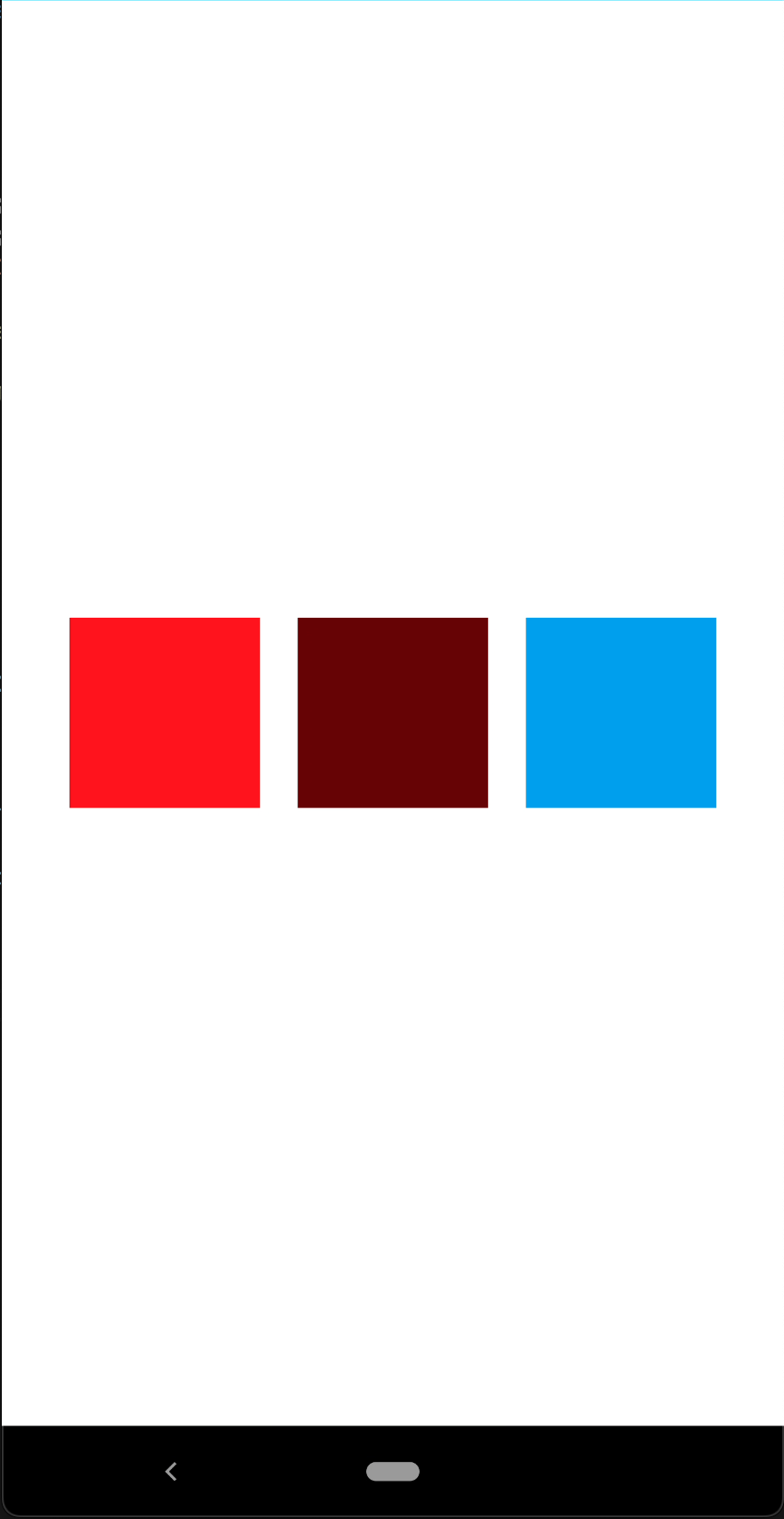
Color is used to color UI objects and its elements. A Color instance is created by passing RGB-ARGB values or a hexadecimal string. There are constant and predefined colors as well.
note
The components in the example are added from the code for better showcase purposes. To learn more about the subject you can refer to:
Adding Component From CodeAs a best practice, Smartface recommends using the WYSIWYG editor in order to add components and styles to your page or library. To learn how to use UI Editor better, please refer to this documentation
UI Editor Basicsscript/pages/pageSample.ts
import PageSampleDesign from "generated/pages/pageSample";
import Application from "@smartface/native/application";
import System from "@smartface/native/device/system";
import View from "@smartface/native/ui/view";
import { Route, Router } from "@smartface/router";
import { withDismissAndBackButton } from "@smartface/mixins";
import { styleableComponentMixin } from "@smartface/styling-context";

class StyleableView extends styleableComponentMixin(View) {}

export default class ColorSample extends withDismissAndBackButton(
  PageSampleDesign
) {
  myViewWithRed: StyleableView;
  myViewWithBlueColorWithAlpha: StyleableView;
  myViewWithHEXColor: StyleableView;

  constructor(private router?: Router, private route?: Route) {
    super({});
  }

  // The page design has been made from the code for better
  // showcase purposes. As a best practice, remove this and
  // use WYSIWYG editor to style your pages.
  centerizeTheChildrenLayout() {
    this.style.apply({
      flexProps: {
        flexDirection: "ROW",
        justifyContent: "CENTER",
        alignItems: "CENTER",
      },
    });
  }

  onShow() {
    super.onShow();

    const { headerBar } =
      System.OS === System.OSType.ANDROID ? this : this.parentController;
    Application.statusBar.visible = false;
    headerBar.visible = false;
  }

  onLoad() {
    super.onLoad();
    this.centerizeTheChildrenLayout();

    let myRedColor = "rgb(255, 0, 0)";
    let myBlueColorWithAlpha = "rgba(100, 0, 0, 1)";
    let myHEXColor = "#00A1F1";

    this.myViewWithRed = new StyleableView();
    this.myViewWithBlueColorWithAlpha = new StyleableView();
    this.myViewWithHEXColor = new StyleableView();

    this.addChild(this.myViewWithRed, "myView1", ".view", {
      width: 100,
      height: 100,
      margin: 10,
      backgroundColor: myRedColor,
    });

    this.addChild(this.myViewWithBlueColorWithAlpha, "myView2", ".view", {
      width: 100,
      height: 100,
      margin: 10,
      backgroundColor: myBlueColorWithAlpha,
    });

    this.addChild(this.myViewWithHEXColor, "myView3", ".view", {
      width: 100,
      height: 100,
      margin: 10,
      backgroundColor: myHEXColor,
    });
  }
}

Get Color from variables
info
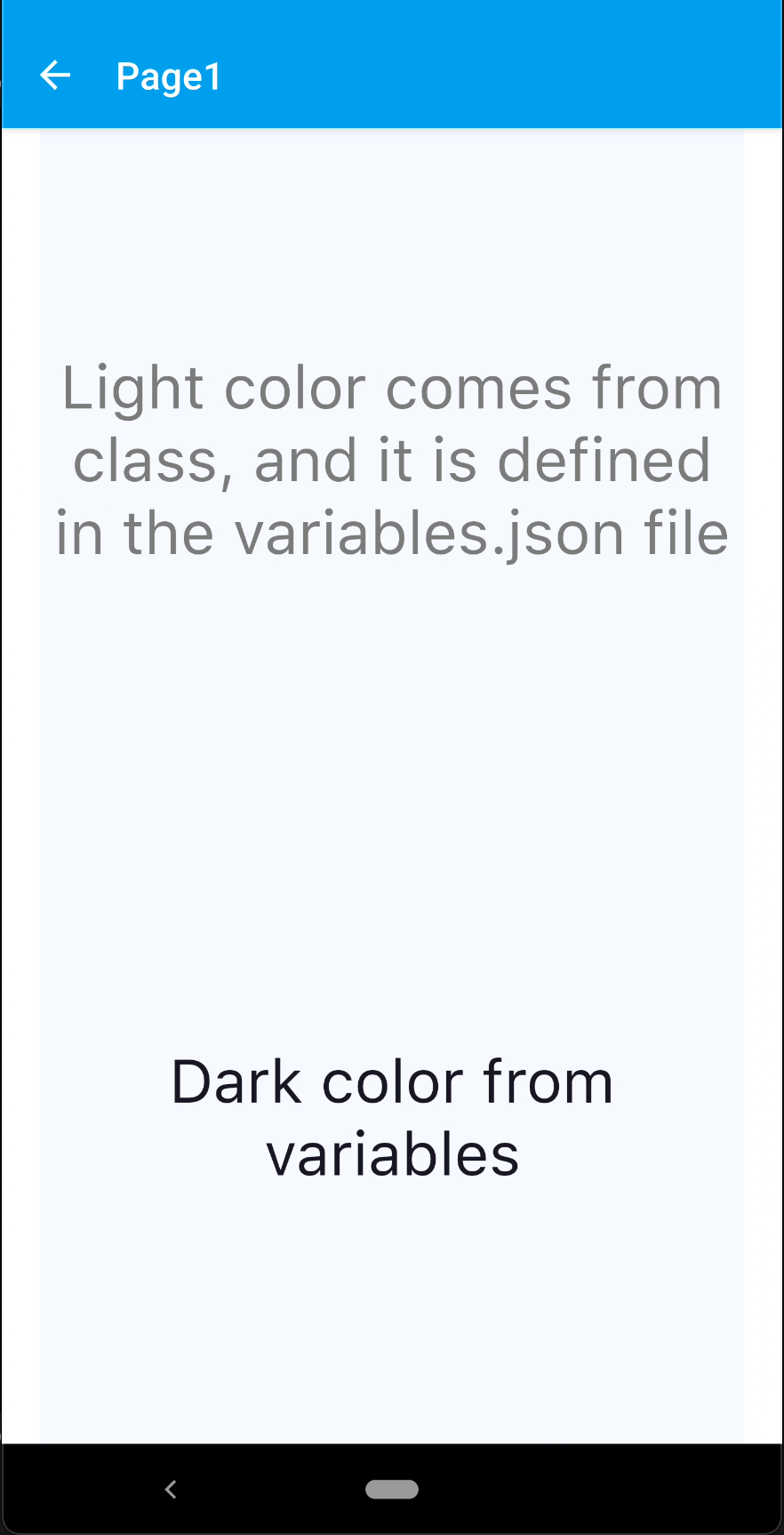
In best practice, you should use predefined colors. Variables are defined in the variables.json file, variables.json file is located in the themes/yourTheme folder. It comes with the theme.
- Color Variables
- Page Style
- Component Style
- Page
themes/yourTheme/variables.json
{
  "main": "#53B175",
  "backgroundMain": "rgba(245,249,254,1.0)",
  "backgroundSecondary": "rgba(237,243,254,1.0)",
  "textDark": "#181725",
  "textLight": "#7C7C7C"
}
themes/yourTheme/styles/pages/Page1.json
{
  "#page1": {
    "&-lbl": {
      "backgroundColor": "${backgroundMain}",
      "textColor": "${textDark}",
      "flexProps": {
        "marginLeft": 20,
        "marginRight": 20,
        "alignSelf": "STRETCH",
        "flexGrow": 1
      },
      "font": {
        "size": 32,
        "bold": false,
        "italic": false,
        "family": "SFProText",
        "style": "Regular"
      },
      "height": 600,
      "multiline": true,
      "textAlignment": "MIDCENTER",
      "maxLines": 5
    }
  }
}
themes/yourTheme/styles/components/FlMyComponent.json
{
  ".flMyComponent": {
    "backgroundColor": "${backgroundSecondary}",
    "textColor": "${textLight}",
    "flexProps": {
      "alignItems": "CENTER"
    }
  }
}
script/pages/page1.ts
import Page1Design from "generated/pages/page1";
import { Route, Router } from "@smartface/router";
import { withDismissAndBackButton } from "@smartface/mixins";
import { themeService } from "theme";
import { styleableComponentMixin } from "@smartface/styling-context";
import Label from "@smartface/native/ui/label";

const textLight = themeService.getNativeStyle(".flMyComponent").textColor;

class StyleableLabel extends styleableComponentMixin(Label) {}

export default class Page1 extends withDismissAndBackButton(Page1Design) {
  lblOne: StyleableLabel;
  lblTwo: StyleableLabel;

  constructor(private router?: Router, private route?: Route) {
    super({});
    this.lblOne = new StyleableLabel();
    this.lblTwo = new StyleableLabel();
  }

  onShow() {
    super.onShow();

    //#page1-lbl variable retrieves the style values from Page1.json
    this.addChild(this.lblOne, "lblOne", "#page1-lbl");
    this.addChild(this.lblTwo, "lblTwo", "#page1-lbl");

    this.lblTwo.text = "Dark color from variables";

    this.lblOne.text =
      "Light color comes from class, and it is defined in the variables.json file";
    this.lblOne.textColor = textLight;
  }
  onLoad() {
    super.onLoad();
  }
}
