SelectablePicker
API Reference: UI.SelectablePicker
This component only works for Android.
SelectablePicker is a UI Component that allows you to create a list from which the user can pick a single or multiple item / items.
Single SelectablePicker
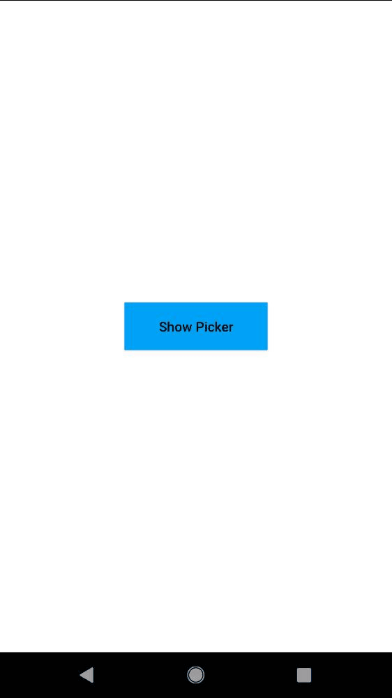
Following the example below is showing the single SelectablePicker. When the user clicks ok / done button, label section will be updated with the selected items.
The components in the example are added from the code for better showcase purposes. To learn more about the subject you can refer to:
Adding Component From CodeAs a best practice, Smartface recommends using the WYSIWYG editor in order to add components and styles to your page or library. To learn how to use UI Editor better, please refer to this documentation
UI Editor Basicsimport PageSampleDesign from "generated/pages/pageSample";
import { Route, Router } from "@smartface/router";
import { styleableComponentMixin } from "@smartface/styling-context";
import Button from "@smartface/native/ui/button";
import SelectablePicker from "@smartface/native/ui/selectablepicker";
import System from "@smartface/native/device/system";
class StyleableButton extends styleableComponentMixin(Button) {}
//You should create new Page from UI-Editor and extend with it.
export default class Sample extends PageSampleDesign {
myButton: StyleableButton;
items: string[] = ["item 1", "item 2", "item 3", "item 4", "item 5"];
constructor(private router?: Router, private route?: Route) {
super({});
}
// The page design has been made from the code for better
// showcase purposes. As a best practice, remove this and
// use WYSIWYG editor to style your pages.
centerizeTheChildrenLayout() {
this.style.apply({
flexProps: {
flexDirection: "ROW",
justifyContent: "CENTER",
alignItems: "CENTER",
},
});
}
doneCallback(params: { items: number[] }): void {
console.log("Selected index: " + params.items);
}
cancelCallback(): void {
console.log("Cancel Clicked!");
}
showPicker(): void {
let mySelectablePicker = new SelectablePicker({
items: this.items,
multiSelectEnabled: false,
checkedItems: 2,
});
mySelectablePicker.on("selected", (index, selected) => {
console.log(
"onSelected callback triggered. index: " +
index +
" selected: " +
selected
);
});
mySelectablePicker.show(this.doneCallback, this.cancelCallback);
}
onShow() {
super.onShow();
}
onLoad() {
super.onLoad();
this.centerizeTheChildrenLayout();
this.myButton = new StyleableButton({
text: "Show Picker",
});
this.myButton.on("press", () => {
if (System.OS === System.OSType.ANDROID) this.showPicker();
});
this.addChild(this.myButton, "myButton", ".button", {
textColor: "#000000",
backgroundColor: "#00A1F1",
});
}
}

Multiple SelectablePicker
Following the example below is showing the multiple SelectablePicker. In multiple SelectablePicker, you must set multiSelectEnabled property in the constructor and you can not set this property on run-time. Otherwise, SelectablePicker may not work properly. If you want to set checkedItem property, the array of index must same size with given items array. When the user clicks ok/done button, label section will be updated with the selected items
The components in the example are added from the code for better showcase purposes. To learn more about the subject you can refer to:
Adding Component From CodeAs a best practice, Smartface recommends using the WYSIWYG editor in order to add components and styles to your page or library. To learn how to use UI Editor better, please refer to this documentation
UI Editor Basicsimport PageSampleDesign from "generated/pages/page4";
import { Route, Router } from "@smartface/router";
import { styleableComponentMixin } from "@smartface/styling-context";
import Button from "@smartface/native/ui/button";
import SelectablePicker from "@smartface/native/ui/selectablepicker";
import System from "@smartface/native/device/system";
import Application from "@smartface/native/application";
class StyleableButton extends styleableComponentMixin(Button) {}
//You should create new Page from UI-Editor and extend with it.
export default class Sample extends PageSampleDesign {
myButton: Button;
items: string[] = ["item 1", "item 2", "item 3", "item 4", "item 5"];
constructor(private router?: Router, private route?: Route) {
super({});
}
doneCallback(params: { items: number[] }): void {
console.log("Selected index: " + params.items);
}
cancelCallback(): void {
console.log("Cancel Clicked!");
}
showPicker(): void {
let mySelectablePicker = new SelectablePicker({
items: this.items,
multiSelectEnabled: true,
checkedItems: [3, 2],
});
mySelectablePicker.onSelected = function (index, selected) {
console.log(
"onSelected callback triggered. index: " +
index +
" selected: " +
selected
);
};
mySelectablePicker.show(this.doneCallback, this.cancelCallback);
}
// The page design has been made from the code for better
// showcase purposes. As a best practice, remove this and
// use WYSIWYG editor to style your pages.
centerizeTheChildrenLayout() {
this.dispatch({
type: "updateUserStyle",
userStyle: {
flexProps: {
flexDirection: "ROW",
justifyContent: "CENTER",
alignItems: "CENTER",
},
},
});
}
onShow() {
super.onShow();
const { headerBar } =
System.OS === System.OSType.ANDROID ? this : this.parentController;
Application.statusBar.visible = false;
headerBar.visible = false;
}
onLoad() {
super.onLoad();
this.centerizeTheChildrenLayout();
this.myButton = new StyleableButton({
text: "Show Picker",
onPress: () => {
this.showPicker();
},
});
this.addChild(this.myButton, "myButton", ".sf-button", {
textColor: "#000000",
backgroundColor: "#00A1F1",
});
}
}
SelectablePicker selected/unselected color
Those colors are only for published projects. If you are using emulator, you can not change those colors.
You can not change selected/unselected color directly. If you want to change this color, follow the instructions:
- Under the
/workspace/themes/defaultTheme/styles, there is a file named__applicationAndroidStyle.json. Copy this file. - Paste under the
/workspace/themes/baseTheme/styles/defaults. - Now you can change selected/unselected color by changing colorAccent key in the
__applicationAndroidStyle.jsonthat you copied
Changing the value of colorAccent will change also the color of cancel/done buttons of SelectablePicker, if you did not set cancel / done button color.