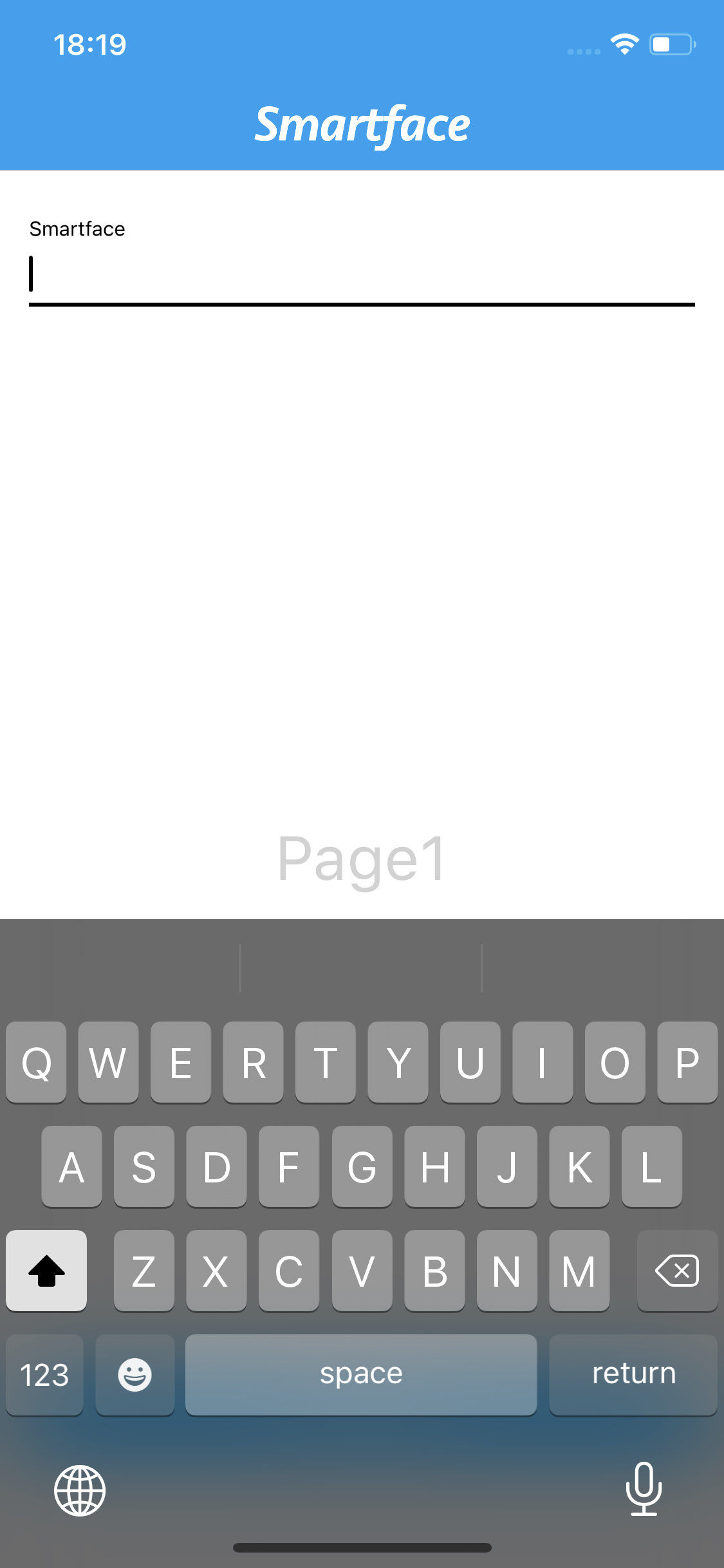
Keyboard Types and Handling Keyboard
The keyboard is an important factor in the mobile application. In order to give native experience, keyboard should act like in a native way for both platforms.
Key Differences of Keyboards
| iOS - iPadOS | Android |
|---|---|
| Has one standard keyboard. | Different keyboards can be used. |
| Keyboard has theme support, keyboard theme can be changed by application. | Keyboard theming is keyboard-app dependant. Applications can't change keyboard theme. |
| Has less types supported. | Has more variety of types. |
| Auto-correction, auto capitalisation etc. is handled by Platform and cannot be configured via app. | Auto-correction, auto capitalisation etc. can be configured via app. |
| Numeric Keyboard doesn't have action button on bottom corner. | Numeric Keyboard has action button on bottom corner. |
| Custom layouts can be added on top of keyboard. | Custom layouts cannot be added on top of keyboard. |
| Keyboard will take same space on every device. | Keyboard size is configurable, can be changed per device and keyboard app. |
| Only tablets can have floating keyboard. | Both tablets and Smartphones can have floating keyboard. |
| Text appearance will not be changed via writing with a keyboard. | Texts might be underlined when typing. It indicates that the text can be changed by auto-correct. |
Tablets can have external keyboard or stylus plugged in, which will make the virtual keyboard stay hidden an the tablet will act like a computer.
Customizing Keyboard on Application
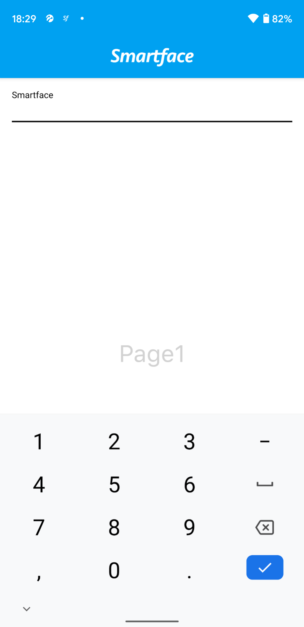
Keyboard Types
API Reference: https://ref.smartface.io/#!/api/UI.KeyboardType
To customize your keyboard experience,
import KeyboardType from "@smartface/native/ui/keyboardtype";
// TextBox
this.tbLogin.keyboardType = KeyboardType.NUMBER;
// MaterialTextBox
this.mtbLogin.options = {
  hint: "Smartface",
};
this.mtbLogin.materialTextBox.keyboardType = KeyboardType.NUMBER;
On Android, you can have more predefined types. To check them out, refer here.
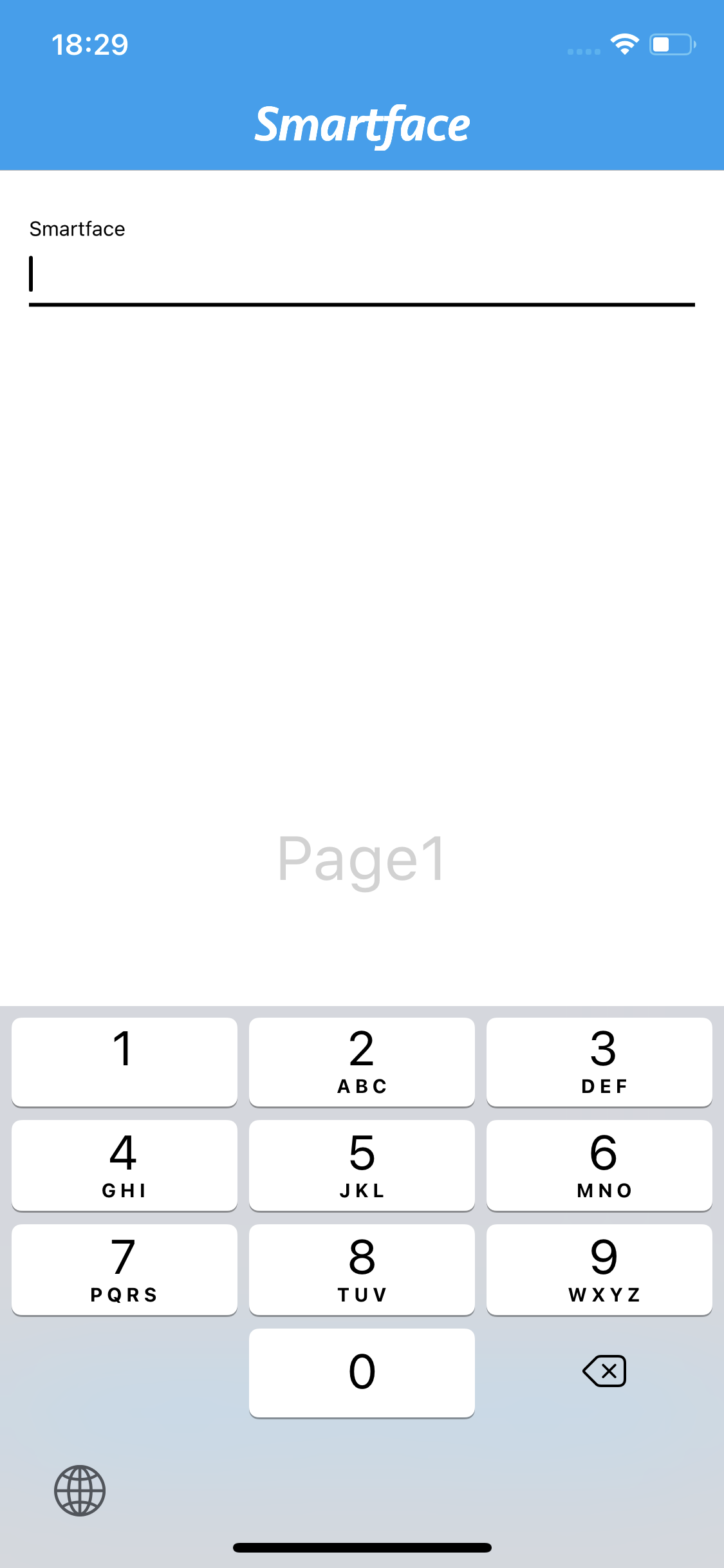
Keep in mind that on Number keyboard, iOS doesn't have ActionButton within the keyboard. Head over to KeyboardLayout section of this document to handle navigation better.
Keyboard Appearance
API Reference: https://ref.smartface.io/#!/api/UI.KeyboardAppearance
You can change the theme of your keyboard programmatically on iOS.
import KeyboardAppearance from "@smartface/native/ui/keyboardappearance";
// TextBox
this.tbLogin.ios.keyboardAppearance = KeyboardAppearance.DARK;
// MaterialTextBox
this.mtbLogin.materialTextBox.ios.keyboardAppearance = KeyboardAppearance.DARK;
// Alternatively
this.mtbLogin.options = {
  hint: "Smartface",
  ios: {
    keyboardAppearance: KeyboardAppearance.DARK,
  },
};
This feature is iOS only. On Android, keyboard theme cannot be controlled by the application.
Keyboard Modes
API Reference: https://ref.smartface.io/interfaces/application.ApplicationAndroidProps.html#keyboardMode
This API is for Android only. For iOS, the OS will handle the keyboard management.
KeyboardMode is the way to tell the mobile phone which way to adjust UI with the keyboard. You can configure things like Virtual Keyboard always staying on top, bottom etc.
KeyboardMode is a global method. Setting the KeyboardMode will stay the same throught the project unless it is set to something else.
Therefore, if you want to have different KeyboardMode for a specific page, you should change the mode back to default when you leave the page.
For more information of how to do that, refer to the Page Life-Cycle Documentation
The default KeyboardMode for Smartface Applications is KeyboardAdjustPan.

Usage
Simply put this call under app.ts or constructor methods if you want want to have a global setting.
import Application from "@smartface/native/application";
Application.android.keyboardMode =
  Application.Android.KeyboardMode.AlwaysVisible;
AlwaysHidden
This will hide the keyboard whenever the user changes activity.
AlwaysVisible
This will make the keyboard visible until the input has lost focus(e.g. clicked outside of the textbox)
KeyboardAdjustNothing
This will make the keyboard override every view on their way and blocking the underlying UI elements.

KeyboardAdjustPan
Default behavior.
KeyboardAdjustResize
Allows the inner contents to be resized in a smart way(The OS will figure out what to shrink)
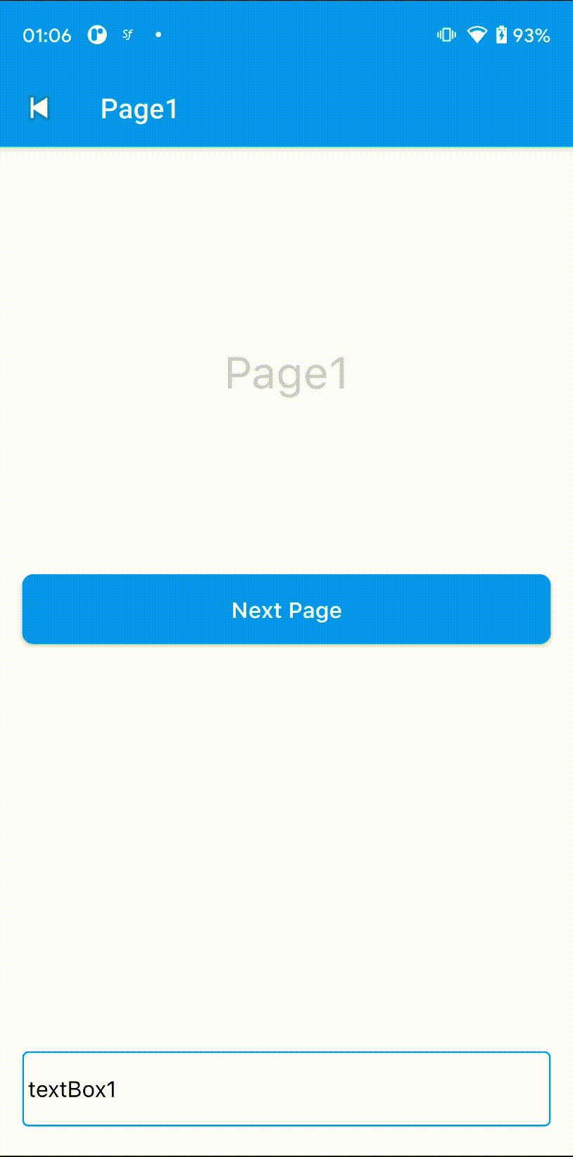
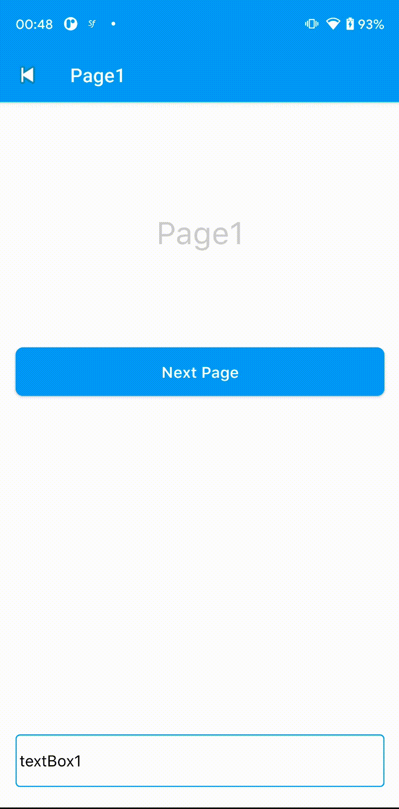
In the example, the Page1 Label was shrunk, which is wrong behavior. This happened because Spacer had a fixed height and the Label above has a FlexGrow assigned. When both has given a FlexGrow, it will shrink both like below:
This mode will basically re-render the screen behaving like the Screen height is now total height minus keyboard height. Your page design should be applicable for this behavior.
KeyboardAdjustUnspecified
Setting this will let the OS to pick one of the methods above according to the contents on the screen. Using this is not recommended since it might act different than the desired output.
Hiding Keyboard on Page Transitions
By default, Android Keyboard will stay on the screen even during the page transitions like this
To change the behavior, there a a couple of things you can do:
- [Recommended] Calling HideKeyboard method on router.listen
- Calling HideKeyboard at onHide page event
- Calling HideKeyboard at touch events of the specifid UI elements
Simply add this to your routes/index.ts file
router.listen(() => {
  setTimeout(() => Application.hideKeyboard(), 300);
});
The result will look like this:
Navigating Between Text Fields
For Android, textbox navigation is usually handled by platform. However, if it fails, you can manually set your navigation by using onActionButtonPress method.
For iOS, you can add a custom flexLayout on top of the keyboard, to ease the input navigation.
KeyboardLayout
API Reference: https://ref.smartface.io/interfaces/textbox.TextBoxiOSProps.html#keyboardLayout
Utility Location: https://github.com/smartface/sf-component-keyboardlayout
To ease out the navigation in multiple textboxes, on iOS there is an utility called KeyboardLayout. It is included in the Smartface project by default.
Usage
- Page Code
- Page UI Code
import Page1Design from "generated/pages/page1";
import { Route, Router } from "@smartface/router";
import System from "@smartface/native/device/system";
import KeyboardType from "@smartface/native/ui/keyboardtype";
import KeyboardLayout from "@smartface/component-keyboardlayout";

//You should create new Page from UI-Editor and extend with it.
export default class Page1 extends Page1Design {
  constructor(private router?: Router, private route?: Route) {
    super({});
  }

  initMaterialTextBoxes() {
    const userNameType =
      System.OS === System.OSType.ANDROID
        ? KeyboardType.Android.TEXTPERSONNAME
        : KeyboardType.DEFAULT;
    this.mtbUsername.options = {
      hint: "Username",
    };
    this.mtbUsername.materialTextBox.keyboardType = userNameType;
    this.mtbEmail.options = {
      hint: "Email Address",
    };
    this.mtbEmail.materialTextBox.keyboardType = KeyboardType.EMAILADDRESS;
    this.mtbPin.options = {
      hint: "Pin Code",
    };
    this.mtbPin.materialTextBox.keyboardType = KeyboardType.NUMBER;
    const keyboardLayouts = KeyboardLayout.init([
      this.mtbUsername.materialTextBox,
      this.mtbEmail.materialTextBox,
      this.mtbPin.materialTextBox,
    ]);
  }

  onShow() {
    super.onShow();
  }

  onLoad() {
    super.onLoad();
    this.centerizeTheChildrenLayout();
    this.initMaterialTextBoxes();
  }
}
{
    "components": [
        {
            "className": ".sf-page",
            "id": "e891b86d",
            "initialized": true,
            "props": {
                "children": [
                    "42b807d1",
                    "b7d28cff",
                    "ee71-c9bc-30b5-6202",
                    "6b34-f2f3-19c9-85e7",
                    "442d-5bea-4baf-4959"
                ],
                "isRemovable": true,
                "name": "page1",
                "orientation": "PORTRAIT",
                "parent": null,
                "safeAreaEnabled": true
            },
            "type": "Page",
            "userProps": {
                "flexProps": {
                    "justifyContent": "FLEX_START",
                    "alignItems": "STRETCH"
                },
                "orientation": "PORTRAIT",
                "paddingBottom": 20,
                "paddingLeft": 16,
                "paddingRight": 16,
                "safeAreaEnabled": true
            },
            "version": "6.15.1"
        },
        {
            "className": ".sf-statusBar",
            "id": "42b807d1",
            "props": {
                "children": [],
                "isRemovable": false,
                "name": "statusBar",
                "parent": "e891b86d"
            },
            "type": "StatusBar",
            "userProps": {
                "visible": true
            }
        },
        {
            "className": ".sf-headerBar",
            "id": "b7d28cff",
            "props": {
                "children": [],
                "isRemovable": false,
                "name": "headerBar",
                "parent": "e891b86d",
                "title": "Page1"
            },
            "type": "HeaderBar",
            "userProps": {
                "title": "Page1",
                "visible": true
            }
        },
        {
            "className": ".flexLayout .materialTextBox-wrapper",
            "hiddenComponent": false,
            "id": "ee71-c9bc-30b5-6202",
            "initialized": false,
            "props": {
                "children": [],
                "name": "mtbUsername",
                "parent": "e891b86d",
                "usePageVariable": true
            },
            "source": {
                "page": "__library__",
                "type": "materialTextBox",
                "id": "574a-10da-b765-48e5"
            },
            "type": "FlexLayout",
            "userProps": {
                "flex": {
                    "positionType": 0
                },
                "flexProps": {
                    "positionType": "RELATIVE"
                },
                "left": 0,
                "testId": "CVEVkbtyf",
                "top": 0,
                "usePageVariable": true
            }
        },
        {
            "className": ".flexLayout .materialTextBox-wrapper",
            "hiddenComponent": false,
            "id": "6b34-f2f3-19c9-85e7",
            "initialized": false,
            "props": {
                "children": [],
                "name": "mtbEmail",
                "parent": "e891b86d",
                "usePageVariable": true
            },
            "source": {
                "page": "__library__",
                "type": "materialTextBox",
                "id": "574a-10da-b765-48e5"
            },
            "type": "FlexLayout",
            "userProps": {
                "flex": {
                    "positionType": 0
                },
                "flexProps": {
                    "positionType": "RELATIVE"
                },
                "left": 0,
                "testId": "X-wG8LqxK",
                "top": 0,
                "usePageVariable": true
            }
        },
        {
            "className": ".flexLayout .materialTextBox-wrapper",
            "hiddenComponent": false,
            "id": "442d-5bea-4baf-4959",
            "initialized": false,
            "props": {
                "children": [],
                "name": "mtbPin",
                "parent": "e891b86d",
                "usePageVariable": true
            },
            "source": {
                "page": "__library__",
                "type": "materialTextBox",
                "id": "574a-10da-b765-48e5"
            },
            "type": "FlexLayout",
            "userProps": {
                "flex": {
                    "positionType": 0
                },
                "flexProps": {
                    "positionType": "RELATIVE"
                },
                "left": 0,
                "testId": "NBR4Oxoep",
                "top": 0,
                "usePageVariable": true
            }
        }
    ]
}
By default, KeyboardLayout will have:
- Down button to navigate to one textbox below
- Up button to navigate to one textbox above
- Done button to close the keyboard
You can change those behavior by using keyboardLayouts array. The layout object will be returned ordered like it was passed on init method.
You can combine this feature with inputView on iOS to have picker and done button above it.
Changing the KeyboardLayout Style
KeyboardLayout style files will be located in themes/baseTheme/styles/KeyboardLayout.json by default. You should copy this file and paste into your theme folders. If you have dark theme support, you should also paste the file and edit the values accordingly in both folder. More info is located at: