Button
API Reference: UI.Button
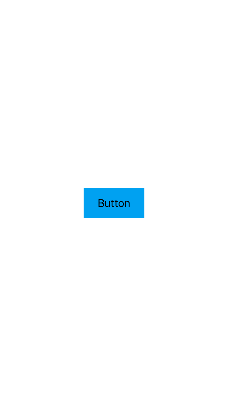
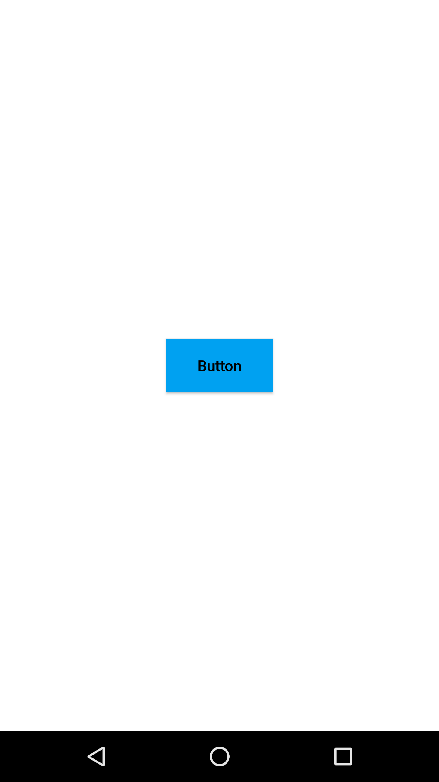
Button represents a clickable object on the screen. A button instance consists of a text or an icon (or both).
The components in the example are added from the code for better showcase purposes. To learn more about the subject you can refer to:
Adding Component From CodeAs a best practice, Smartface recommends using the WYSIWYG editor in order to add components and styles to your page or library. To learn how to use UI Editor better, please refer to this documentation
UI Editor Basicsimport PageSampleDesign from "generated/pages/pageSample";
import FlexLayout from "@smartface/native/ui/flexlayout";
import Application from "@smartface/native/application";
import System from "@smartface/native/device/system";
import Button from "@smartface/native/ui/button";
import { withDismissAndBackButton } from "@smartface/mixins";
import { Route, Router } from "@smartface/router";
import { styleableComponentMixin } from "@smartface/styling-context";
class StyleableButton extends styleableComponentMixin(Button) {}
//You should create new Page from UI-Editor and extend with it.
export default class Sample extends withDismissAndBackButton(PageSampleDesign) {
myButton: StyleableButton;
constructor(private router?: Router, private route?: Route) {
super({});
}
// The page design has been made from the code for better
// showcase purposes. As a best practice, remove this and
// use WYSIWYG editor to style your pages.
centerizeTheChildrenLayout() {
this.dispatch({
type: "updateUserStyle",
userStyle: {
flexProps: {
flexDirection: "ROW",
justifyContent: "CENTER",
alignItems: "CENTER",
},
},
});
}
onShow() {
super.onShow();
const { headerBar } =
System.OS === System.OSType.ANDROID ? this : this.parentController;
Application.statusBar.visible = true;
headerBar.visible = true;
}
onLoad() {
super.onLoad();
this.centerizeTheChildrenLayout();
this.myButton = new StyleableButton({
text: "Button",
onPress: function () {
console.log("Button pressed");
},
});
this.addChild(this.myButton, "myButton", ".sf-button", {
width: 100,
height: 50,
textColor: "#000000",
backgroundColor: "#00A1F1",
});
}
}
In a column-flexlayout : If no height and flexgrow set for a label object, it automatically resizes according to text content.
In a row-flexlayout : If no width and flexgrow set for a label object, it automatically resizes according to text content.
How to place view over button?
On android, default elevation value of button is bigger than 0, but not others. Also, elevation value is different on pressed state and on normal state. To place view over button, you have to change zIndex after Android Lollipop.
The components in the example are added from the code for better showcase purposes. To learn more about the subject you can refer to:
Adding Component From CodeAs a best practice, Smartface recommends using the WYSIWYG editor in order to add components and styles to your page or library. To learn how to use UI Editor better, please refer to this documentation
UI Editor Basicsimport PageSampleDesign from "generated/pages/pageSample";
import FlexLayout from "@smartface/native/ui/flexlayout";
import Application from "@smartface/native/application";
import System from "@smartface/native/device/system";
import Button from "@smartface/native/ui/button";
import ActivityIndicator from "@smartface/native/ui/activityindicator";
import { withDismissAndBackButton } from "@smartface/mixins";
import { Route, Router } from "@smartface/router";
import { styleableComponentMixin } from "@smartface/styling-context";
class StyleableActivityIndicator extends styleableComponentMixin(
ActivityIndicator
) {}
class StyleableButton extends styleableComponentMixin(Button) {}
//You should create new Page from UI-Editor and extend with it.
export default class Sample extends withDismissAndBackButton(PageSampleDesign) {
myButton: StyleableButton;
myActivityIndicator: StyleableActivityIndicator;
constructor() {
super({});
}
// The page design has been made from the code for better
// showcase purposes. As a best practice, remove this and
// use WYSIWYG editor to style your pages.
centerizeTheChildrenLayout() {
this.dispatch({
type: "updateUserStyle",
userStyle: {
flexProps: {
flexDirection: "ROW",
justifyContent: "CENTER",
alignItems: "CENTER",
},
},
});
}
onShow() {
super.onShow();
const { headerBar } =
System.OS === System.OSType.ANDROID ? this : this.parentController;
Application.statusBar.visible = false;
headerBar.visible = false;
}
onLoad() {
super.onLoad();
this.centerizeTheChildrenLayout();
this.myActivityIndicator = new StyleableActivityIndicator();
this.myButton = new StyleableButton({
text: "Press me!",
onPress: (): void => {
this.myActivityIndicator.android.zIndex =
this.myButton.android.zIndex + 1;
},
});
this.addChild(this.myButton, "myButton", ".sf-button", {
width: 100,
height: 50,
textColor: "#000000",
backgroundColor: "#00A1F1",
});
this.addChild(
this.myActivityIndicator,
"myActivityIndicator",
".sf-activityIndicator",
{
width: 42,
height: 42,
flexProps: {
positionType: "ABSOLUTE",
},
color: "#808080",
}
);
}
}
iOS Issue
The Border and Shadow properties cannot be used together. If both properties are utilized, the border will not be visible.