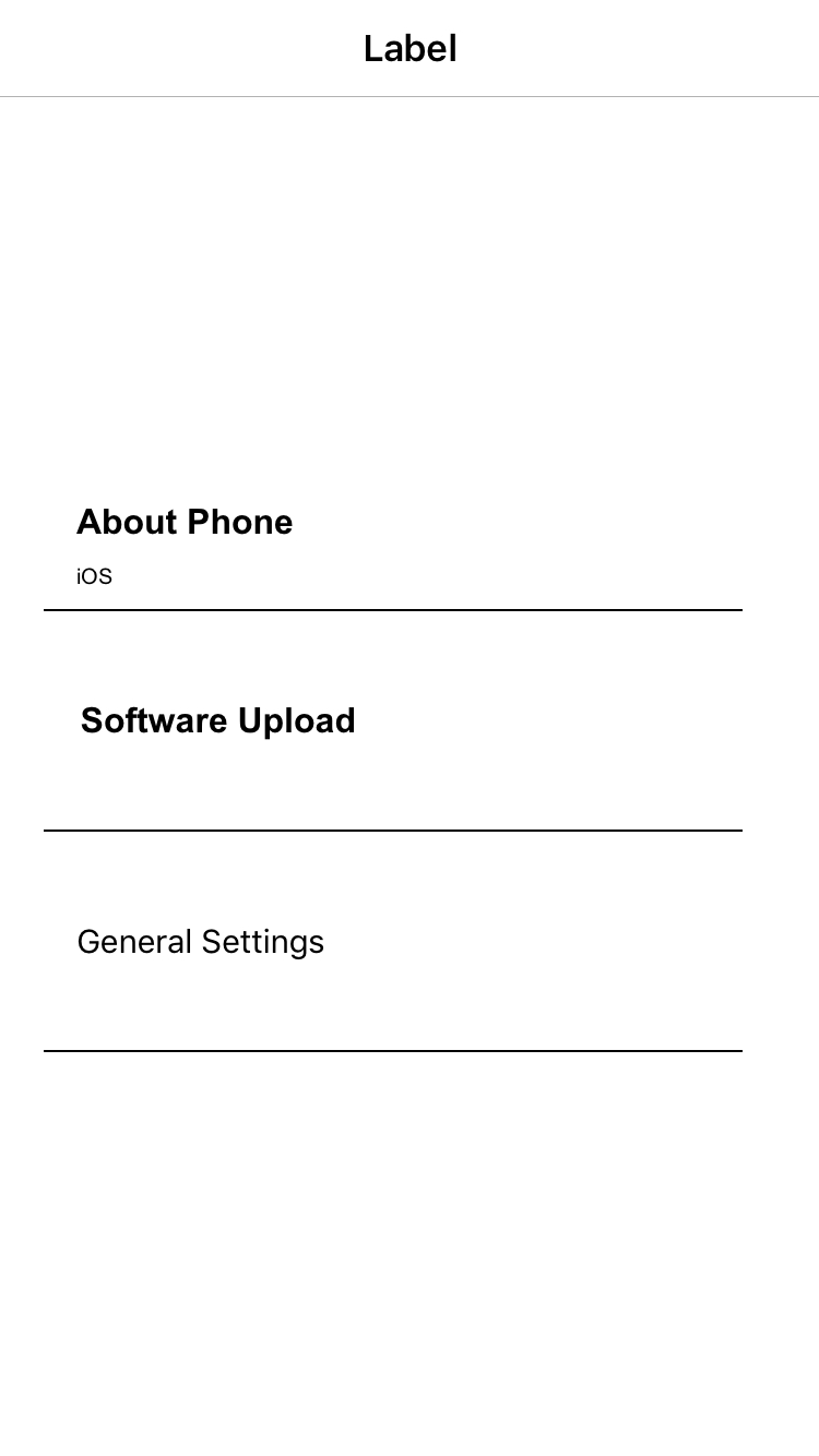
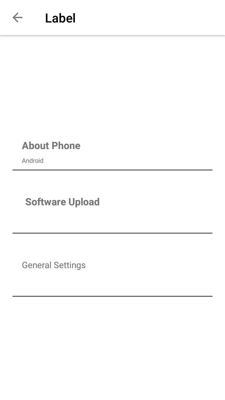
Label
API Reference: UI.Label
Label is a view that displays read-only text on the screen.
The components in the example are added from the code for better showcase purposes. To learn more about the subject you can refer to:
Adding Component From CodeAs a best practice, Smartface recommends using the WYSIWYG editor in order to add components and styles to your page or library. To learn how to use UI Editor better, please refer to this documentation
UI Editor Basicsimport PageSampleDesign from "generated/pages/pageSample";
import Application from "@smartface/native/application";
import ImageView from "@smartface/native/ui/imageview";
import { Route, Router } from "@smartface/router";
import {
styleableContainerComponentMixin,
styleableComponentMixin,
} from "@smartface/styling-context";
import System from "@smartface/native/device/system";
import FlexLayout from "@smartface/native/ui/flexlayout";
import Label from "@smartface/native/ui/label";
class StyleableImageView extends styleableComponentMixin(ImageView) {}
class StyleableLabel extends styleableComponentMixin(Label) {}
class StyleableFlexLayout extends styleableContainerComponentMixin(
FlexLayout
) {}
//You should create new Page from UI-Editor and extend with it.
export default class Sample extends PageSampleDesign {
myLabel: StyleableLabel;
myLabel1: StyleableLabel;
myFlexLayout: StyleableFlexLayout;
textLabel: StyleableLabel;
myFlexLayout1: StyleableFlexLayout;
myLabel2: StyleableLabel;
myFlexLayout2: StyleableFlexLayout;
constructor(private router?: Router, private route?: Route) {
super({});
}
// The page design has been made from the code for better
// showcase purposes. As a best practice, remove this and
// use WYSIWYG editor to style your pages.
centerizeTheChildrenLayout() {
this.dispatch({
type: "updateUserStyle",
userStyle: {
flexProps: {
flexDirection: "ROW",
justifyContent: "CENTER",
alignItems: "CENTER",
},
},
});
}
onShow() {
super.onShow();
const { headerBar } = this;
Application.statusBar.visible = false;
headerBar.visible = false;
}
onLoad() {
super.onLoad();
this.centerizeTheChildrenLayout();
const { headerBar } = this;
headerBar.title = "Label";
headerBar.borderVisibility = true;
this.myLabel = new StyleableLabel({
text: "About Phone",
});
this.myLabel1 = new StyleableLabel({
text: System.OS,
});
this.textLabel = new StyleableLabel({
text: "Software Upload",
});
this.textLabel.onTouch = () => {
alert("Upload Operation System");
};
this.myLabel2 = new StyleableLabel({
text: "General Settings",
});
let flexLayoutOptions = {
backgroundColor: "#000000",
height: 1,
width: 320,
marginLeft: 20,
textAlignment: "MIDCENTER",
};
this.myFlexLayout = new StyleableFlexLayout();
this.myFlexLayout1 = new StyleableFlexLayout();
this.myFlexLayout2 = new StyleableFlexLayout();
this.addChild(this.myLabel, "myLabel", ".sf-label", {
width: 320,
height: 20,
textAlignment: "MIDLEFT",
left: 35,
font: {
size: 16,
bold: true,
italic: false,
family: "Arial",
},
textColor: "#000000",
});
this.addChild(this.myLabel1, "myLabel1", ".sf-label", {
width: 320,
height: 30,
left: 35,
textAlignment: "MIDLEFT",
font: {
size: 10,
bold: false,
italic: false,
family: "Arial",
},
textColor: "#000000",
});
this.addChild(
this.myFlexLayout,
"myFlexLayout",
".sf-flexLayout",
flexLayoutOptions
);
this.addChild(this.textLabel, "textLabel", ".sf-label", {
width: 320,
height: 100,
textAlignment: "MIDCENTER",
textColor: "#000000",
});
this.addChild(
this.myFlexLayout1,
"myFlexLayout1",
".sf-flexLayout",
flexLayoutOptions
);
this.addChild(this.myLabel2, "myLabel2", ".sf-label", {
width: 320,
height: 100,
left: 35,
multiline: true,
textAlignment: "MIDLEFT",
textColor: "#000000",
});
this.addChild(
this.myFlexLayout2,
"myFlexLayout2",
".sf-flexLayout",
flexLayoutOptions
);
this.dispatch({
type: "updateUserStyle",
userStyle: {
flexProps: {
justifyContent: "CENTER",
flexDirection: "COLUMN",
},
},
});
}
}


In a column-flexlayout : If no height and flexgrow set for a label object, it automatically resizes according to text content.
In a row-flexlayout : If no width and flexgrow set for a label object, it automatically resizes according to text content.
Label vs TextView
- Label is a light-weight version of TextView
- Label performs better than TextView. This is mostly observable within ListView
- Label does not support AttributedText
- Label does not support all of TextAlignment. Only MIDLEFT, MIDCENTER, MIDRIGHT is supported.
- Label supports multi-line, but scrolling of the lines are not supported
iOS Issue
The Border and Shadow properties cannot be used together. If both properties are utilized, the border will not be visible.