DatePicker
API Reference: UI.DatePicker
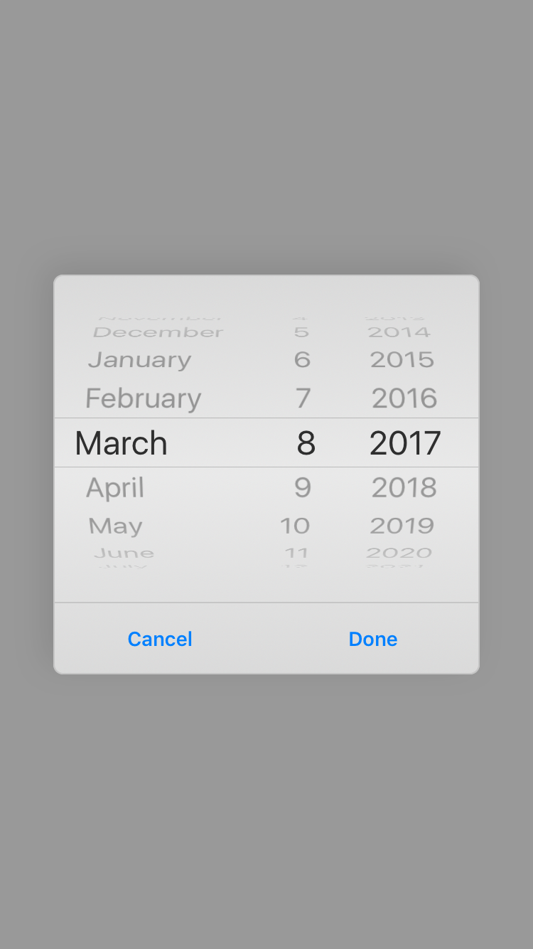
Basic DatePicker
DatePicker is a dialog from which the user can select a date.
import PageSampleDesign from "generated/pages/pageSample";
import Application from "@smartface/native/application";
import System from "@smartface/native/device/system";
import DatePicker from "@smartface/native/ui/datepicker";
import { Route, Router } from '@smartface/router';
import { withDismissAndBackButton } from '@smartface/mixins';

//You should create new Page from UI-Editor and extend with it.
export default class AlertViewSample extends withDismissAndBackButton(PageSampleDesign) {
  myDatePicker: DatePicker;

  constructor(private router?: Router, private route?: Route) {
    super({});
  }

  // The page design has been made from the code for better
  // showcase purposes. As a best practice, remove this and
  // use WYSIWYG editor to style your pages.
  centerizeTheChildrenLayout() {
      this.dispatch({
          type: "updateUserStyle",
          userStyle: {
              flexProps: {
                flexDirection: 'ROW',
                justifyContent: 'CENTER',
                alignItems: 'CENTER'
              }
          }
      })
  }

  onShow() {
    super.onShow();
    const { headerBar } =
      System.OS === System.OSType.ANDROID ? this : this.parentController;
    Application.statusBar.visible = false;
    headerBar.visible = false;

    this.myDatePicker.show();
  }

  onLoad() {
    super.onLoad();
    this.centerizeTheChildrenLayout();

    this.myDatePicker = new DatePicker();
    this.myDatePicker.onDateSelected = function (date) {
      alert(
        "Year: " +
          date.getFullYear() +
          " Month: " +
          date.getMonth() +
          " Day" +
          date.getDate()
      );
    };
  }
}
caution
DatePicker cannot be shown before the current page's onShow() event is triggered.
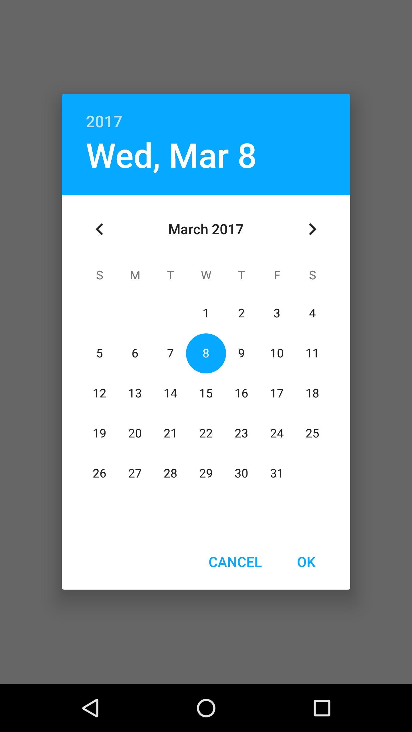
Customized DatePicker
DatePicker can be customizable on both platform.
Setting iOS Properties
Properties of DatePicker only works with show method. Must set before show method.
import PageSampleDesign from "generated/pages/pageSample";
import FlexLayout from "@smartface/native/ui/flexlayout";
import Application from "@smartface/native/application";
import System from "@smartface/native/device/system";
import DatePicker from "@smartface/native/ui/datepicker";
import Color from "@smartface/native/ui/color";
import Font from "@smartface/native/ui/font";
import { Route, Router } from '@smartface/router';
import { withDismissAndBackButton } from '@smartface/mixins';

//You should create new Page from UI-Editor and extend with it.
export default class Sample extends withDismissAndBackButton(PageSampleDesign) {
  myDatePicker: DatePicker;

  constructor(private router?: Router, private route?: Route) {
    super({});
  }

  // The page design has been made from the code for better
  // showcase purposes. As a best practice, remove this and
  // use WYSIWYG editor to style your pages.
  centerizeTheChildrenLayout() {
      this.dispatch({
          type: "updateUserStyle",
          userStyle: {
              flexProps: {
                flexDirection: 'ROW',
                justifyContent: 'CENTER',
                alignItems: 'CENTER'
              }
          }
      })
  }

  onShow() {
    super.onShow();
    const { headerBar } =
      System.OS === System.OSType.ANDROID ? this : this.parentController;
    Application.statusBar.visible = false;
    headerBar.visible = false;

    this.myDatePicker.show();
  }

  onLoad() {
    super.onLoad();
    this.centerizeTheChildrenLayout();

    this.myDatePicker = new DatePicker({
      android: {
        style: DatePicker.Android.Style.DEFAULT_DARK,
      },
    });

    this.myDatePicker.ios.title = "Smartface";
    this.myDatePicker.ios.titleColor = Color.BLACK;
    this.myDatePicker.ios.okColor = Color.BLACK;
    this.myDatePicker.ios.cancelColor = Color.RED;
    this.myDatePicker.ios.cancelHighlightedColor = Color.create(79, 84, 88, 100);
    this.myDatePicker.ios.okHighlightedColor = Color.BLUE;
    this.myDatePicker.ios.datePickerMode =
      DatePicker.iOS.DatePickerMode.DATEANDTIME;
    this.myDatePicker.ios.titleFont = Font.create("Arial", 20, Font.BOLD_ITALIC);
    this.myDatePicker.ios.cancelFont = Font.create("Arial", 16, Font.BOLD_ITALIC);
    this.myDatePicker.ios.okFont = Font.create("Arial", 16, Font.BOLD_ITALIC);
    this.myDatePicker.onDateSelected = (date): void => {
      alert(
        "Year: " +
          date.getFullYear() +
          " Month: " +
          date.getMonth() +
          " Day:" +
          date.getDate()
      );
    };
    this.myDatePicker.onCancelled = (): void => {
      alert("Cancelled");
    };
  }
}