Icon
Icon component is used to display an icon.
Icons are used to represent actions, objects, and concepts. They are used to communicate the purpose of a button, tool, or action. Icons are also used to create visual hierarchies and draw attention to important content.
Icon component is shows an icon with a supported icon-font library, for example, Font Awesome, Material Design Icons, and Ionicons.
Usage
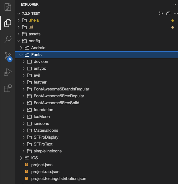
If you want to use a custom icon, you can place the font that support the icon in the config/fonts folder. Then you can use the icon by selecting the icon name in the glyph field.