Reusable Components
Creating and using reusable components are the key element between a successful project and being unable to minimize the effort through the lifetime of project. You can find examples of reusable component even outside of the Software World. Fields like Sales, Animation, Graphics Design or even Film Industry create and re-use some of their actions to ease their workflow.
When You Will Need Components
- When you are designing ListViewItem and GridViewItem. These views use RecyclerView, therefore it is required to use reusable components.
- When you create SliderDrawer. Since it is a global view and acts as a main navigator through the project, creating a component for each section would help to ease out the process.
- When you have a design pattern like Cards, Profiles or any potentially repeatable UI/UX action, it is strongly recommended to create a component, then to create the same thing over and over again.
If your design requires to have a different color than default palette, make sure to define them on a class rather than creating a separate component.
More info about using UI Editor and Classes can be found below:
Using Style and ClassesHow To Create and Use Components
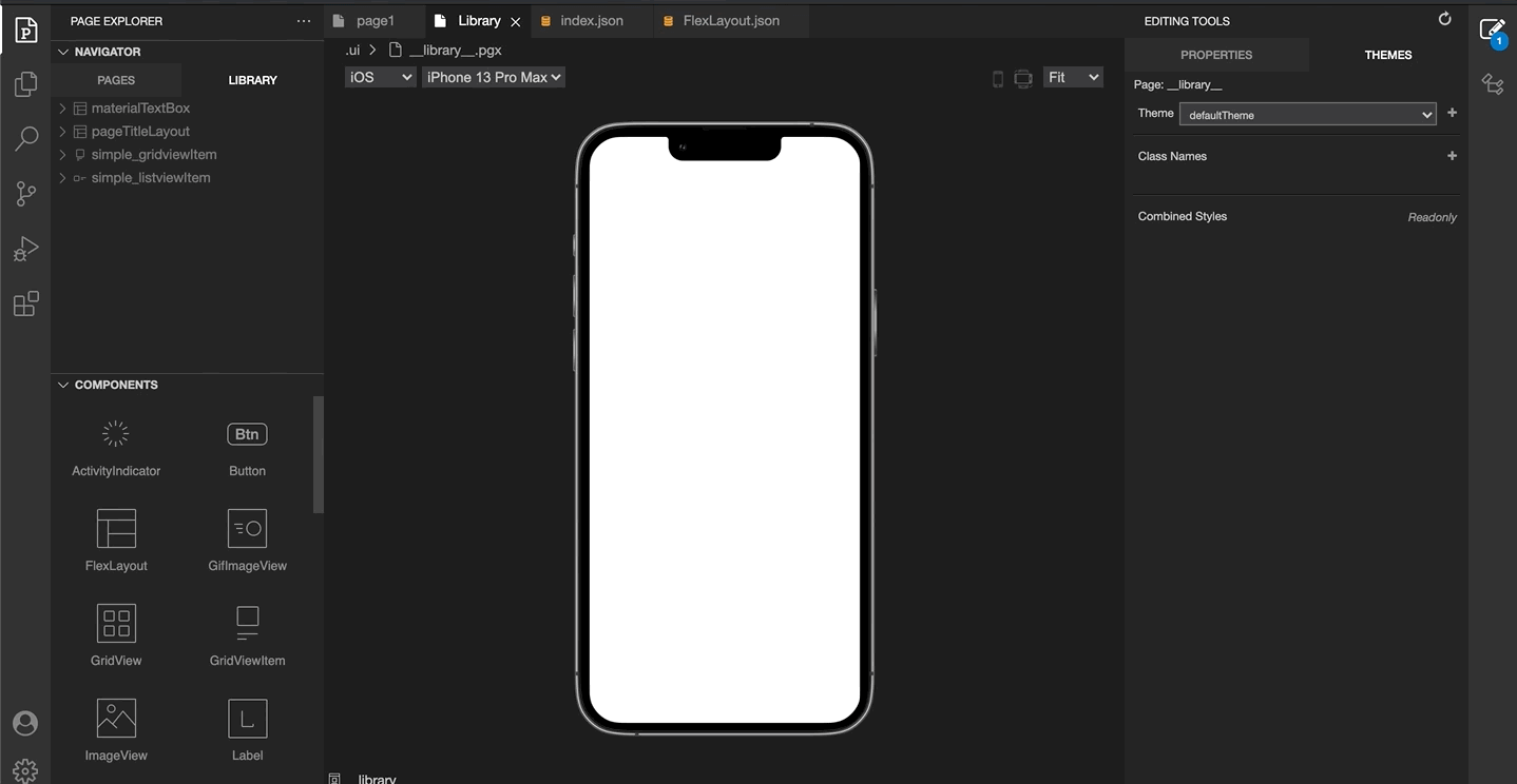
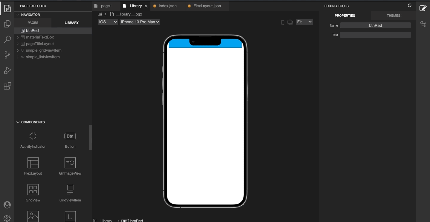
Simply head into the Library tab on the Smartface WYSIWYG editor.
Create And Use Components from UI Editor
- From the Project Explorer, open the Library pane.
- Drag a FlexLayout from the toolbox to the Library. This layout represents your first library component.
- Double click on the FlexLayout that you just moved. This will enable you to insert other components inside your layout.
- Drag a Button inside of your layout, then save your changes.
- There you have it! You can use this library component across all of your pages.
- Now drag flexLayout1 (which is your library component), from the library pane to your page.
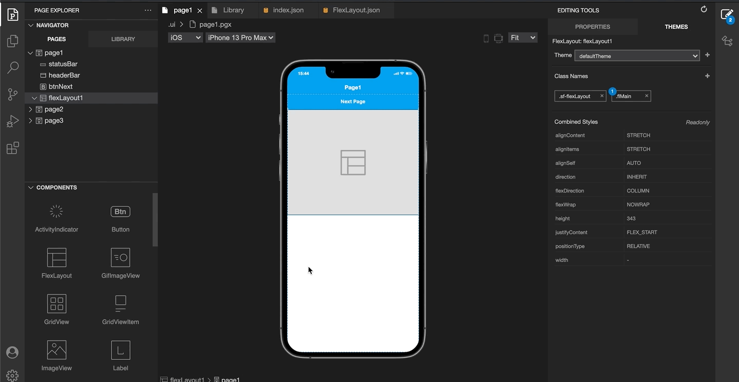
- Don't forget that a library component update will be reflected to all pages using this component. This is the primary advantage of using a library.
- As an example, change the background color of your button of flexLayout1
Adding Code to the Created Component
Only using UI will not be enough if you want to set things programmatically or want anything dynamic. In that case, you should wrap your code and logic inside of the component file. When you create a component from Smartface UI Editor, Smartface UI Editor will create a file with the component name for you.
This is how the default component page looks like:
import FlexLayout1Design from "generated/my-components/FlexLayout1";

export default class FlexLayout1 extends FlexLayout1Design {
  pageName?: string | undefined;
  constructor(props?: any, pageName?: string) {
    // Initalizes super class for this scope
    super(props);
    this.pageName = pageName;
    this.button1.text = "Smartace"; // This was added from the Smartface UI Editor
  }
}
You can add functions, properties or anything you wish inside of the component.
Using Style and Classes for Library Components
The library components are no different when it comes to styling. You can use same methods as you would on normal classes.
If you create a class name matching with the component name itself, a new style file will be created, helping with the structure of the theme folder. If not, the changes will be written in common.json
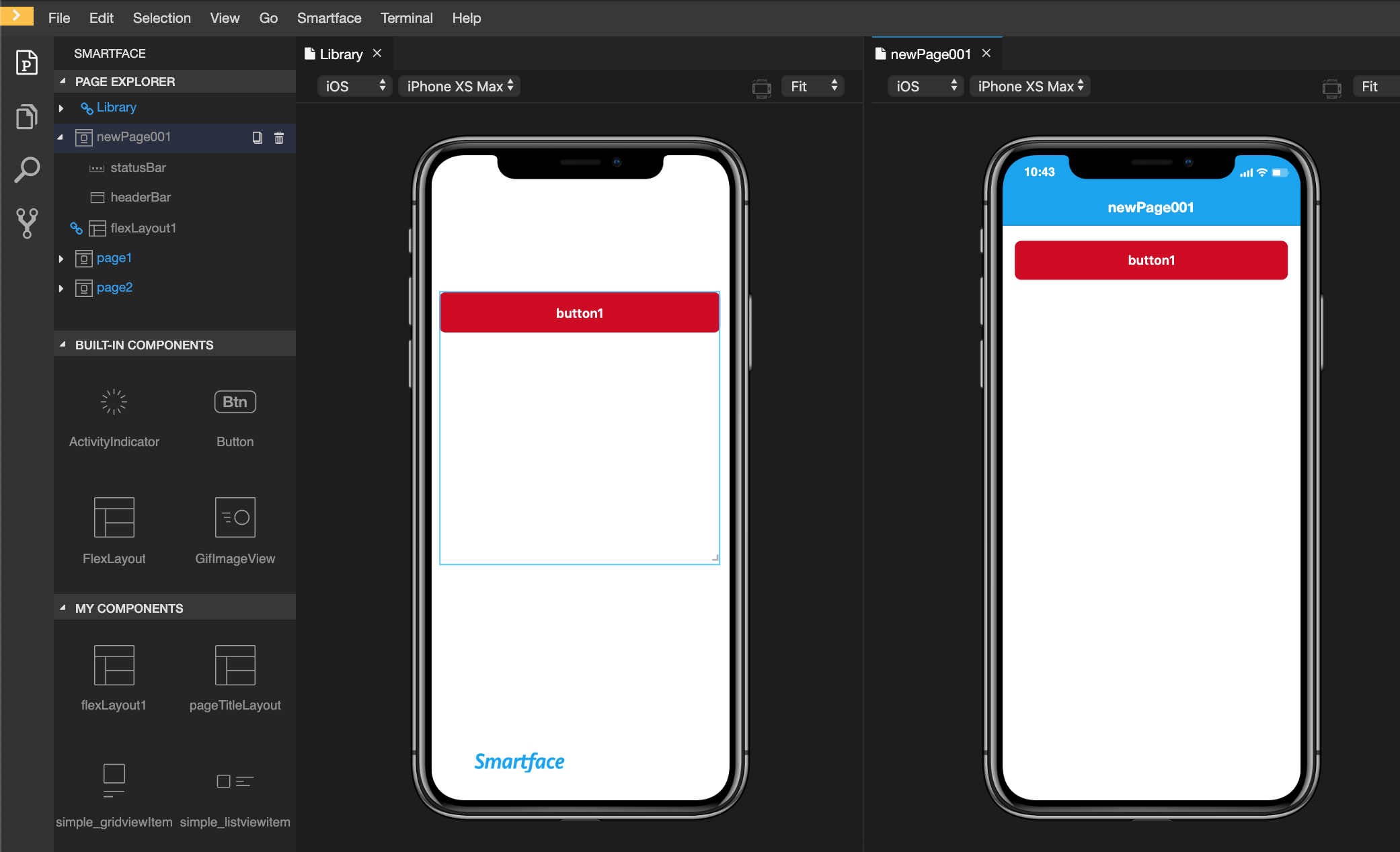
On Library, it will behave like a component blueprint. Therefore, the user properties which are applied directly to the component WILL NOT be applied to the implemented page code. For example, let's change width and height of our component after we have put it in our page:
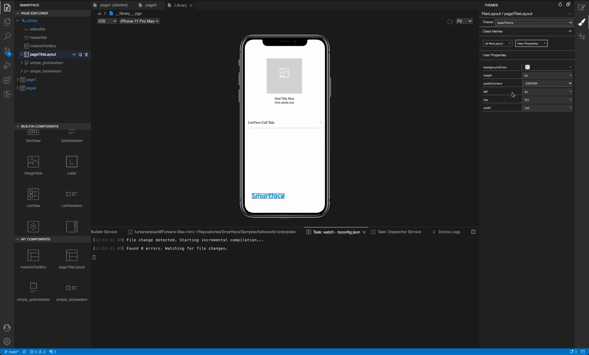
As it can be seen from the video, the userprops changes are not applied to our implemented code. This will help you to showcase your responsive components which normally doesn't have width/height properties.
Same rule goes for classes itself. If you assign a new class to your library component, the changes will not be applied to the other instances.
Create and use Components From Code
This method is not recommended unless you have a strictly specific action to take.
If you want to create a component in runtime and add it to your page, you should emulate the same steps that UI Editor does for you.
You need to create the file like scripts/components/FlexLayout.ts to keep your code clean.
- Component Code
- Page Code
import FlexLayout from "@smartface/native/ui/flexlayout";
import Button from "@smartface/native/ui/button";
import { styleableContainerComponentMixin } from "@smartface/styling-context";
/**
 * Since this file wasn't created from Smartface UI Editor,
 * you should manually extend the Smartface Component yourself.
 */

class StyleableButton extends styleableComponentMixin(Button) {}

export default class FlexLayout1 extends FlexLayout {
  pageName?: string | undefined;
  button1: StyleableButton; // You can set this to private if you don't want it to be accssed.
  constructor(props?: any, pageName?: string) {
    super(props);
    this.pageName = pageName;
    this.top = 30; // Direct assignment is fine because this is constructor of the component.
    this.height = 20;
    // Add another view like Button or whatever you want to.
    this.button1 = new StyleableButton();
    this.addChild(this.button1, "button1", ".sf-button");
  }

  changeStyle() {
    // 3rd parameter is optional and is used to give class name
    // 4th parameter is optional and is used to give user properties
    this.addChild(myFlexlayout, "myFlexlayout", ".sf-flexlayout", {
      top: 60,
      height: 10,
      flexProps: {
        alignSelf: "CENTER",
        positionType: "ABSOLUTE",
      },
    });
  }
}
import Page1Design from "generated/pages/page1";
import FlexLayout1 from "components/FlexLayout1";
import { Route, Router } from "@smartface/router";
import { styleableContainerComponentMixin } from "@smartface/styling-context";

class StyleableFlexLayout1 extends styleableContainerComponentMixin(
  FlexLayout1
) {}

export default class Page1 extends Page1Design {
  flexLayout1: StyleableFlexLayout1;
  constructor(private router?: Router, private route?: Route) {
    super({});
  }

  initFlexLayout() {
    const flexlayout1 = new StyleableFlexLayout1();

    // 2nd parameter is to assign an ID for Context
    // 3rd parameter is optional and is used to give class name
    this.addChild(flexlayout1, "flexlayout1", ".sf-flexlayout");
    this.flexLayout1 = flexLayout1;
    this.flexLayout1.button1.text = "Smartface";
  }

  onShow() {
    super.onShow();
    this.flexLayout1.changeStyle(); // Change style on runtime
  }

  onLoad() {
    super.OnLoad();
    this.initFlexLayout();
  }
}
To learn more about what dispatch and other parameters are, refer to the document below:
Using Style and ClassesTo learn more about what onLoad or onShow means, refer to the document below:
Page Life-CycleIf you are going to add another view inside of your component, you should do it in component file itself, not the page file.
Tips & Tricks about Reusable Components
One of the main purpose of creating reusable component is to use it inside of ListView or GridView. Kindly refer to the document below to learn more:
Using ListView or GridView with UI EditorOn Smartface, all UI components inherit the properties one of the following parent components:
View Component
If a component is derived from View, it means the component cannot have child components. E.g. a Button is a component which inherits properties of View, therefore you cannot add child component inside of a Button
ViewGroup Component
If a component is derived from ViewGroup, it means the component is a container component and can receive child component. E.g. a FlexLayout can have child components inside of it.
ListViewItem and GridViewItem are components which are derived from ViewGroup, however they are components with a different purpose, therefore they are partially exempt from this practice. Continue reading to learn the best practice on how to use them.
How to Specify Where a Component Belongs
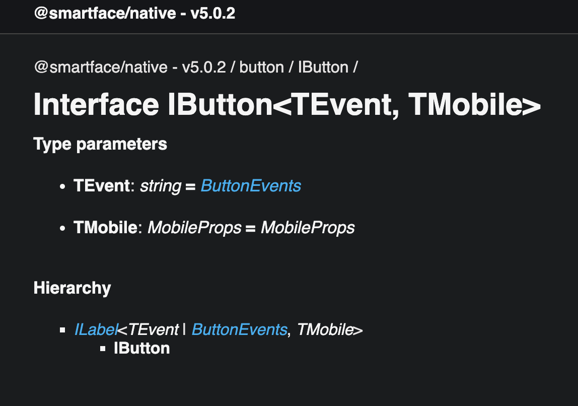
Method 1
Check the hierarchy specified at API Documentation of the component. It is located on the right side of the component page. Example for button:
Method 2
You can also specify which class the UI component inherits by using the power of Typescript.
- Type the name of the desired component to any scope
- Let the Typescript Language Features auto-import the class for you
- Hover the component by pressing down
ctrlcmd(ctrl on Windows/Linux, cmd on Mac) - The declaration of the component will be shown.
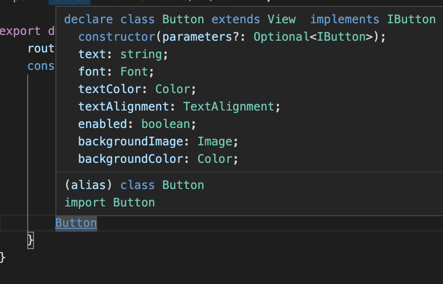
Alternatively, you can directly go into the module in node_modules and directly delve into the d.ts of the component itself.
Using View Based Components as Library Component
When a component is created & reused, the newly reused component will share all of the state the library component has at that time. The parent component will be duplicated and child components will share the same reference as the Library Component.
Therefore, when the developer wants to change something in the component, the following changes will not be applied to the parent of the reused component.
- User properties of the parent component
- Classes of the parent component (the changes in the class itself will be applied)
Every change which are made in the child components will be applied to every reused component.
Example Case
Let's say we need to have a Button red colored and rounded. It should also have an extended functionality(e.g prompting a dialog on press)
❌ Don't
Creating a View based Class like this is a bad practice. As explained above, if you need to change about this library class, since the properties will be duplicated instead of being referenced, the other places which use this component will not receive the changes.
✅ Do
Wrap the component with a FlexLayout instead and use [FlexGrow](https://ref.smartface.io/interfaces/flexlayout.IFlexLayout.html#flexGrow to expand your component to your needs. This way, your changes on the Button will be applied seamlessly. You can also apply extra properties to the parent component if it is needed.
💭 If you Only Need to Change Styles
Simply create a class for your button and use them with normal button. For more information about classes, refer to the document below:
Using Style and ClassesNested Components
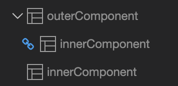
You can use library components inside other library components to maximize reusability.
Encapsulation of UI Component
You can encapsulate your UI component to make it more scalable.
With the below example, we have a component called Simple_gridviewItem. We encapsulate it into a class called Simple_gridviewItem. This way, we can reuse the component in other places.
Main purpose of encapsulation is to make your component more scalable and reusable.
Without Encapsulation
If you don't want to encapsulate your component, you can use the below example. But this is not recommended in most cases because it will make your component not reusable.
For example, if you change your Label color based on device, you will have to do it every time the component is used in other places.
  initGridView() {
    this.gridViewMain.onItemBind = (GridViewItem: SimpleGridviewItem, index) => {
      const { title, subTitle, image } = this.myDataSet[index];

      GridViewItem.lblTitle.text = title;
      GridViewItem.lblSubtitle.text = subTitle;
      if (System.OS === System.OSType.IOS) {
        GridViewItem.lblSubtitle.textColor = Color.RED;
      } else {
        GridViewItem.lblSubtitle.textColor = Color.BLUE;
      }
      GridViewItem.imgPreview.image = Image.createFromFile(image);
    };
  }
If you used encapsulation, you don't need to do it every time you use the component in other places.
import Image from "@smartface/native/ui/image";
import Simple_gridviewItemDesign from "generated/my-components/Simple_gridviewItem";

export default class Simple_gridviewItem extends Simple_gridviewItemDesign {
  pageName?: string | undefined;
  constructor(props?: any, pageName?: string) {
    // Initalizes super class for this scope
    super(props);
    this.pageName = pageName;
  }
  get gridTitle(): string {
    return this.lblTitle.text;
  }
  set gridTitle(value: string) {
    this.lblTitle.text = value;
  }
  get gridSubTitle(): string {
    return this.lblSubtitle.text;
  }
  set gridSubTitle(value: string) {
    this.lblSubtitle.text = value;
    this.setSubtitleColor();
  }
  get gridImage(): string | Image {
    return this.imgPreview.image;
  }
  set gridImage(value: string | Image) {
    if (value instanceof Image) {
      this.imgPreview.image = value;
    } else if (typeof value === "string") {
      this.imgPreview.image = Image.createFromFile(value);
    }
  }
  setSubtitleColor() {
    if (System.OS === System.OSType.IOS) {
      this.lblSubtitle.textColor = Color.RED;
    } else {
      this.lblSubtitle.textColor = Color.BLUE;
    }
  }
}
 initGridView() {
    this.gridViewMain.onItemBind = (GridViewItem: SimpleGridviewItem, index) => {
      const { title, subTitle, image } = this.myDataSet[index];
      GridViewItem.gridTitle = title;
      GridViewItem.gridSubTitle = subTitle;
      GridViewItem.gridImage = image;
    };
  }