Using Style and Classes
Just like in any webpage, a consistent mobile app needs a theming structure to help developers implement pages faster by reducing unnecessary overhead. It also helps designers to create a structural UI/UX to have a consistent experience in the app.
This document will focus on using class variables and overall importance of theming the application.
It is advised to check following documentation about how to update component layouts on runtime:
Changing UI Properties on RuntimeTheming Structure
Like in every framework or bare-bone css, Smartface has a theme structure to provide theming.
Refer to below doc for detailed information about separating styles in themes:
By default, there are 2 distinct themes, plus your additional themes on a Smartface application:
- defaultTheme
- This is a default theming for Smartface applications to run. When Smartface releases updates, the contents in the defaultTheme will be overwritten with version defaults. Therefore, you should not change anything in this folder.
- baseTheme
- This is a base theme which your application will be using. You should place your global styles in this folder like:
- Margin left-right
- Heights
- Helper styles like flexgrow ( relative and absolute )
- If your application will have dark theme support or different skin support for e.g. halloween or holidays, separating color classes with dimension classes are crucial.
- This is a base theme which your application will be using. You should place your global styles in this folder like:
- yourTheme
- As explained in Using Themes in Apps doc, you can create your own themes to make your styles dynamic and interchangeable.
- This theme should contain anything that falls under skin category like:
- Fonts
- Colors
- Variables ( which will be explained on different section )
- image names
You can create as much as different theme as you like. As long as you keep the same naming convention, switching themes will be a piece of cake!
As architect or project owner, your goal should be to hand over the extended theme to anyone without coding experience and they should be able to tweak with colors as much as they like to create different skins for your application. The developers should implement dimensional styles like width or height inside of baseTheme folder or a different theme which you have set.
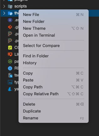
Create a New Theme
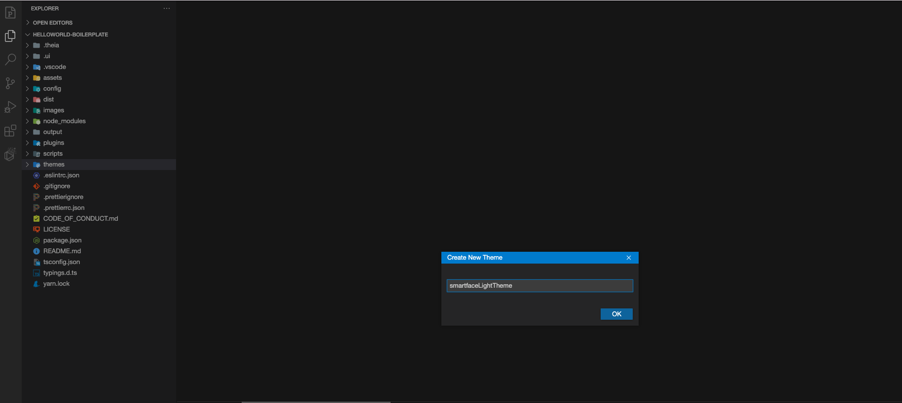
A Smartface Team consists of a few JSON files in a specific named folder. In order to create a new theme, simply right click to the themes folder in your project and click New Theme
Give it a name and click ok:
Your theme will be created successfully. You can now see it on the Smartface UI Editor.
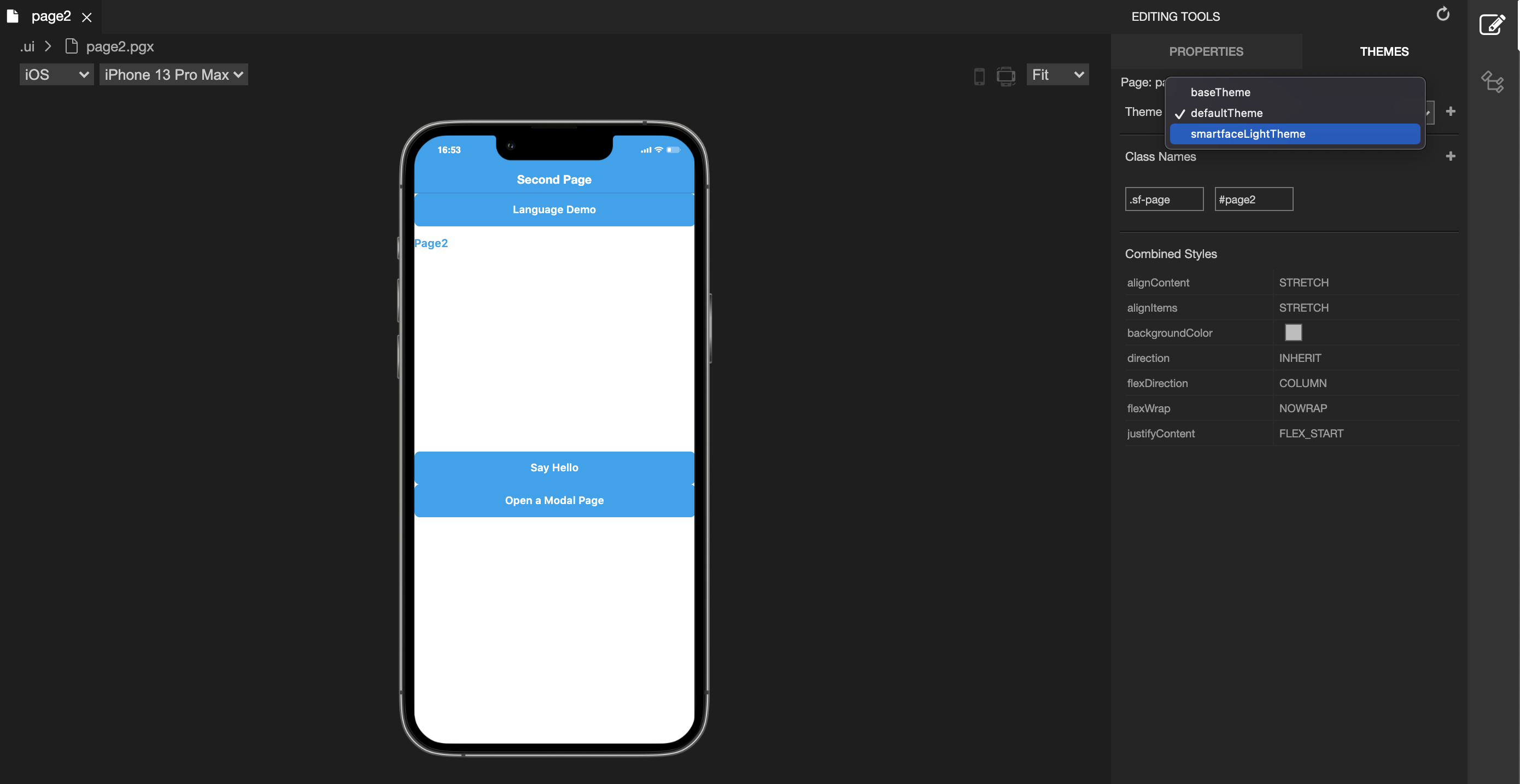
Changing Themes on Smartface UI Editor
After you have created a theme, you can start using it normally. In order to change your current theme to another theme:
- Open any Page or Component on Smartface UI Editor
- On Theme Panel, Select your desired theme
- Save your changes!
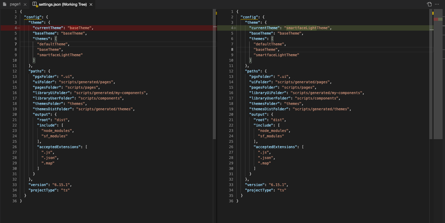
Changing a theme simply changes currentTheme value in the scripts/settings.json file.
Alternatively, you can manually write your theme there to change your theme without using Smartface UI editor.
Style Filing Structure
When you create a style on UI editor, it can have three different naming:
- By starting the name with
#, It creates a separate file.- This notation is commonly used to separate page styles like
#pgLoginon a different file. Use this when you are going to have a specific style for a page. Common examples are:- Aligning the dimensions of a specific element that only belongs to that page
- When re-using a style, the predefined style might not be enough for your needs. You can create a page specific style for that purpose
- This notation is commonly used to separate page styles like
- By starting the name with
.componentName, it creates a different file on components folder. Casing does not matter, but it is advised to use camel case for component names. - By typing anything that doesn't match any of your components names like
.smartface, it will create the style incommon.jsonfile. You should avoid that unless you are creating a global-wide style.
Purpose of common.json
Every theme folder will have its own common.json file. This file should only contain global theming like project-wide margin or height.
For example, the two classes below has a purpose of making the element full screen, in relative and absolute style. Since this doesn't have anything to do with theme, this can be considered as global-wide style and can be placed in common.json.
{
  ".flexGrow-relative": {
    "height": null,
    "width": null,
    "flexProps": {
      "flexGrow": 1
    }
  },
  ".flexGrow-absolute": {
    "top": 0,
    "bottom": 0,
    "left": 0,
    "right": 0,
    "width": null,
    "height": null,
    "flexProps": {
      "flexGrow": 1,
      "positionType": "ABSOLUTE"
    }
  }
}
To learn more about . and - notations, refer to:
When named incorrectly, your component themes will be written in common.json file.
In that case, simply create a new file on yourTheme/styles/components/yourcomponent.json and copy the code there.
This will help your styles to be more organized.
Determining the Style of Your App
Properties
Properties contain the element specific properties that you can set on the element without using any css classes.
More info can be found at this doc.
Dynamically assigning or removing classes
After you created and used your class, you might want to add another class to the component on runtime, instead of using theme class.
Let's recreate the above example with classes.
- Code
- Style
function hideWrapperLayout() {
  this.flexLayout.dispatch({
    type: "pushClassNames",
    classNames: ".layout-hidden",
  });
}

function showWrapperLayout() {
  this.flexLayout.dispatch({
    type: "pushClassNames",
    classNames: ".layout-shown",
  });
  // Alternate method
  this.flexLayout.dispatch({
    type: "removeClassName",
    className: ".layout-hidden", // Instead of pushing shown class, we removed hidden class
  });
}
{
    ".layout": {
        "&-shown": {
            "height": 300,
            "visible": true,
            "flexProps": {
                "positionType": "ABSOLUTE"
            }
        },
        "&-hidden": {
            "height": 0,
            "visible": false,
            "flexProps": {
                "positionType": "RELATIVE"
            }
        }
    }
}
More information can be found at contxjs document.
Getting style properties from code
After styling an element, if you need value of the style, you should use getStyle method of your Theme Service
Common use case is, when you specify height of a ListViewItem in its respective class, you will need that height value at the onRowHeight method. For this case, you should use getStyle. Example for ListViewItem height:
- Code
- Style
import LviRow1LineDesign from "generated/my-components/LviRow1Line";
import { themeService } from "theme";

export default class LviRow1Line extends LviRow1LineDesign {
  pageName?: string | undefined;
  constructor(props?: any, pageName?: string) {
    super(props);
    this.pageName = pageName;
  }
  static getHeight(): number {
    return themeService.getStyle(".lviRow1Line").height || 0;
  }
}
{
    ".lviRow1Line": {
        "height": 80,
        "flexProps": {
           "justifyContent": "FLEX_START"
        }
    }
}
More info about ListView and its structure can be found at following doc:
Using ListView or GridView with UI EditorExample Login page with Best Practices
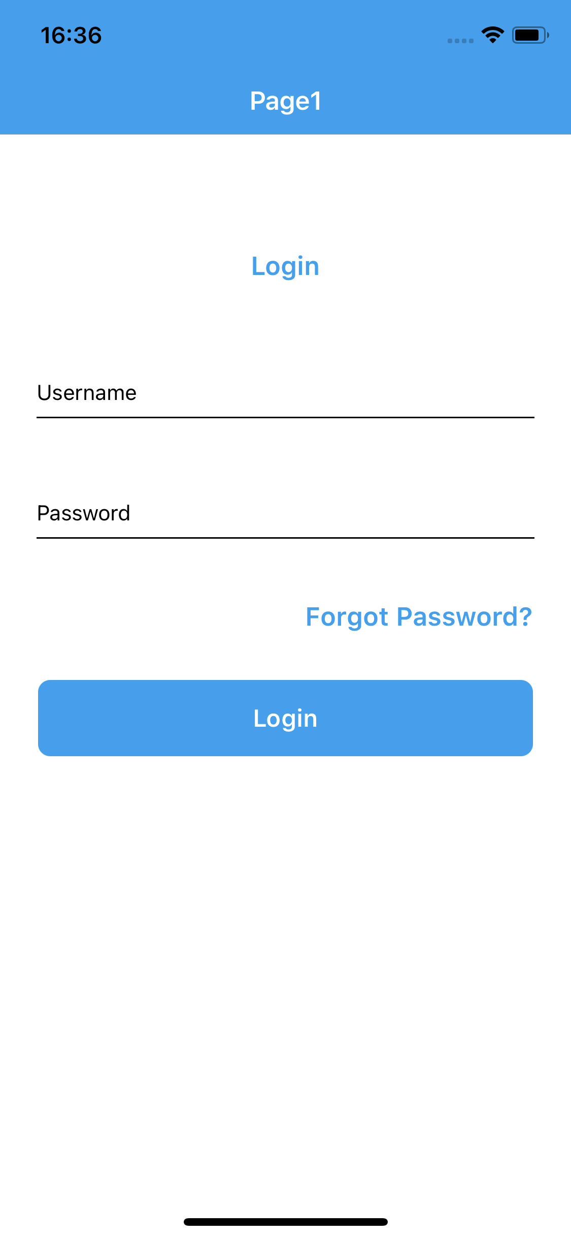
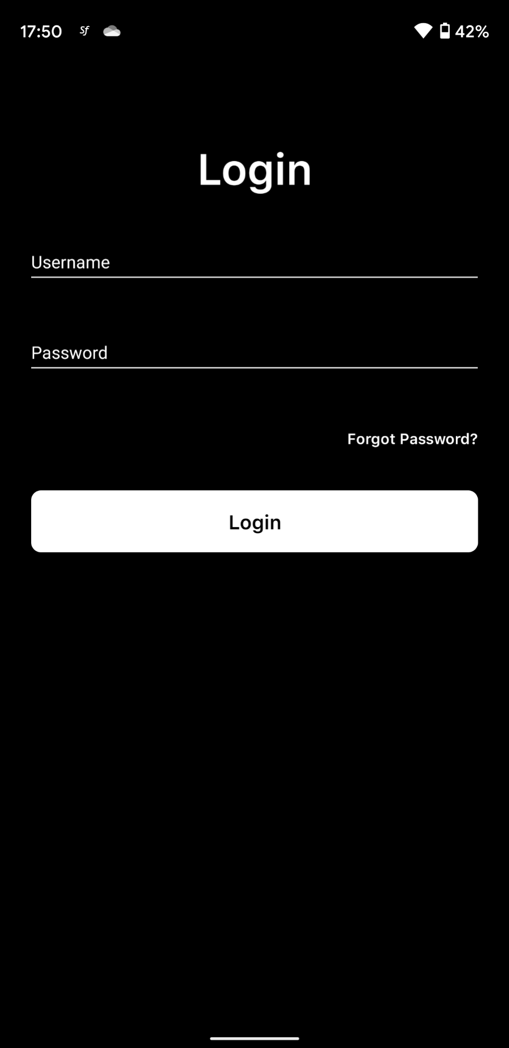
To demonstrate, we are going to create design of this login page in matter of minutes, using Smartface theming!
The components will be:
- 1 Label for Big login text
- 2 MaterialTextBox objects
- 1 label for Forgot Password? text
- 1 button for Login button
For maintenance purposes, developers should refrain using default names and change their page and element names accordingly.
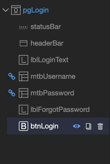
After drag & drop on the UI editor in order, the UI of pgLogin should look like this:
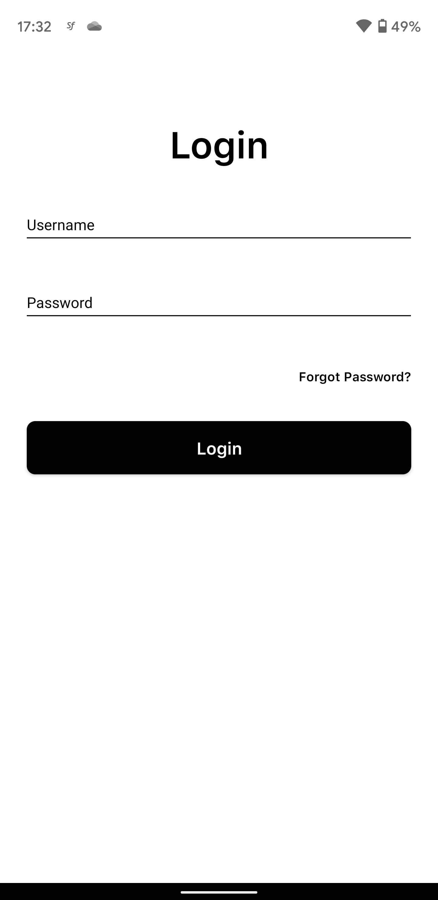
Styling and wrappers
We have added our elements, but now there are no styling done. Before we head out to make font changes, let's adjust the dimensions and place our elements first.
When styling, you should refrain from using hardcoded dimensions, especially width. You should always consider different sizing of mobile devices.
You should take advantage of flexbox, since Smartface supports built-in flexbox by default. Practice it by playing flexboxfroggy game.
Page Specific Styles
As explained in the document above, any dimensional theme independent page-specific variables should be styled like #pageName.
For left and right padding, we should add a global style at common.json file, to use it everywhere later on.
You can also override and add desired values to .sf-page style to reduce overhead. However, in our case, we might need pages without horizontal paddings, so we keep it in a different style.
Keeping the naming convention and by only doing dimensional styling, our current page files look like this
- Page Theme
- Page Markup
- Common.json
- Page Code
{
  "#pgLogin": {
    "paddingTop": 40,
    "&-lblLoginText": {
      "height": 90,
      "textAlignment": "MIDCENTER"
    },
    "&-lblForgotPassword": {
      "textAlignment": "MIDRIGHT"
    },
    "&-btnLogin": {
      "marginTop": 16
    }
  }
}
{
  "components": [
    {
      "className": ".sf-page #pgLogin .padding-vertical",
      "id": "e891b86d",
      "initialized": true,
      "props": {
        "children": [
          "42b807d1",
          "b7d28cff",
          "01ee-3b7d-fae4-a0fe",
          "e8d0-e028-be62-a7e2",
          "80c4-be9c-a3f5-3e3b",
          "0855-e9ce-5840-6caf",
          "0cff-66df-b749-b9f8"
        ],
        "isRemovable": true,
        "name": "pgLogin",
        "orientation": "PORTRAIT",
        "parent": null,
        "safeAreaEnabled": true
      },
      "type": "Page",
      "userProps": {
        "orientation": "PORTRAIT",
        "safeAreaEnabled": true
      },
      "version": "6.15.1"
    },
    {
      "className": ".sf-statusBar",
      "id": "42b807d1",
      "props": {
        "children": [],
        "isRemovable": false,
        "name": "statusBar",
        "parent": "e891b86d"
      },
      "type": "StatusBar",
      "userProps": {
        "visible": true
      }
    },
    {
      "className": ".sf-headerBar",
      "id": "b7d28cff",
      "props": {
        "children": [],
        "isRemovable": false,
        "name": "headerBar",
        "parent": "e891b86d",
        "title": "Page1"
      },
      "type": "HeaderBar",
      "userProps": {
        "title": "Page1",
        "visible": true
      }
    },
    {
      "className": ".sf-label #pgLogin-lblLoginText",
      "id": "01ee-3b7d-fae4-a0fe",
      "props": {
        "children": [],
        "name": "lblLoginText",
        "parent": "e891b86d",
        "text": "Login",
        "usePageVariable": true
      },
      "type": "Label",
      "userProps": {
        "testId": "31XoZqypi",
        "text": "Login",
        "usePageVariable": true
      }
    },
    {
      "className": ".flexLayout .materialTextBox-wrapper",
      "hiddenComponent": false,
      "id": "e8d0-e028-be62-a7e2",
      "initialized": false,
      "props": {
        "children": [],
        "name": "mtbUsername",
        "parent": "e891b86d",
        "usePageVariable": true
      },
      "source": {
        "page": "__library__",
        "type": "materialTextBox",
        "id": "574a-10da-b765-48e5"
      },
      "type": "FlexLayout",
      "userProps": {
        "flex": {
          "positionType": 0
        },
        "flexProps": {
          "positionType": "RELATIVE"
        },
        "left": 0,
        "testId": "GBgEp8H6g",
        "top": 0,
        "usePageVariable": true
      }
    },
    {
      "className": ".flexLayout .materialTextBox-wrapper",
      "hiddenComponent": false,
      "id": "80c4-be9c-a3f5-3e3b",
      "initialized": false,
      "props": {
        "children": [],
        "name": "mtbPassword",
        "parent": "e891b86d",
        "usePageVariable": true
      },
      "source": {
        "page": "__library__",
        "type": "materialTextBox",
        "id": "574a-10da-b765-48e5"
      },
      "type": "FlexLayout",
      "userProps": {
        "flex": {
          "positionType": 0
        },
        "flexProps": {
          "positionType": "RELATIVE"
        },
        "left": 0,
        "testId": "2VkXyj8Sk",
        "top": 0,
        "usePageVariable": true
      }
    },
    {
      "className": ".sf-label #pgLogin-lblForgotPassword",
      "id": "0855-e9ce-5840-6caf",
      "props": {
        "children": [],
        "name": "lblForgotPassword",
        "parent": "e891b86d",
        "text": "Forgot Password?",
        "usePageVariable": true
      },
      "type": "Label",
      "userProps": {
        "testId": "cxb0GrKoG",
        "text": "Forgot Password?",
        "usePageVariable": true
      }
    },
    {
      "className": ".sf-button #pgLogin-btnLogin",
      "id": "0cff-66df-b749-b9f8",
      "props": {
        "children": [],
        "name": "btnLogin",
        "parent": "e891b86d",
        "text": "Login",
        "usePageVariable": true
      },
      "type": "Button",
      "userProps": {
        "testId": "lU2lMxhdz",
        "text": "Login",
        "usePageVariable": true
      }
    }
  ]
}
{
  ".padding": {
    "&-vertical": {
      "paddingLeft": 25,
      "paddingRight": 25
    }
  }
}
import PgLoginDesign from "generated/pages/pgLogin";

export default class PgLogin extends PgLoginDesign {
  constructor() {
    super();
    this.onShow = onShow.bind(this, this.onShow.bind(this));
    this.onLoad = onLoad.bind(this, this.onLoad.bind(this));
  }

  initMaterialTextBoxes() {
    this.mtbUsername.options = {
      hint: "Username",
    };
    this.mtbPassword.options = {
      hint: "Password",
    };
    this.mtbPassword.materialTextBox.isPassword = true;
  }
}

function onShow(superOnShow: () => void) {
  superOnShow();
}

function onLoad(superOnLoad: () => void) {
  superOnLoad();
  this.initMaterialTextBoxes();
}
Since MaterialTextBox is a special component, it should be initialized from code. More info is located at the document below
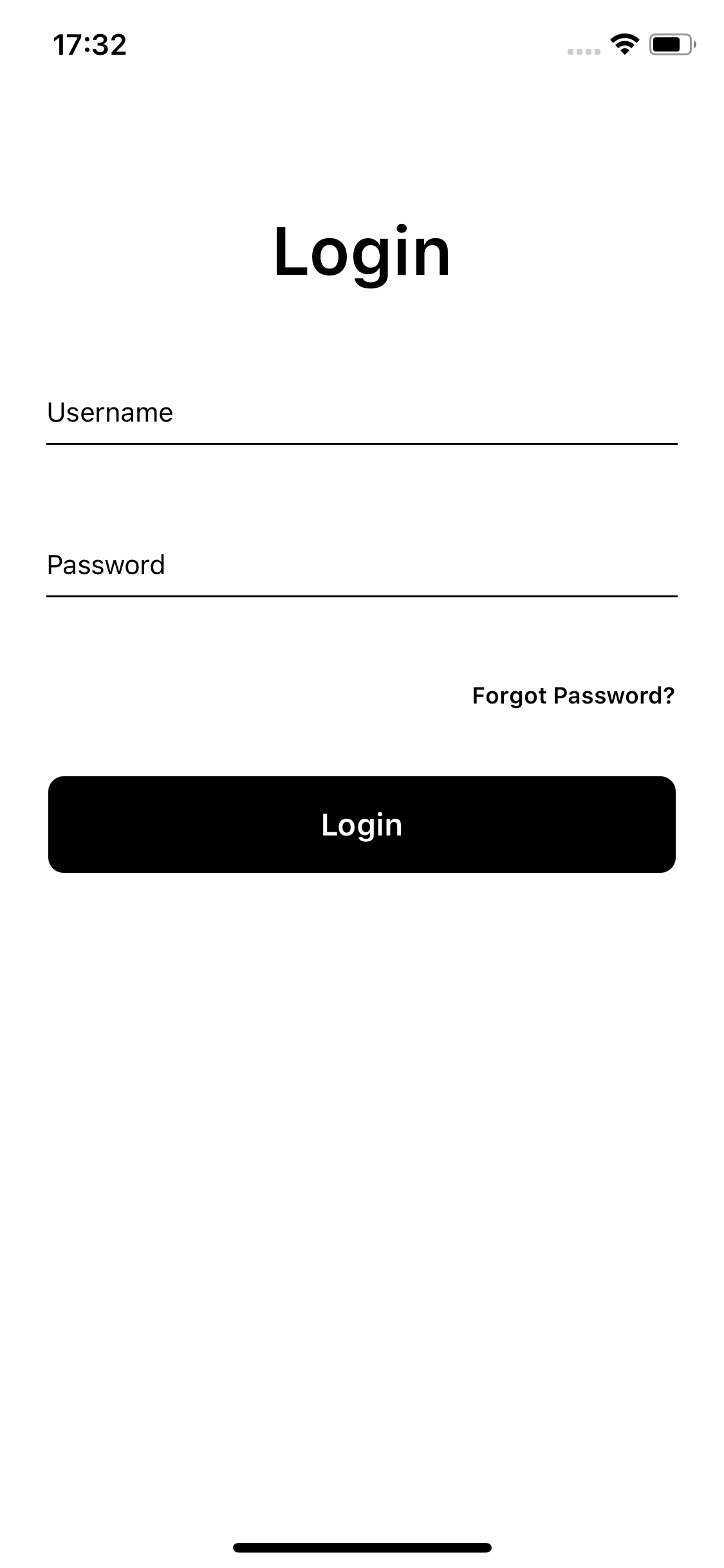
Applying Theme Specific Styles for Multi Theme Support
Since we are done with adjusting elements, we can change their color, font and other values.
If you haven't created a new theme already, please create one as explained on the start of the documentation.
The theme name smartfaceLightTheme, will be used to specify the dark theme support. If you want to, you can also create smartfaceDarkTheme as different theme right now.
On UI Editor, you can switch the theme on the go!
And also note that when you make any change to theme on the UI Editor, this will only be applied to the current chosen theme.
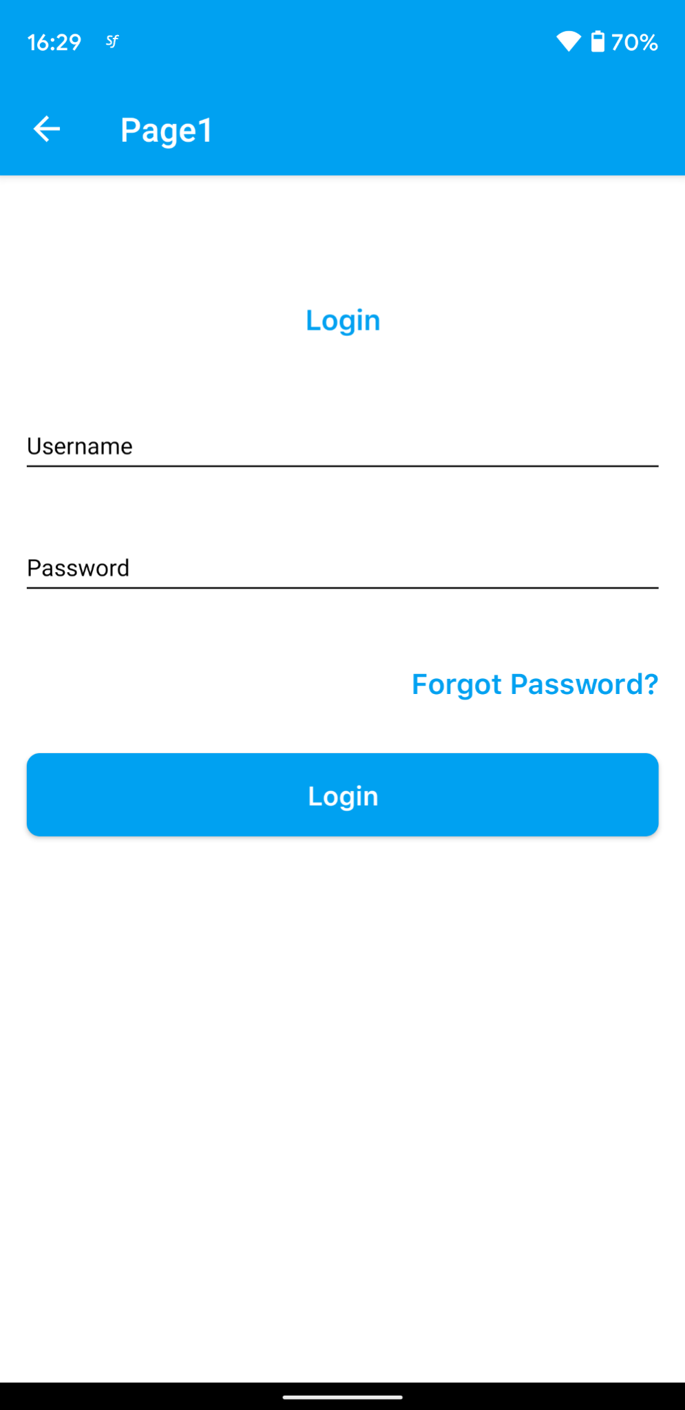
Change the active theme from UI editor and add following styles from UI editor:
Since our design doesn't have headerBar, we should hide it. We should also change color of statusBar to white.
- PgLogin
- StatusBar
- HeaderBar
{
  "#pgLogin": {
    "&-lblLoginText": {
      "textColor": "#000000",
      "font": {
        "size": 35
      }
    },
    "&-lblForgotPassword": {
      "textColor": "#000000",
      "font": {
        "size": 12
      }
    },
    "&-btnLogin": {
      "backgroundColor": "#000000"
    }
  }
}
{
  ".sf-statusBar": {
    "masksToBounds": true,
    "android": {
      "color": "#FFFFFF"
    },
    "style": "DEFAULT",
    "visible": true
  }
}
{
  ".sf-headerBar": {
    "masksToBounds": true,
    "visible": false,
    "backgroundColor": "rgba( 0, 161, 241, 1 )",
    "titleColor": "rgba( 255, 255, 255, 1 )",
    "itemColor": "rgba( 255, 255, 255, 1 )"
  }
}
For statusBar and headerBar, or any other default component:
- Create a new folder defaults in
themes/smartfaceLightTheme/styles/**** folder - copy the components you want to overwrite from
themes/defaultTheme/styles/defaults/**** folder to the newly created folder and overwrite it to your will!
Any skin value should be defined in its own theme.
Result should look like this:
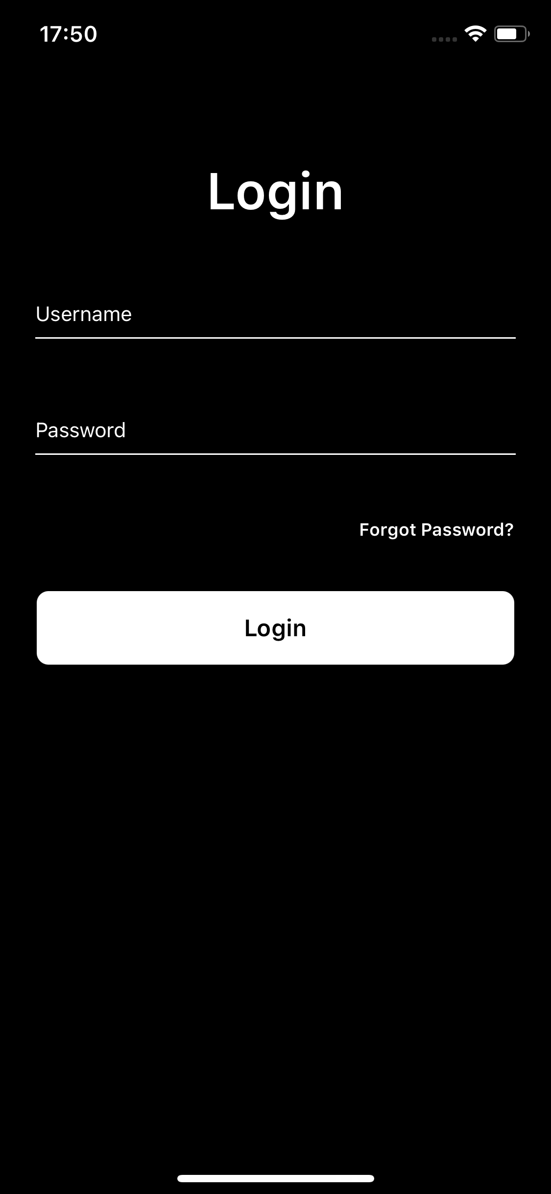
Dark theme support
By following this method, you can also have dark theme in your application. For small scale applications, create another theme and adjust the skin values accordingly. Here is where separating dimensional and skin theming difference starts to matter.
Keep in mind that MaterialTextBox.json file is also copied to darkTheme folder
- HeaderBar
- StatusBar
- Page
- MaterialTextBox
{
  ".sf-headerBar": {
    "masksToBounds": true,
    "visible": false,
    "backgroundColor": "rgba( 0, 161, 241, 1 )",
    "titleColor": "rgba( 255, 255, 255, 1 )",
    "itemColor": "rgba( 255, 255, 255, 1 )"
  }
}
{
  ".sf-statusBar": {
    "masksToBounds": true,
    "android": {
      "color": "#000000"
    },
    "style": "LIGHTCONTENT",
    "visible": true
  }
}
{
  "#pgLogin": {
    "backgroundColor": "#000000",
    "&-lblLoginText": {
      "textColor": "#FFFFFF",
      "font": {
        "size": 35
      }
    },
    "&-lblForgotPassword": {
      "textColor": "#FFFFFF",
      "font": {
        "size": 12
      }
    },
    "&-btnLogin": {
      "backgroundColor": "#FFFFFF",
      "textColor": "#000000"
    }
  }
}
{
  ".materialTextBox": {
    "ellipsizeMode": "END",
    "textAlignment": "MIDLEFT",
    "textColor": "rgba( 255,255,255,1 )",
    "errorColor": "rgba( 255,0,0,1 )",
    "hintTextColor": "rgba( 255,255,255,1 )",
    "cursorColor": "rgba( 0,161,241,1 )",
    "selectedHintTextColor": "rgba( 255,255,255,1 )",
    "lineColor": {
      "normal": "rgba( 255,255,255,1 )",
      "selected": "rgba( 255,255,255,1 )"
    },
    "font": {
      "size": 14,
      "family": "Default"
    },
    "labelsFont": {
      "size": 14,
      "family": "Default"
    }
  },
  ".materialTextBox-rightLayout": {
    "marginLeft": 1,
    "marginRight": 1,
    "paddingBottom": 4,
    "flexProps": {
      "alignItems": "FLEX_END",
      "justifyContent": "FLEX_END",
      "flexGrow": 1
    },
    "&-rightLabel": {
      "textColor": "rgba( 119,119,119,1 )",
      "textAlignment": "MIDRIGHT",
      "font": {
        "size": 12,
        "family": "Default"
      }
    },
    "+Device:Device.os === \"Android\"": {
      "marginLeft": 4,
      "marginRight": 4
    }
  },
  ".materialTextBox-wrapper": {
    "height": null,
    "width": null,
    "marginLeft": -1,
    "marginRight": -1,
    "+Device:Device.os === \"Android\"": {
      "height": 81,
      "marginBottom": -8,
      "marginLeft": -4,
      "marginRight": -4
    }
  },
  ".materialTextBox-wrapper-dropArrow": {
    "flexProps": {
      "positionType": "ABSOLUTE"
    },
    "right": 2,
    "height": 30,
    "width": 30,
    "top": 20,
    "image": "arrowbottom.png",
    ".hidden": {
      "visible": false
    }
  }
}
This method to switch between light/dark theme is intended for simple applications and requires the style contents to be created in the both theme folder. This method is not recommended for large scale application.
For larger application, variabling method should be used like explained below.
Handling Fonts
Your application may require different fonts, and font rendering can be different by platform and the font itself. To upload your font, refer to this doc:
FontMock example of handling fonts for above login page:
- Light Theme
- Dark Theme
{
  ".login": {
    "textColor": "#000000",
    ".forgotPassword": {
      "font": {
        "size": 12
      }
    },
    ".bigLoginText": {
      "font": {
        "size": 35
      }
    }
  }
}
{
  ".login": {
    "textColor": "#FFFFFF",
    ".forgotPassword": {
      "font": {
        "size": 12
      }
    },
    ".bigLoginText": {
      "font": {
        "size": 35
      }
    }
  }
}
Keep in mind that . notation inherits the values from its parent. Therefore, in this example, both .login.forgotPassword and .login.bigLoginText will have the textColor
On the styling side for large scale applications, it is recommended to create a different style folder and gather all the fonts there, especially if you have a Style Catalog taken from design applications like Zeplin.
Handling Colors
To handle colors in a better way, we should use variables.json like mentioned about. Also, by using this method, we no longer have a need to create different json file for pages. These files should be deleted:
themes/smartfaceLightTheme/styles/pages/PgLogin.jsonthemes/smartfaceDarkTheme/styles/pages/PgLogin.jsonthemes/smartfaceLightTheme/styles/textStyleCatalog.jsonthemes/smartfaceDarkTheme/styles/textStyleCatalog.json
MaterialTextBox is an exception, the MaterialTextBox.json file under the baseTheme folder will be overridden on version changes and should be copied to your newly created theme. Otherwise your changes will be lost.
Also, create those files:
- textStyleCatalog.json file under
themes/baseTheme/stylesfolder.
We are not going to delete headerbar and statusbar theme files, since it contains properties other than colors.
When we created themes, there are two new files named variables.json are created for us. Add those in them:
- Light Theme
- Dark Theme
{
  "mainText": "#000000",
  "background": "#FFFFFF"
}
{
  "mainText": "#FFFFFF",
  "background": "#000000"
}
Now we have out two simple variables, we may head to make necessary changes over our files. We need to adapt our theme files. Keep in mind that we are going to change files in baseTheme:
- Login Page
- TextStyleCatalog - Base
- MaterialTextBox - Light
- MaterialTextBox - Dark
{
  "#pgLogin": {
    "&-lblLoginText": {
      "height": 90,
      "textAlignment": "MIDCENTER"
    },
    "paddingTop": 40,
    "&-lblForgotPassword": {
      "textAlignment": "MIDRIGHT"
    },
    "&-btnLogin": {
      "marginTop": 16,
      "backgroundColor": "${mainText}",
      "textColor": "${background}"
    }
  }
}
{
  ".login": {
    "textColor": "${mainText}",
    ".forgotPassword": {
      "font": {
        "size": 12
      }
    },
    ".bigLoginText": {
      "font": {
        "size": 35
      }
    }
  }
}
{
  ".materialTextBox": {
    "ellipsizeMode": "END",
    "textAlignment": "MIDLEFT",
    "textColor": "${mainText}",
    "errorColor": "rgba( 255,0,0,1 )",
    "hintTextColor": "${mainText}",
    "cursorColor": "rgba( 0,161,241,1 )",
    "selectedHintTextColor": "${mainText}",
    "lineColor": {
      "normal": "${mainText}",
      "selected": "${mainText}"
    },
    "font": {
      "size": 14,
      "family": "Default"
    },
    "labelsFont": {
      "size": 14,
      "family": "Default"
    }
  },
  ".materialTextBox-rightLayout": {
    "marginLeft": 1,
    "marginRight": 1,
    "paddingBottom": 4,
    "flexProps": {
      "alignItems": "FLEX_END",
      "justifyContent": "FLEX_END",
      "flexGrow": 1
    },
    "&-rightLabel": {
      "textColor": "rgba( 119,119,119,1 )",
      "textAlignment": "MIDRIGHT",
      "font": {
        "size": 12,
        "family": "Default"
      }
    },
    "+Device:Device.os === \"Android\"": {
      "marginLeft": 4,
      "marginRight": 4
    }
  },
  ".materialTextBox-wrapper": {
    "height": null,
    "width": null,
    "marginLeft": -1,
    "marginRight": -1,
    "+Device:Device.os === \"Android\"": {
      "height": 81,
      "marginBottom": -8,
      "marginLeft": -4,
      "marginRight": -4
    }
  },
  ".materialTextBox-wrapper-dropArrow": {
    "flexProps": {
      "positionType": "ABSOLUTE"
    },
    "right": 2,
    "height": 30,
    "width": 30,
    "top": 20,
    "image": "arrowbottom.png",
    ".hidden": {
      "visible": false
    }
  }
}
You should also change StatusBar styles:
- StatusBar Light
- StatusBar Dark
{
  ".sf-statusBar": {
    "masksToBounds": true,
    "android": {
      "color": "${mainText}"
    },
    "style": "DEFAULT",
    "visible": true
  }
}
{
  ".sf-statusBar": {
    "masksToBounds": true,
    "android": {
      "color": "${mainText}"
    },
    "style": "LIGHTCONTENT",
    "visible": true
  }
}
Changing Theme on Runtime
Let's add another label under Login button and name it lblChangeTheme . It can have the same style with Forgot Password text, so no additional styling is required. It will be aligned to left.
- Login Page Code
- Login Page Markup
import PgLoginDesign from "generated/pages/pgLogin";
import { themeService } from "theme";
import { config } from "settings.json";

export default class PgLogin extends PgLoginDesign {
  private currentTheme = config.theme.currentTheme;
  constructor() {
    super();
    this.onShow = onShow.bind(this, this.onShow.bind(this));
    this.onLoad = onLoad.bind(this, this.onLoad.bind(this));
  }

  initMaterialTextBoxes() {
    this.mtbUsername.options = {
      hint: "Username",
    };
    this.mtbPassword.options = {
      hint: "Password",
    };
    this.mtbPassword.materialTextBox.isPassword = true;
  }

  initChangeTheme() {
    this.lblChangeTheme.onTouchEnded = () => {
      const nextTheme = this.currentTheme.includes("Dark")
        ? "smartfaceLightTheme"
        : "smartfaceDarkTheme";
      themeService.changeTheme(nextTheme);
      this.currentTheme = nextTheme;
    };
  }
}

function onShow(superOnShow: () => void) {
  superOnShow();
}

function onLoad(superOnLoad: () => void) {
  superOnLoad();
  this.initMaterialTextBoxes();
  this.initChangeTheme();
}
{
  "components": [
    {
      "className": ".sf-page #pgLogin .padding-vertical",
      "id": "e891b86d",
      "initialized": true,
      "props": {
        "children": [
          "42b807d1",
          "b7d28cff",
          "01ee-3b7d-fae4-a0fe",
          "e8d0-e028-be62-a7e2",
          "80c4-be9c-a3f5-3e3b",
          "0855-e9ce-5840-6caf",
          "0cff-66df-b749-b9f8",
          "f14e-2237-759b-cb90"
        ],
        "isRemovable": true,
        "name": "pgLogin",
        "orientation": "PORTRAIT",
        "parent": null,
        "safeAreaEnabled": true
      },
      "type": "Page",
      "userProps": {
        "orientation": "PORTRAIT",
        "safeAreaEnabled": true
      },
      "version": "6.15.1"
    },
    {
      "className": ".sf-statusBar",
      "id": "42b807d1",
      "props": {
        "children": [],
        "isRemovable": false,
        "name": "statusBar",
        "parent": "e891b86d"
      },
      "type": "StatusBar",
      "userProps": {}
    },
    {
      "className": ".sf-headerBar",
      "id": "b7d28cff",
      "props": {
        "children": [],
        "isRemovable": false,
        "name": "headerBar",
        "parent": "e891b86d",
        "title": "Page1"
      },
      "type": "HeaderBar",
      "userProps": {
        "title": "Page1",
        "visible": false
      }
    },
    {
      "className": ".sf-label #pgLogin-lblLoginText .login.bigLoginText",
      "id": "01ee-3b7d-fae4-a0fe",
      "props": {
        "children": [],
        "name": "lblLoginText",
        "parent": "e891b86d",
        "text": "Login",
        "usePageVariable": true
      },
      "type": "Label",
      "userProps": {
        "testId": "31XoZqypi",
        "text": "Login",
        "usePageVariable": true
      }
    },
    {
      "className": ".flexLayout .materialTextBox-wrapper",
      "hiddenComponent": false,
      "id": "e8d0-e028-be62-a7e2",
      "initialized": false,
      "props": {
        "children": [],
        "name": "mtbUsername",
        "parent": "e891b86d",
        "usePageVariable": true
      },
      "source": {
        "page": "__library__",
        "type": "materialTextBox",
        "id": "574a-10da-b765-48e5"
      },
      "type": "FlexLayout",
      "userProps": {
        "flex": {
          "positionType": 0
        },
        "flexProps": {
          "positionType": "RELATIVE"
        },
        "left": 0,
        "testId": "GBgEp8H6g",
        "top": 0,
        "usePageVariable": true
      }
    },
    {
      "className": ".flexLayout .materialTextBox-wrapper",
      "hiddenComponent": false,
      "id": "80c4-be9c-a3f5-3e3b",
      "initialized": false,
      "props": {
        "children": [],
        "name": "mtbPassword",
        "parent": "e891b86d",
        "usePageVariable": true
      },
      "source": {
        "page": "__library__",
        "type": "materialTextBox",
        "id": "574a-10da-b765-48e5"
      },
      "type": "FlexLayout",
      "userProps": {
        "flex": {
          "positionType": 0
        },
        "flexProps": {
          "positionType": "RELATIVE"
        },
        "left": 0,
        "testId": "2VkXyj8Sk",
        "top": 0,
        "usePageVariable": true
      }
    },
    {
      "className": ".sf-label #pgLogin-lblForgotPassword .login.forgotPassword",
      "id": "0855-e9ce-5840-6caf",
      "props": {
        "children": [],
        "name": "lblForgotPassword",
        "parent": "e891b86d",
        "text": "Forgot Password?",
        "usePageVariable": true
      },
      "type": "Label",
      "userProps": {
        "testId": "cxb0GrKoG",
        "text": "Forgot Password?",
        "usePageVariable": true
      }
    },
    {
      "className": ".sf-button #pgLogin-btnLogin",
      "id": "0cff-66df-b749-b9f8",
      "props": {
        "children": [],
        "name": "btnLogin",
        "parent": "e891b86d",
        "text": "Login",
        "usePageVariable": true
      },
      "type": "Button",
      "userProps": {
        "testId": "lU2lMxhdz",
        "text": "Login",
        "usePageVariable": true
      }
    },
    {
      "className": ".sf-label .login.forgotPassword",
      "id": "f14e-2237-759b-cb90",
      "props": {
        "children": [],
        "name": "lblChangeTheme",
        "parent": "e891b86d",
        "text": "Change Theme",
        "usePageVariable": true
      },
      "type": "Label",
      "userProps": {
        "testId": "xE30i1PuB",
        "text": "Change Theme",
        "usePageVariable": true
      }
    }
  ]
}
ThemeService.changeTheme function is executed on main thread, therefore it is sync. You may place loading sign before and after the code.
It is recommended to save the current theme information into device storage. That way, devices will remember what theme they were in. More information can be found at this doc: Using Themes Programmatically
Zeplin Integration
Did you know that Smartface has Zeplin Integration ? You can easily convert the styles and text catalog to smartface compatible syntax.
More Best Practices & Recipes
Under Smartface organization, there are more best practice examples located here
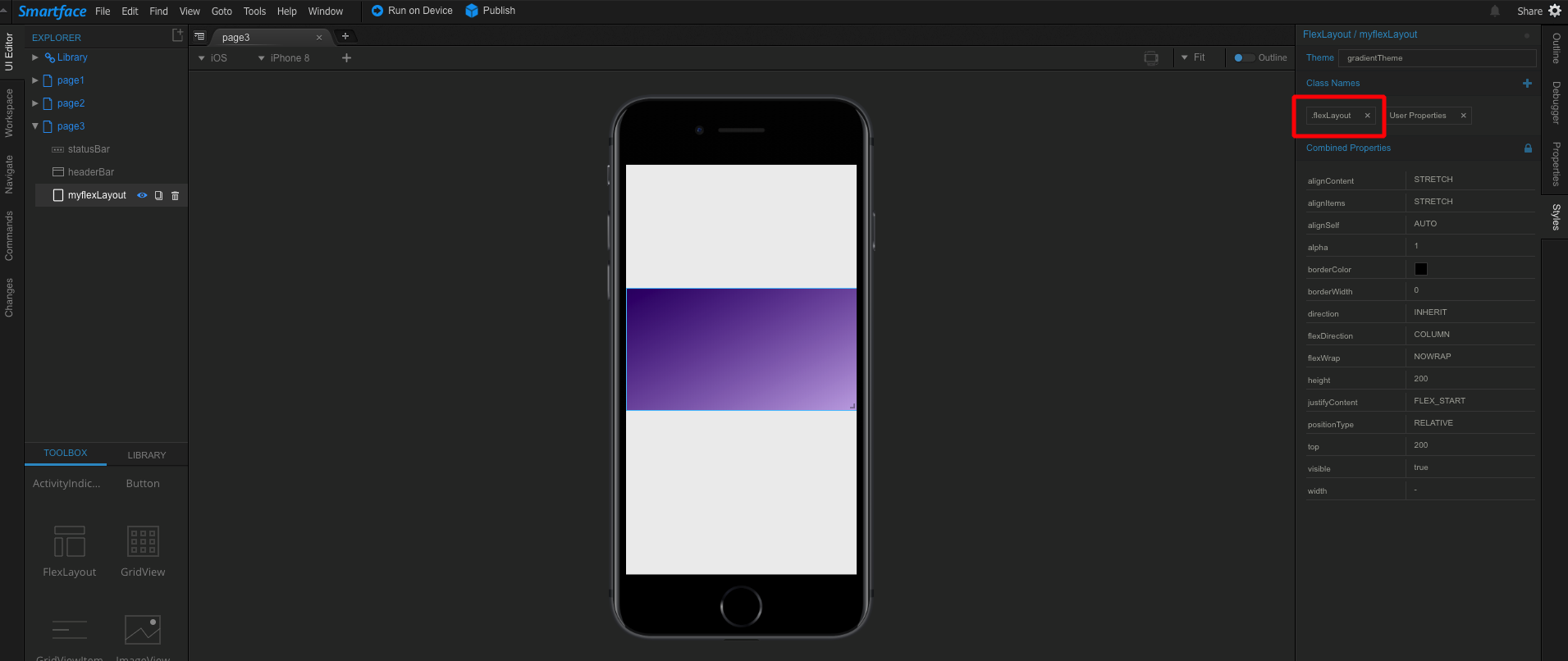
BackgroundColor With Gradient
It is possible to color backgroundColor gradient with style files. Creating a new style file or modifying exist style file provides gradient supplement for backGroundColor from code section.
{
  ".flexLayout": {
    "height": 200,
    "width": 200,
    "touchEnabled": true,
    "visible": true,
    "backgroundColor": {
      "startColor": "#340470",
      "endColor": "#c6aee5",
      "direction": "DIAGONAL_LEFT"
    },
    "alpha": 1,
    "borderColor": "rgba(0,0,0,1)",
    "borderWidth": 0,
    "font": {},
    "flexProps": {
      "alignSelf": "AUTO",
      "direction": "INHERIT",
      "alignContent": "STRETCH",
      "alignItems": "STRETCH",
      "justifyContent": "FLEX_START",
      "flexWrap": "NOWRAP",
      "flexDirection": "COLUMN",
      "positionType": "RELATIVE"
    },
    "&-small": {
      "width": 100
    },
    "&-medium": {
      "width": 250
    },
    "&-large": {
      "width": 350
    }
  }
}