HeaderBar
API Reference: UI.HeaderBar
HeaderBar class represents Navigation Bar for iOS and Action Bar for Android. It is a bar shown on top of page under the statusBar object. You can use it for a way to navigate in the application or for certain functions with buttons. You can also show title of page on HeaderBar.
You can access the header bar of a page via UI.Page.headerBar property.
this.headerBar.title = "Smartface";
On iOS, you should work with header bar in the scope of onLoad() and onShow() events, otherwise behavior would be undefined.
When you hide the headerBar on iOS, page goes under the statusBar but Android it does not. This behaviour causes the difference between Android & iOS user interfaces. Giving paddingTop for IOS devices might help to solve this problem.
Basic HeaderBar Usage
import PageSampleDesign from 'generated/pages/pageSample';
import FlexLayout from '@smartface/native/ui/flexlayout';
import Application from '@smartface/native/application';
import System from '@smartface/native/device/system';
import HeaderBarItem from '@smartface/native/ui/headerbaritem';
import Color from '@smartface/native/ui/color';
import { Route, Router } from '@smartface/router';
//You should create new Page from UI-Editor and extend with it.
export default class Sample extends PageSampleDesign {
myItem: HeaderBarItem;
constructor(private router?: Router, private route?: Route) {
super({});
}
/**
* @event onShow
* This event is called when a page appears on the screen (everytime).
* @param {function} superOnShow super onShow function
* @param {Object} parameters passed from Router.go function
*/
onShow() {
const { headerBar } = System.OS === System.OSType.ANDROID ? this : this.parentController;
super.onShow();
Application.statusBar.visible = false;
headerBar.visible = true;
}
/**
* @event onLoad
* This event is called once when page is created.
* @param {function} superOnLoad super onLoad function
*/
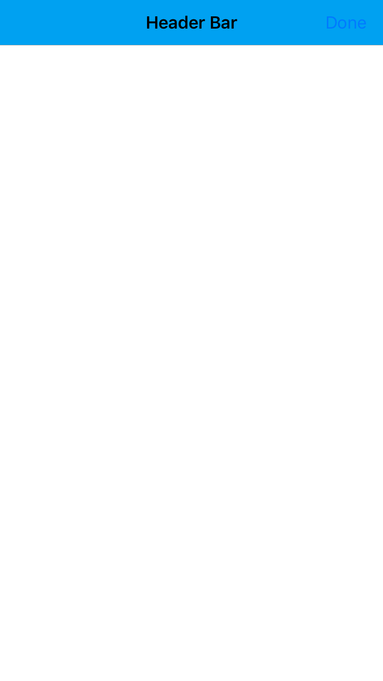
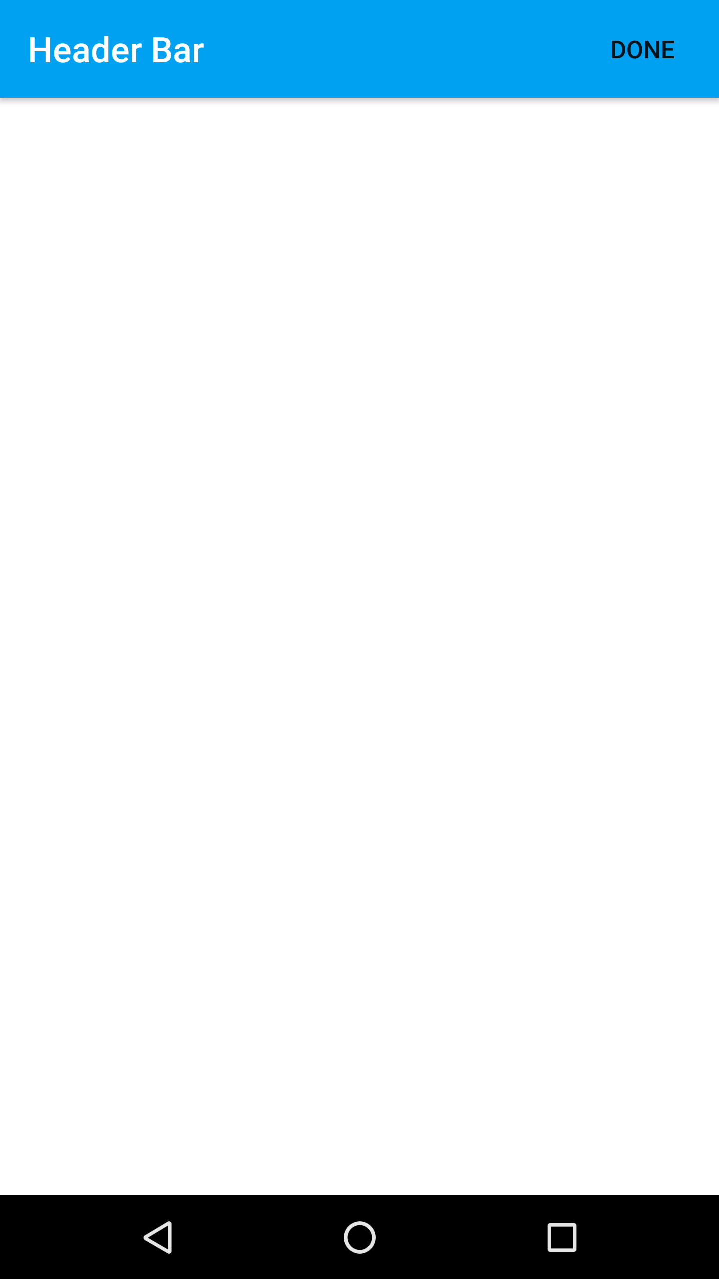
onLoad() {
super.onLoad();
const { headerBar } = System.os === System.OSType.ANDROID ? this : this.parentController;
headerBar.backgroundColor = Color.create('#00A1F1');
headerBar.title = 'Header Bar';
// Border visibility is optional
headerBar.borderVisibility = true;
this.myItem = new HeaderBarItem({
title: 'Done',
onPress: function () {
console.log('You pressed Done item!');
}
});
this.headerBar.setItems([this.myItem]);
}
}
Default Navigation
There is a default left item on the every HeaderBar. This default button is used to go back in the Router of Navigator history. The back action using this does not send any arguments to the previous page (this cannot be changed).
This default behavior can be prevented by:
- setting a custom left item
this.headerBar.leftItemEnabled = false
With the default behavior, iOS gesture to swipe back works. If one of the actions described above is used, this also prevents the default swipe back gesture.
For Android, on each page, the developer has to write custom back button action.
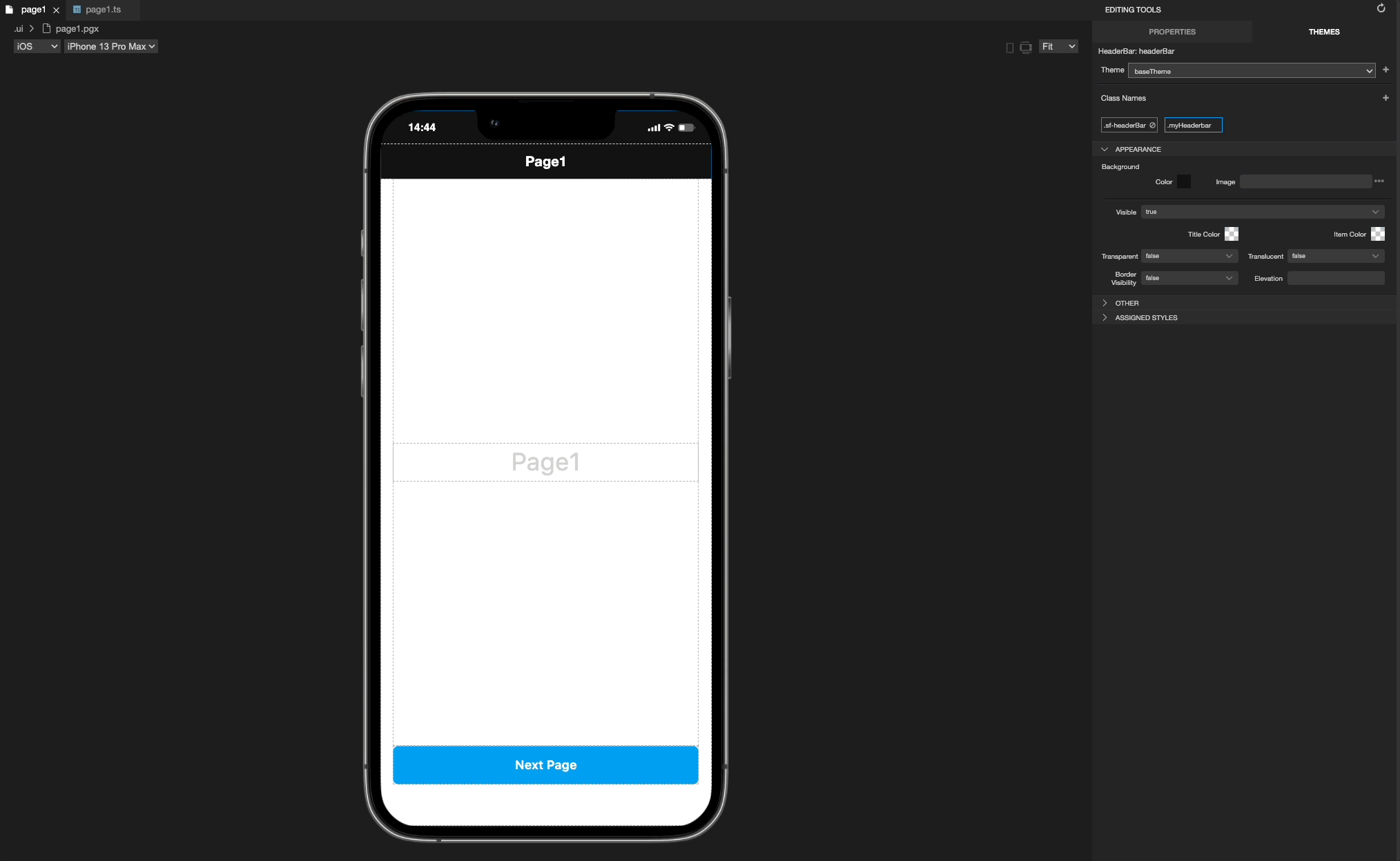
Hide HeaderBar
On Android, HeaderBar visibility can be managed via class or property. Simply set it to false to hide headerbar. Reference:
For iOS, HeaderBar should be toggled via router. To adapt headerbar visibility for both platform from style, use the code below:
import { NativeRouter, NativeStackRouter, Route } from '@smartface/router';
import * as Pages from 'pages';
import { themeService } from 'theme';
const headerBarStyle = themeService.getStyle('.sf-headerBar');

const router = NativeRouter.of({
  path: '/',
  isRoot: true,
  routes: [
    NativeStackRouter.of({
      path: '/pages',
      routes: [
        Route.of<Pages.Page1>({
          path: '/pages/page1',
          headerBarParams: () => ({
            visible: headerBarStyle.visible
          }),
          build(router, route) {
            return new Pages.Page1(router, route);
          }
        }),
        Route.of<Pages.Page2>({
          path: '/pages/page2',
          headerBarParams: () => ({
            visible: headerBarStyle.visible
          }),
          build(router, route) {
            return new Pages.Page2(router, route);
          }
        })
      ]
    })
  ]
});

export default router;
The idea is to get visibility from style & assigning through the code.
Remove Black Border on iOS Devices
On iOS 12 or below, HeaderBar have native black 1px border beneath them to separate it from the page itself. This might get into your way with your design implementation. To remove that, simply set UI.HeaderBar.BorderVisibility to false at onShow event.
import Page1Design from 'generated/pages/page1';
import System from '@smartface/native/device/system';
import { Route, Router } from '@smartface/router';

export default class Page1 extends Page1Design {
  parentController: any;
  constructor(private router?: Router, private route?: Route) {
    super({});
  }
  headerBarBlackLineRemover() {
    if (System.OS === System.OSType.IOS) {
      this.parentController.headerBar.borderVisibility = false;
    }
  }

  onShow() {
    super.onShow();
    this.headerBarBlackLineRemover();
  }

  onLoad() {
    super.onLoad();
  }
}
Setting the color of HeaderBar items
You can change the color of the HeaderBar items (including leftItem) by using the property itemColor.
The color of all individual headerbar items will have higher precedence than the headerbar's itemColor property hence headerbar items that have their respective color won't be affected by the itemColor.
    this.myItem = new HeaderBarItem({
      title: 'Done',
      color: Color.BLUE // if you set color, HeaderBar itemColor property will be ignored
    });
import HeaderBarExampleDesign from 'generated/pages/headerBarExample';
import { withDismissAndBackButton } from '@smartface/mixins';
import { Route, Router } from '@smartface/router';
import System from '@smartface/native/device/system';
import Application from '@smartface/native/application';
import HeaderBarItem from '@smartface/native/ui/headerbaritem';
import Color from '@smartface/native/ui/color';
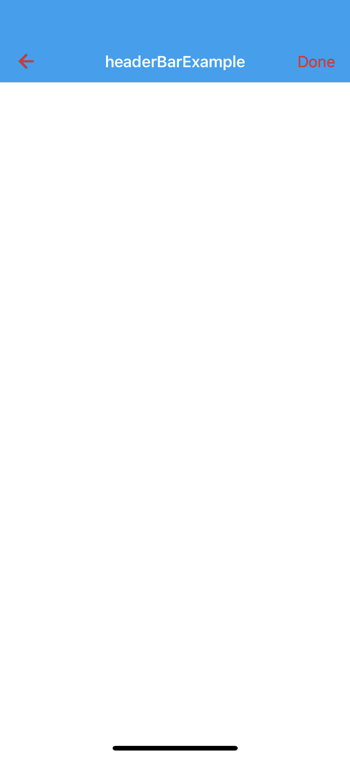
export default class HeaderBarExample extends withDismissAndBackButton(HeaderBarExampleDesign) {
parentController: any;
myItem: HeaderBarItem;
constructor(private router?: Router, private route?: Route) {
super({});
}
onShow() {
this.initBackButton(this.router);
const { headerBar } = System.OS === System.OSType.ANDROID ? this : this.parentController;
super.onShow();
Application.statusBar.visible = false;
headerBar.visible = true;
headerBar.itemColor = Color.RED; // set itemColor to red
}
/**
* @event onLoad
* This event is called once when page is created.
* @param {function} superOnLoad super onLoad function
*/
onLoad() {
super.onLoad();
const { headerBar } = System.OS === System.OSType.ANDROID ? this : this.parentController;
this.myItem = new HeaderBarItem({
title: 'Done',
});
this.headerBar.setItems([this.myItem]);
}
}
Remove Default Elevation from Android HeaderBar
Similarly with iOS, Android has something called elevation to express shadows and border-like feeling. This also might not align with your design choices.
To remove it, simply use theme classes to add the property. Open or create(if you have your own theme) HeaderBar.json file and add the elevation property like this:
You should add this file into your own theme file. The changes you have made into baseTheme might be overridden!
{
  ".sf-headerBar": {
    "masksToBounds": true,
    "visible": true,
    "backgroundColor": "rgba( 0, 161, 241, 1 )",
    "titleColor": "rgba( 255, 255, 255, 1 )",
    "itemColor": "rgba( 255, 255, 255, 1 )",
        "android": {
            "elevation": 0 //Add this line
        },
  }
}
For more information about themes, refer to this documentation:
HeaderBar Adding Image or Text
With the help of the Smartface UI Component UI.HeaderBarItem, you can easily configure your HeaderBar without extra effort!
Select image from generated folder or import from local
You can select image from generated folder or import from local.
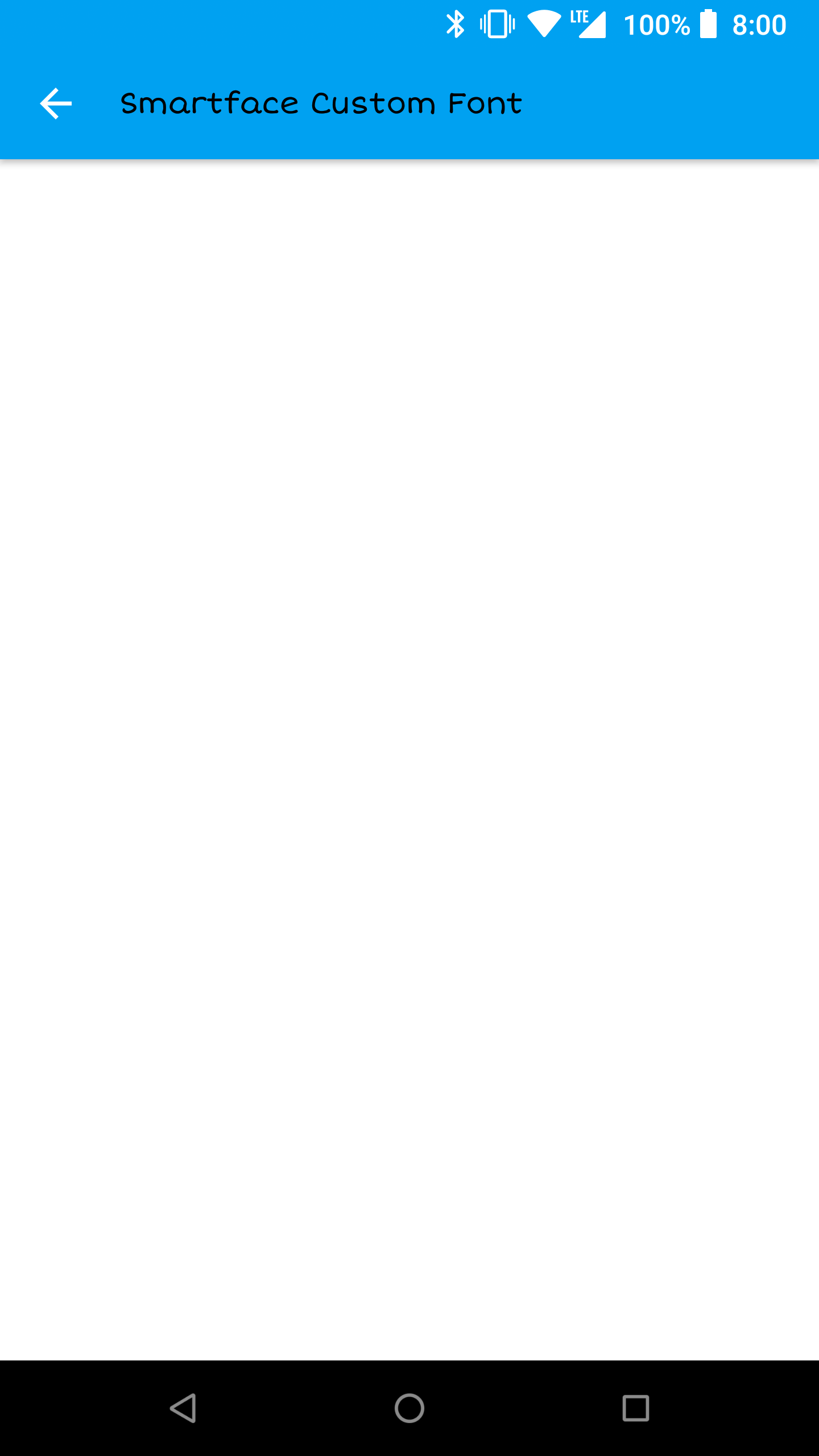
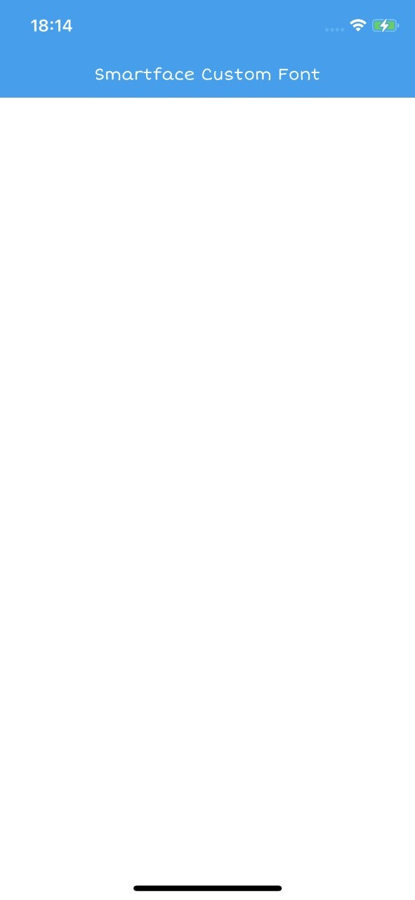
HeaderBar Font Change
import PageTestDesign from 'generated/pages/pageTest';
import { withDismissAndBackButton } from '@smartface/mixins';
import { Route, Router } from '@smartface/router';
import System from '@smartface/native/device/system';
import AttributedString from '@smartface/native/global/attributedstring';
import { themeService } from 'theme';
const headerBarFont = themeService.getNativeStyle('.sf-headerBar').font;

export default class PageTest extends withDismissAndBackButton(PageTestDesign) {
  constructor(private router?: Router, private route?: Route) {
    super({});
  }
  initHeaderBarFont() {
    if (System.OS === System.OSType.ANDROID) {
      let attributeString = new AttributedString();
      attributeString.font = headerBarFont;
      attributeString.string = 'Smartface Custom Font';
      this.headerBar.android.attributedTitle = attributeString;
    } else {
      this.parentController.headerBar.ios.titleFont = headerBarFont;
      this.headerBar.title = 'Smartface Custom Font';
    }
  }
  /**
   * @event onShow
   * This event is called when the page appears on the screen (everytime).
   */
  onShow() {
    super.onShow();
    this.initHeaderBarFont();
    this.initBackButton(this.router); //Addes a back button to the page headerbar.
  }

  /**
   * @event onLoad
   * This event is called once when the page is created.
   */
  onLoad() {
    super.onLoad();
  }
}
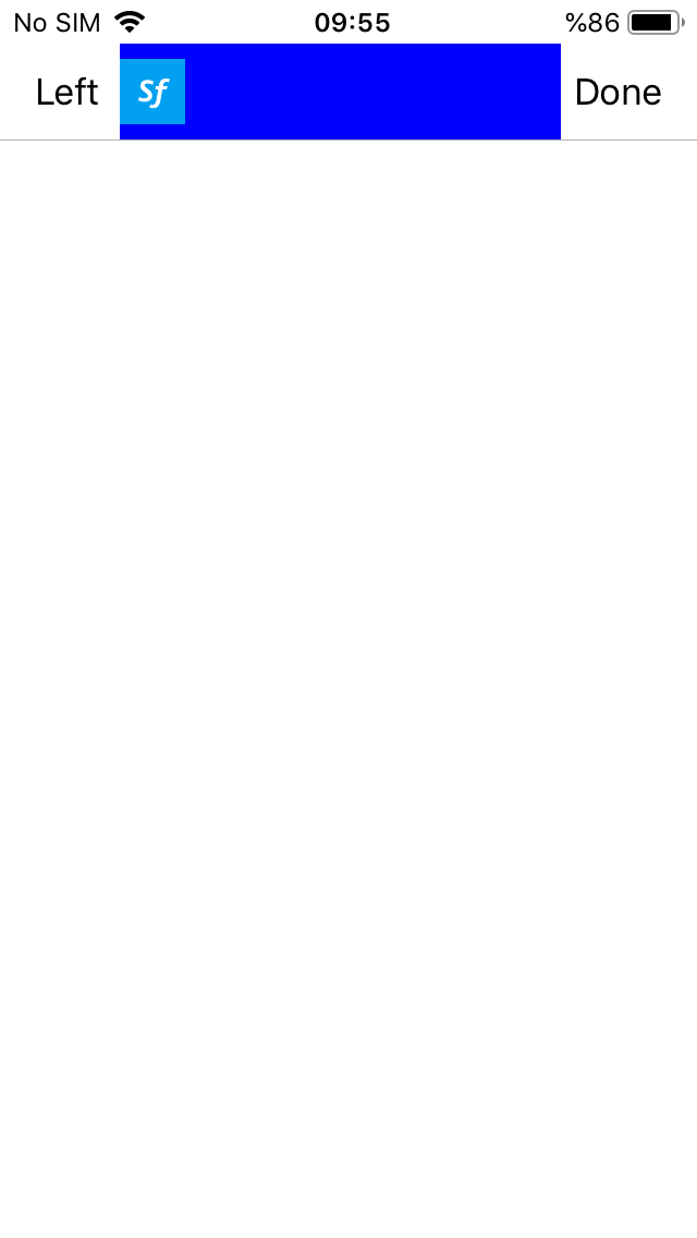
Adding Text
Simply refer to the basic usage and assing the text directly like:
import PgHeaderTextDesign from 'generated/pages/pgHeaderTExt';
import HeaderBarItem from '@smartface/native/ui/headerbaritem';
import { Route, Router } from '@smartface/router';

export default class PgHeaderText extends PgHeaderTextDesign {
  constructor(private router?: Router, private route?: Route) {
    super({});
  }
  addHeaderBarTitle() {
    const headerBarItem = new HeaderBarItem();
    headerBarItem.title = 'Smartface';
    this.headerBar.setItems([headerBarItem]);
    // or
    this.headerBar.setLeftItem(headerBarItem);
  }

  onShow() {
    super.onShow();
  }

  onLoad() {
    super.onLoad();
    this.addHeaderBarTitle();
  }
}
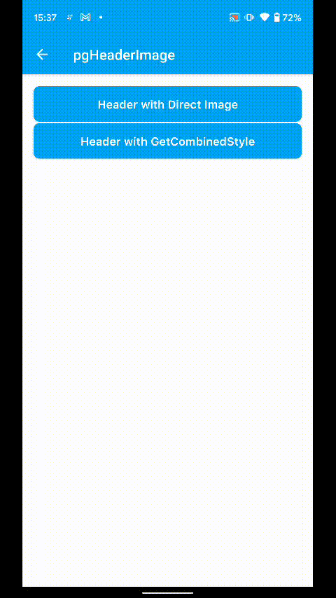
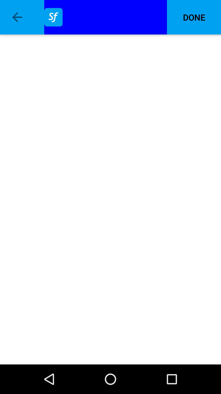
Adding Image
import PgHeaderImageDesign from 'generated/pages/pgHeaderImage';
import HeaderBarItem from '@smartface/native/ui/headerbaritem';
import { themeService } from 'theme';
import Color from '@smartface/native/ui/color';
import { Route, Router } from '@smartface/router';
import Button from '@smartface/native/ui/button';

export default class PgHeaderImage extends PgHeaderImageDesign {
  private disposeables: (() => void)[] = [];
  constructor(private router?: Router, private route?: Route) {
    super({});
  }
  initButtonClicks() {
    this.disposeables.push(this.btnDirectImage.on('press', () => this.addHeaderWithDirectImage()));

    this.disposeables.push(this.btnStyle.on('press', () => this.addHeaderWithGetStyle()));
  }
  addHeaderWithDirectImage() {
    const imageHeaderBarItem = new HeaderBarItem();
    imageHeaderBarItem.image = 'images://smartface.png';
    imageHeaderBarItem.color = Color.BLACK; // For Android
    /**
     * Alternative usage :
     * imageHeaderBarItem.image = Image.createFromFile('images://smartface.png');
     */
    this.headerBar.setItems([imageHeaderBarItem]);
  }

  addHeaderWithGetStyle() {
    const imageHeaderBarItem = new HeaderBarItem();
    imageHeaderBarItem.image = themeService.getStyle('#pgHeaderImage').image;
    this.headerBar.setItems([imageHeaderBarItem]);
  }

  onShow() {
    super.onShow();
  }

  onLoad() {
    super.onLoad();
    this.initButtonClicks();
  }
  onHide(): void {
    this.dispose();
  }

  dispose(): void {
    this.disposeables.forEach((item) => item());
  }
}
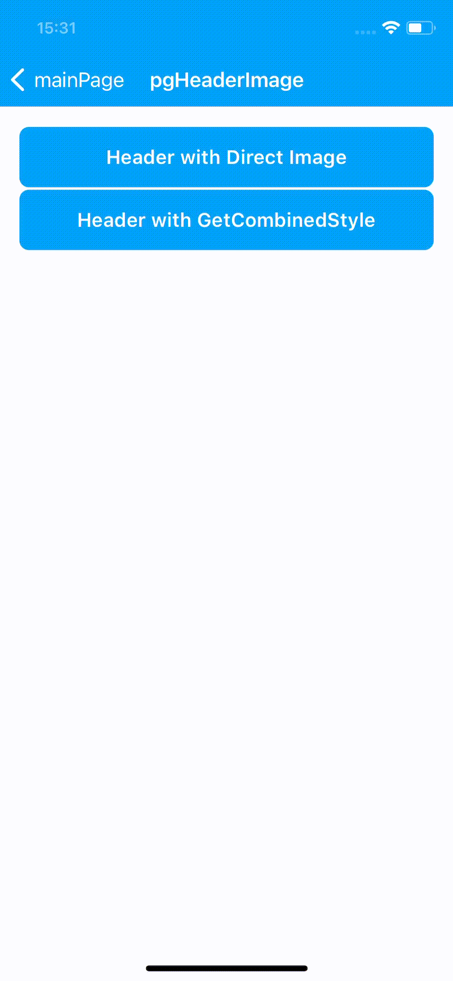
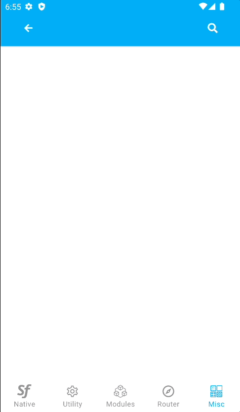
Keep in mind that the dimensions of the Image will not be altered. Therefore, as it can be seen from the Image, the Smartface Logo overflows in the headerBar.
Also, on Android the tint is not applied by default. You should apply appropiate color before using HeaderBarItem.
On iOS, left item's image left spacing is not same as Android. Because of that behavior you can use 2 images with different left spacing on Android and iOS as workaround.


For example, before using the image on iOS, open image on any image editor or Photoshop and set space on left side of the image.
HeaderBar Badge & Custom View
Since sf-core 3.0.0 it is possible to show a badge number or text with the HeaderBarItem. The badge has a circular or elliptical background, displayed on top-right to the HeaderBarItem. Most common use of the badge is to show the number of notifications or items that user needs to pay attention to.
The text of the badge is manually managed by the developer.
Basic properties of badge:
- If the text length of the badge is less, it looks like a circle; otherwise, its width will extend to be an ellipse
- The width of the badge may not extend the HeaderBarItem width, the larger text will be cut
- The height of the badge is fixed, does not change
- By default, it has a red background with white text
- Font and colors of the badge can be changed via JavaScript code, themes cannot be used
The components in the example are added from the code for better showcase purposes. To learn more about the subject you can refer to:
Adding Component From CodeAs a best practice, Smartface recommends using the WYSIWYG editor in order to add components and styles to your page or library. To learn how to use UI Editor better, please refer to this documentation
UI Editor Basicsimport PageSampleDesign from 'generated/pages/page3';
import FlexLayout from '@smartface/native/ui/flexlayout';
import Application from '@smartface/native/application';
import HeaderBarItem from '@smartface/native/ui/headerbaritem';
import ActivityIndicator from '@smartface/native/ui/activityindicator';
import Color from '@smartface/native/ui/color';
import { Route, Router } from '@smartface/router';
import { styleableComponentMixin, styleableContainerComponentMixin } from '@smartface/styling-context';
class StyleableFlexLayout extends styleableContainerComponentMixin(FlexLayout) {}
class StyleableActivityIndicator extends styleableComponentMixin(ActivityIndicator) {}
//You should create new Page from UI-Editor and extend with it.
export default class Sample extends PageSampleDesign {
itemContainerFl: StyleableFlexLayout;
myActivityIndicator: StyleableActivityIndicator;
indicatorItem: HeaderBarItem;
itemWithBadge: HeaderBarItem;
constructor(private router?: Router, private route?: Route) {
super({});
}
onShow() {
const { headerBar } = this;
super.onShow();
Application.statusBar.visible = true;
headerBar.visible = true;
}
onLoad() {
super.onLoad();
const { headerBar } = this;
headerBar.title = 'Smartface';
headerBar.backgroundColor = Color.BLACK;
headerBar.titleColor = Color.WHITE
this.itemContainerFl = new StyleableFlexLayout();
this.addChild(this.itemContainerFl, `itemContainerFl`, '.sf-flexLayout', {
height: 50,
width: 50,
flexProps: {
justifyContent: 'CENTER',
alignItems: 'CENTER'
}
});
this.myActivityIndicator = new StyleableActivityIndicator();
//@ts-ignore
this.myActivityIndicator.ios.activityIndicatorViewStyle = ActivityIndicator.iOS.ActivityIndicatorViewStyle.NORMAL;
this.itemContainerFl.addChild(this.myActivityIndicator, 'myActivityIndicator', '.sf-activityIndicator', {
height: 35,
width: 35,
color: '#00A1F1'
});
this.indicatorItem = new HeaderBarItem({
customView: this.itemContainerFl
});
this.itemWithBadge = new HeaderBarItem({
color: Color.BLUE,
android: {
systemIcon: 17301545 // OR 'ic_dialog_email'
},
ios: {
systemItem: HeaderBarItem.iOS.SystemItem.BOOKMARKS
},
onPress: (): void => {
headerBar.setItems([this.indicatorItem]);
}
});
headerBar.setItems([this.itemWithBadge]);
this.itemWithBadge.badge.visible = true;
this.itemWithBadge.badge.text = '7';
}
}


Custom HeaderBar
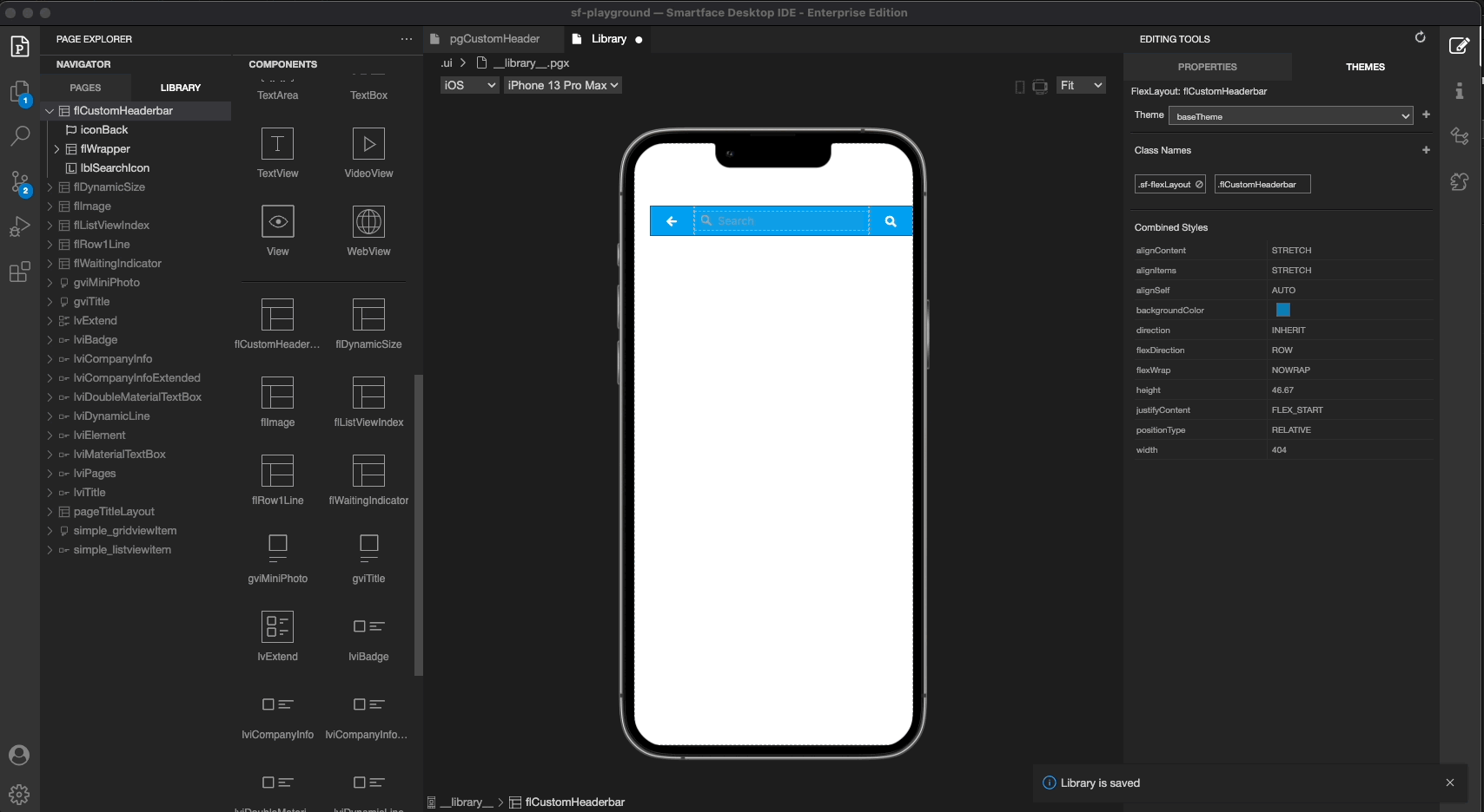
You can create a custom headerBar by creating a custom component in the Library and using it in the headerBar via drag&drop.
- You should remove the
initBackButtonfunction from theonLoadfunction of the page. Otherwise, the native back button will be shown on the headerBar and the custom headerBar will not work as expected. - You shouldn't use
this.headerBar.setLeftItem()orthis.headerBar.setItems()functions when you use custom headerBar. Otherwise, the custom headerBar will not work as expected.
HeaderBar Title Layout
You can wrap your design with a FlexLayout and set that layout to HeaderBar's titleLayout.
Title Layout must be assigned in onLoad method of the Page.
Usage of Title Layout is not something we recommend for you to use.
Title Layout can be used when developer wants to set an ImageView at HeaderBar.
Handling orientation with titleLayout
When using titleLayout together with rotatable pages by setting orientation to AUTO, you should consider different Android and iOS behaviors.
When using it on iOS, you should consider that onOrientationChange event is fired before the change occurs, therefore you should do your resize calculations with care, by using other methods such as timeout.
On Android, the calculations are mostly done by context, therefore keep your calculations to iOS specific.
The components in the example are added from the code for better showcase purposes. To learn more about the subject you can refer to:
Adding Component From CodeAs a best practice, Smartface recommends using the WYSIWYG editor in order to add components and styles to your page or library. To learn how to use UI Editor better, please refer to this documentation
UI Editor Basicsimport PageSampleDesign from 'generated/pages/page3';
import FlexLayout from '@smartface/native/ui/flexlayout';
import Application from '@smartface/native/application';
import HeaderBarItem from '@smartface/native/ui/headerbaritem';
import Color from '@smartface/native/ui/color';
import Image from '@smartface/native/ui/image';
import ImageView from '@smartface/native/ui/imageview';
import { Route, Router } from '@smartface/router';
import { styleableComponentMixin, styleableContainerComponentMixin } from '@smartface/styling-context';
class StyleableFlexLayout extends styleableContainerComponentMixin(FlexLayout) {}
class StyleableImageView extends styleableComponentMixin(ImageView) {}
//You should create new Page from UI-Editor and extend with it.
export default class Sample extends PageSampleDesign {
myFlexLayout: StyleableFlexLayout;
myImageView: StyleableImageView;
myItem: HeaderBarItem;
leftItem: HeaderBarItem;
constructor(private router?: Router, private route?: Route) {
super({});
}
onShow() {
const { headerBar } = this;
super.onShow();
Application.statusBar.visible = true;
headerBar.visible = true;
}
onLoad() {
super.onLoad();
const { headerBar } = this;
this.myItem = new HeaderBarItem({
title: 'Done',
color: Color.BLACK,
onPress: function () {
console.log('You pressed Done item!');
}
});
this.headerBar.setItems([this.myItem]);
this.leftItem = new HeaderBarItem();
this.leftItem.title = 'Left';
this.leftItem.color = Color.BLACK;
this.headerBar.setLeftItem(this.leftItem);
this.myFlexLayout = new StyleableFlexLayout();
this.addChild(this.myFlexLayout, `myFlexLayout`, '.sf-flexLayout', {
width: 250,
height: 50,
backgroundColor: '#000000',
flexProps: {
justifyContent: 'CENTER'
}
});
this.myImageView = new ImageView({
image: Image.createFromFile('images://icon.png')
});
this.myFlexLayout.addChild(this.myImageView, 'myImageView', '.sf-imageView', {
width: 30,
height: 30,
backgroundColor: '#000000',
imageFillType: 'ASPECTFIT'
});
this.headerBar.title = '';
this.headerBar.titleLayout = this.myFlexLayout;
}
}
Headerbar Content Inset (Android)
You can set right and left content inset for HeaderBar.
import Page2Design from 'generated/pages/page2';
import HeaderBarItem from '@smartface/native/ui/headerbaritem';
import { Router, Route } from '@smartface/router';

export default class Page2 extends withDismissAndBackButton(Page2Design) {
  routeData: Record<string, any>;
  parentController: any;
  itemWithBadge: HeaderBarItem;
  constructor(private router?: Router, private route?: Route) {
    super({});
  }

  initHeaderBar() {
    this.headerBar.android.contentInset = {
      left: 100,
      right: 20
    };
    this.headerBar.title = 'Smartface';
  }
  /**
   * @event onShow
   * This event is called when a page appears on the screen (everytime).
   */
  onShow() {
    super.onShow();
    this.headerBar.leftItemEnabled = false;
    this.initBackButton(this.router);
    this.routeData && console.info(this.routeData.message);
    this.initHeaderBar();
  }

  /**
   * @event onLoad
   * This event is called once when page is created.
   */
  onLoad() {
    super.onLoad();
  }
}
ContentInset should be set before other properties like title, titleLayout etc. Otherwise it will not get applied.
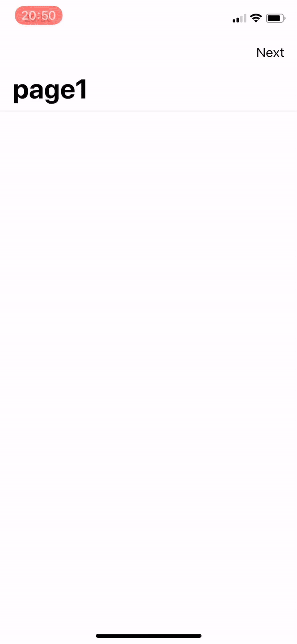
Large Headerbar Title on iOS
Pages may use large titles in the HeaderBar if desired.
prefersLargeTitles property of page's belonging navigator must be set in order to use large title feature
- scripts/start.ts
- scripts/routes/index.ts
- scripts/pages/page1.ts
- scripts/pages/page2.ts
import "@smartface/extension-utils";
import "theme";
import router from "routes";

router.push("/pages/page1");
import { NativeRouter, NativeStackRouter, Route } from '@smartface/router';
import * as Pages from 'pages';
import { themeService } from 'theme';
const headerBarStyle = themeService.getStyle('.sf-headerBar');

const router = NativeRouter.of({
  path: '/',
  isRoot: true,
  routes: [
    NativeStackRouter.of({
      path: '/pages',
      routes: [
        Route.of<Pages.Page1>({
          path: '/pages/page1',
          headerBarParams: () => ({
            visible: headerBarStyle.visible
          }),
          build(router, route) {
            return new Pages.Page1(router, route);
          }
        }),
        Route.of<Pages.Page2>({
          path: '/pages/page2',
          headerBarParams: () => ({
            visible: headerBarStyle.visible
          }),
          build(router, route) {
            return new Pages.Page2(router, route);
          }
        })
      ]
    })
  ]
});

export default router;
import Page1Design from 'generated/pages/page1';
import HeaderBarItem from '@smartface/native/ui/headerbaritem';
import Page from '@smartface/native/ui/page';
import { Route, Router } from '@smartface/router';
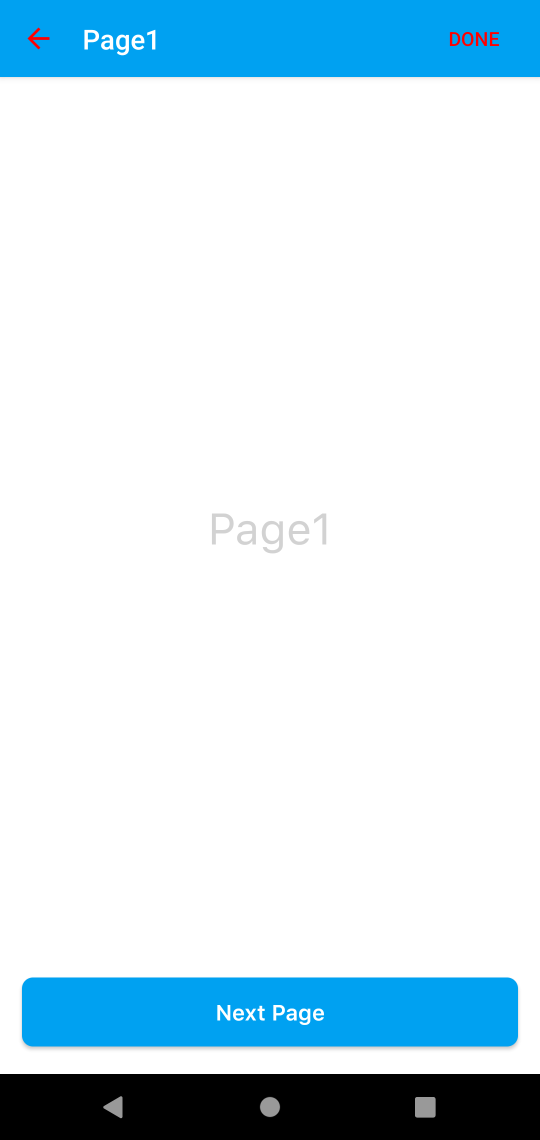
export default class Page1 extends Page1Design {
constructor(private router?: Router, private route?: Route) {
super({});
}
initHeaderbar() {
const myItem = new HeaderBarItem({
title: 'Next',
onPress: () => this.router.push('/pages/page2')
});
this.headerBar.setItems([myItem]);
this.headerBar.title = 'page1';
this.headerBar.ios.largeTitleDisplayMode = Page.iOS.LargeTitleDisplayMode.ALWAYS;
}
onShow() {
super.onShow();
}
onLoad() {
super.onLoad();
this.initHeaderbar();
}
}
import Page2Design from 'generated/pages/page2';
import HeaderBarItem from '@smartface/native/ui/headerbaritem';
import Page from '@smartface/native/ui/page';
import { Route, Router } from '@smartface/router';

export default class Page2 extends Page2Design {
  constructor(private router?: Router, private route?: Route) {
    super({});
  }
  initHeaderbar() {
    const myItem = new HeaderBarItem({
      title: 'Next',
      onPress: () => this.router.push('/pages/page2')
    });
    this.headerBar.setItems([myItem]);
    this.headerBar.title = 'page1';
    this.headerBar.ios.largeTitleDisplayMode = Page.iOS.LargeTitleDisplayMode.ALWAYS;
  }

  onShow() {
    super.onShow();
  }

  onLoad() {
    super.onLoad();
    this.initHeaderbar();
  }
}
Setting Parent Controller Properties On iOS
According to Smartface Router some of headerBar properties are moved parentController. These properties must be set like page.parentController.headerBar.backgroundImage.
These are:
backgroundImagetransparentalphatitleColorvisibleitemColorbackgroundColorheightborderVisibilitybackIndicatorImage// iOS onlytranslucent// iOS only