TextBox
API Reference: UI.TextBox
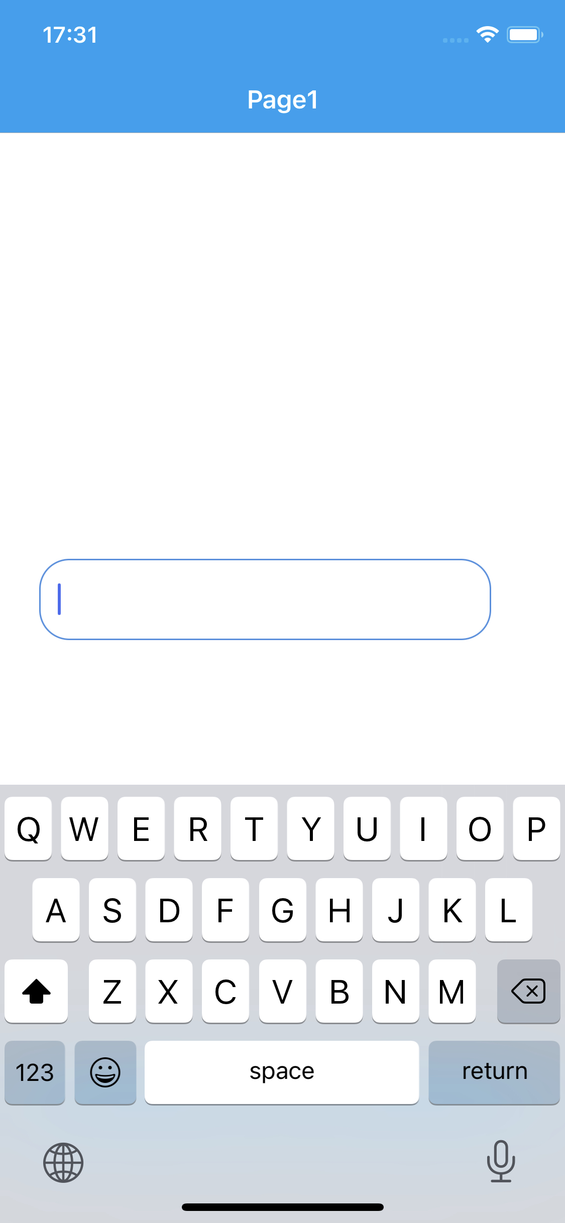
TextBox is a UI object, contents of which is editable by the user.
For Android, the keyboard might not be closed on page transitions. To prevent this behavior, you should call removeFocus() from any textbox before changing the page.
The components in the example are added from the code for better showcase purposes. To learn more about the subject you can refer to:
Adding Component From CodeAs a best practice, Smartface recommends using the WYSIWYG editor in order to add components and styles to your page or library. To learn how to use UI Editor better, please refer to this documentation
UI Editor Basicsimport PageSampleDesign from "generated/pages/pageSample";
import { Route, Router } from "@smartface/router";
import { styleableComponentMixin } from '@smartface/styling-context';
import Application from "@smartface/native/application";
import TextBox from "@smartface/native/ui/textbox";
class StyleableTextBox extends styleableComponentMixin(TextBox) {}
//You should create new Page from UI-Editor and extend with it.
export default class Sample extends PageSampleDesign {
myTextBox: StyleableTextBox;
constructor(private router?: Router, private route?: Route) {
super({});
}
// The page design has been made from the code for better
// showcase purposes. As a best practice, remove this and
// use WYSIWYG editor to style your pages.
centerizeTheChildrenLayout() {
this.dispatch({
type: "updateUserStyle",
userStyle: {
flexProps: {
flexDirection: 'ROW',
justifyContent: 'CENTER',
alignItems: 'CENTER'
}
}
})
}
onShow() {
super.onShow();
const { headerBar } = this;
Application.statusBar.visible = false;
headerBar.visible = false;
}
onLoad() {
super.onLoad();
this.centerizeTheChildrenLayout();
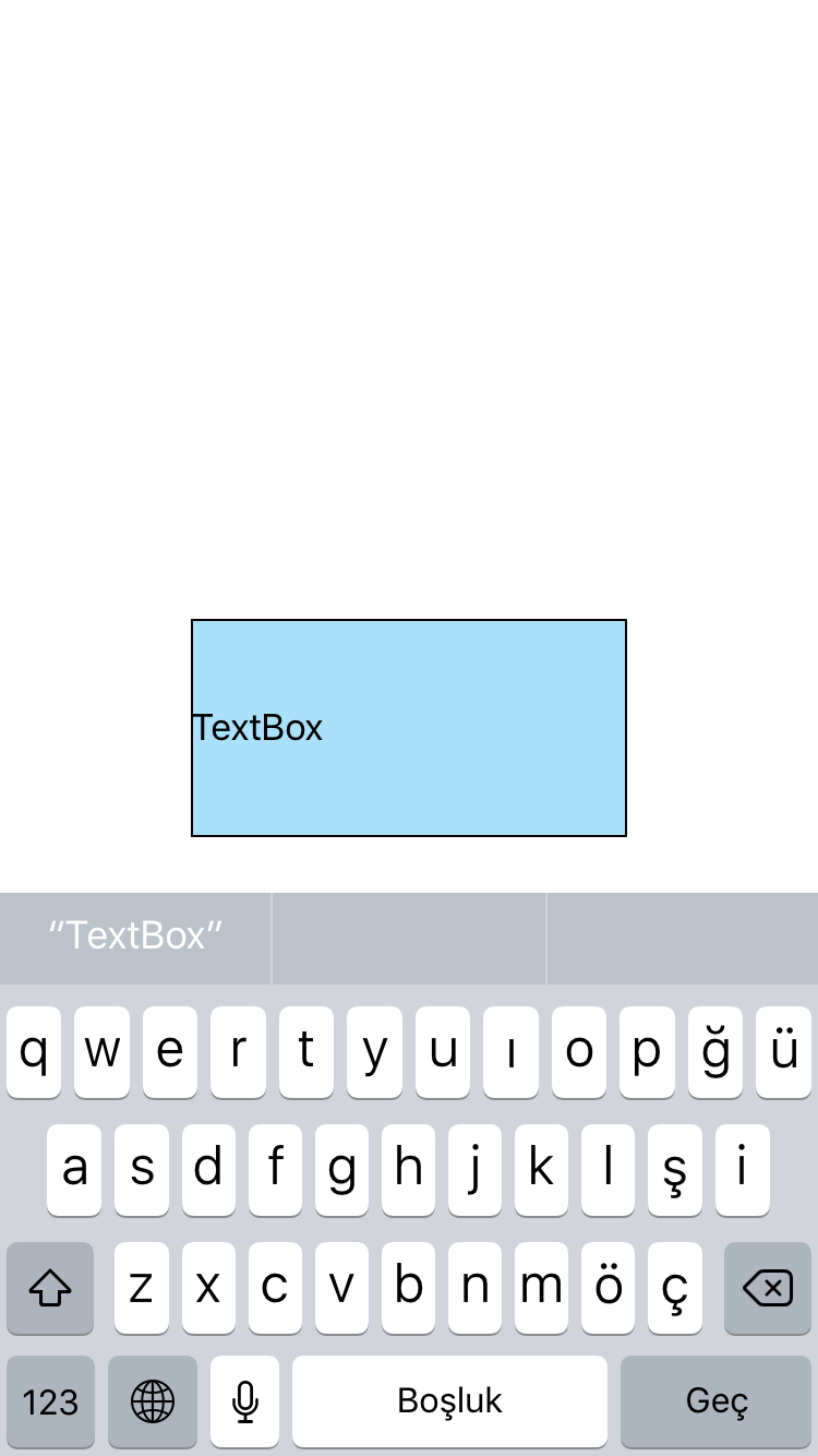
this.myTextBox = new TextBox({
text: "TextBox",
});
this.addChild(this.myTextBox, "myTextBox", ".sf-textBox", {
height: 100,
width: 200,
backgroundColor: "rgba(116, 120, 246, 0.81)",
borderWidth: 1,
borderColor: "#000000",
});
}
}
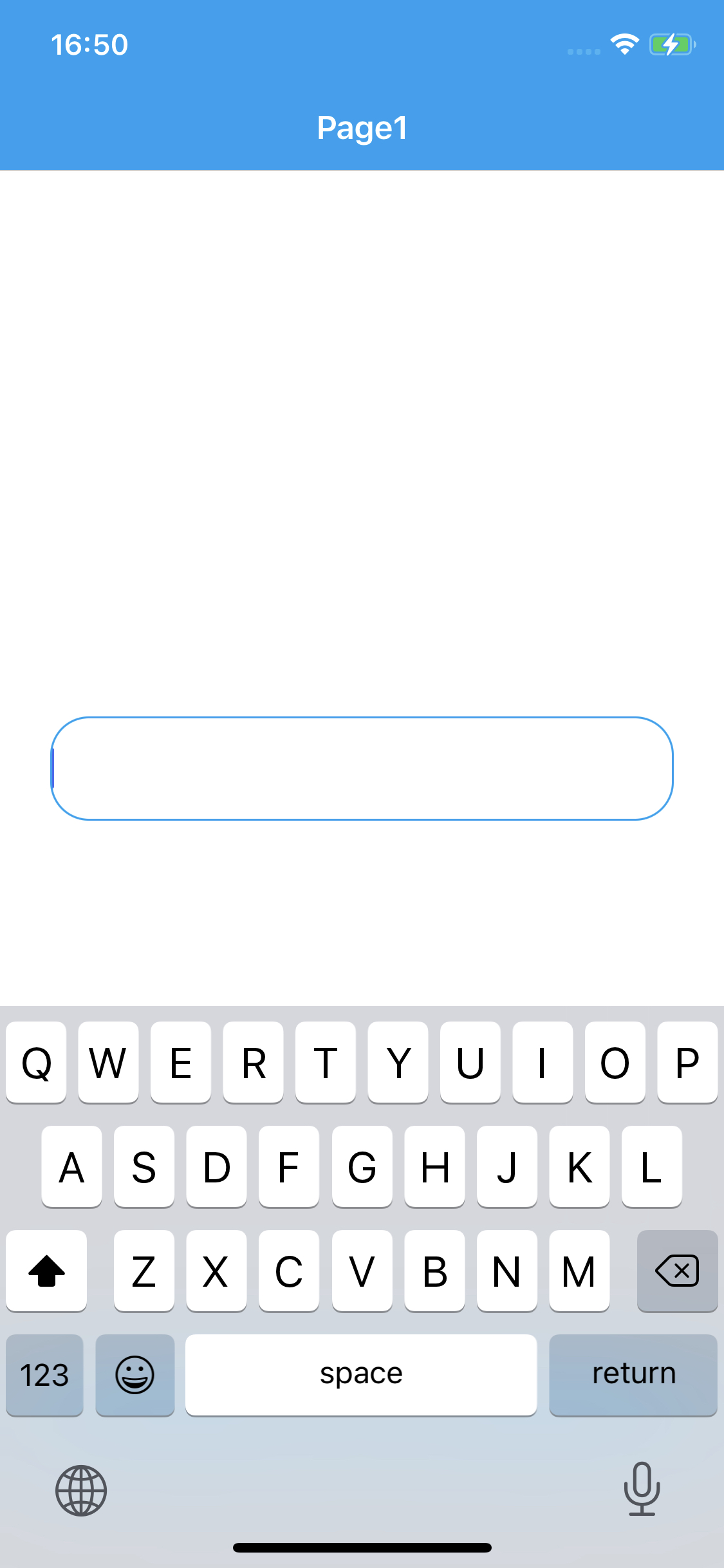
TextBox inputView
The custom input view to display instead of system keyboard when the textbox object became focus. This property works only for iOS only.
The components in the example are added from the code for better showcase purposes. To learn more about the subject you can refer to:
Adding Component From CodeAs a best practice, Smartface recommends using the WYSIWYG editor in order to add components and styles to your page or library. To learn how to use UI Editor better, please refer to this documentation
UI Editor Basicsimport PageSampleDesign from "generated/pages/pageSample";
import { Route, Router } from "@smartface/router";
import { styleableComponentMixin } from '@smartface/styling-context';
import Application from "@smartface/native/application";
import FlexLayout from "@smartface/native/ui/flexlayout";
import TextAlignment from "@smartface/native/ui/textalignment";
import Color from "@smartface/native/ui/color";
import TextBox from "@smartface/native/ui/textbox";
import Picker from "@smartface/native/ui/picker";
class StyleableTextBox extends styleableComponentMixin(TextBox) {}
const items = [
//Text values of the picker
"item 1",
"item 2",
"item 3",
"item 4",
"item 5",
];
//You should create new Page from UI-Editor and extend with it.
export default class Sample extends PageSampleDesign {
constructor(private router?: Router, private route?: Route) {
super({});
}
// The page design has been made from the code for better
// showcase purposes. As a best practice, remove this and
// use WYSIWYG editor to style your pages.
centerizeTheChildrenLayout() {
this.dispatch({
type: "updateUserStyle",
userStyle: {
flexProps: {
flexDirection: 'ROW',
justifyContent: 'CENTER',
alignItems: 'CENTER'
}
}
})
}
onShow() {
super.onShow();
const { headerBar } = this;
Application.statusBar.visible = false;
headerBar.visible = false;
}
onLoad() {
super.onLoad();
this.centerizeTheChildrenLayout();
const myPicker = new Picker({
items: items,
currentIndex: 0,
});
myPicker.onSelected = function (index) {
myTextBox.text = items[index];
};
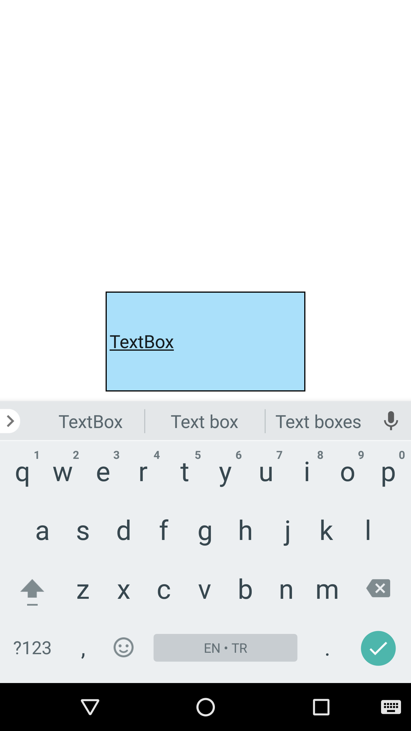
const myTextBox = new StyleableTextBox({
height: 100,
width: 200,
backgroundColor: Color.create("#5500A1F1"),
text: "TextBox",
borderWidth: 1,
textAlignment: TextAlignment.MIDCENTER,
alignSelf: FlexLayout.AlignSelf.CENTER,
});
myTextBox.ios.inputView = {
height: 300,
view: myPicker,
};
this.addChild(myTextBox);
}
}
If you don't want to assign onSelected method and make a free selection, you should take a look into KeyboardLayout document to add a layout above your keyboard.
Border Radius
When the radius is set to the textbox, cursor is nearly invisible at the left side of the textbox. If you want to use TextBox with rounded corners, you can use the our workaround.
Workaround
- Wrap the TextBox with a FlexLayout
- Set the FlexLayout width and height same as the TextBox
- Set the TextBox borderRadius to 0.
- Set the FlexLayout borderRadius based on your needs.
- Set the FlexLayout borderWidth based on your needs.
- Set the FlexLayout paddingLeft to 10 (depends on your UI).
{
  ".radiusWorkaroundFlex": {
    "borderColor": "rgba( 74, 144, 226, 1 )",
    "borderRadius": 20,
    "borderWidth": 1,
    "flexProps": {
      "alignItems": "CENTER",
      "justifyContent": "CENTER"
    },
    "height": 54,
    "paddingLeft": 25,
    "width": 300,
    "&-textBox": {
      "borderRadius": null,
      "borderWidth": null,
      "flexProps": {
        "alignSelf": "CENTER"
      },
      "width": 300
    }
  }
}
- TextBox with radius
- TextBox with radius workaround
Cursor Color
Cursor Color have different behaviors in iOS and Android. For more information, please refer to the following documentation:
Cursor Color