BottomTabBar
Overview
API Reference: UI.BottomTabBar
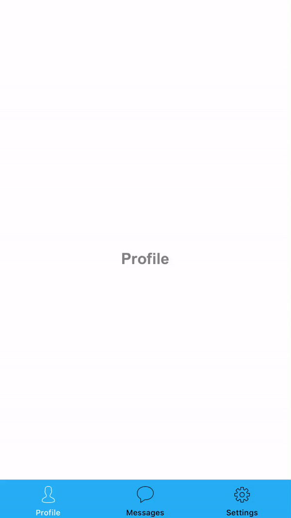
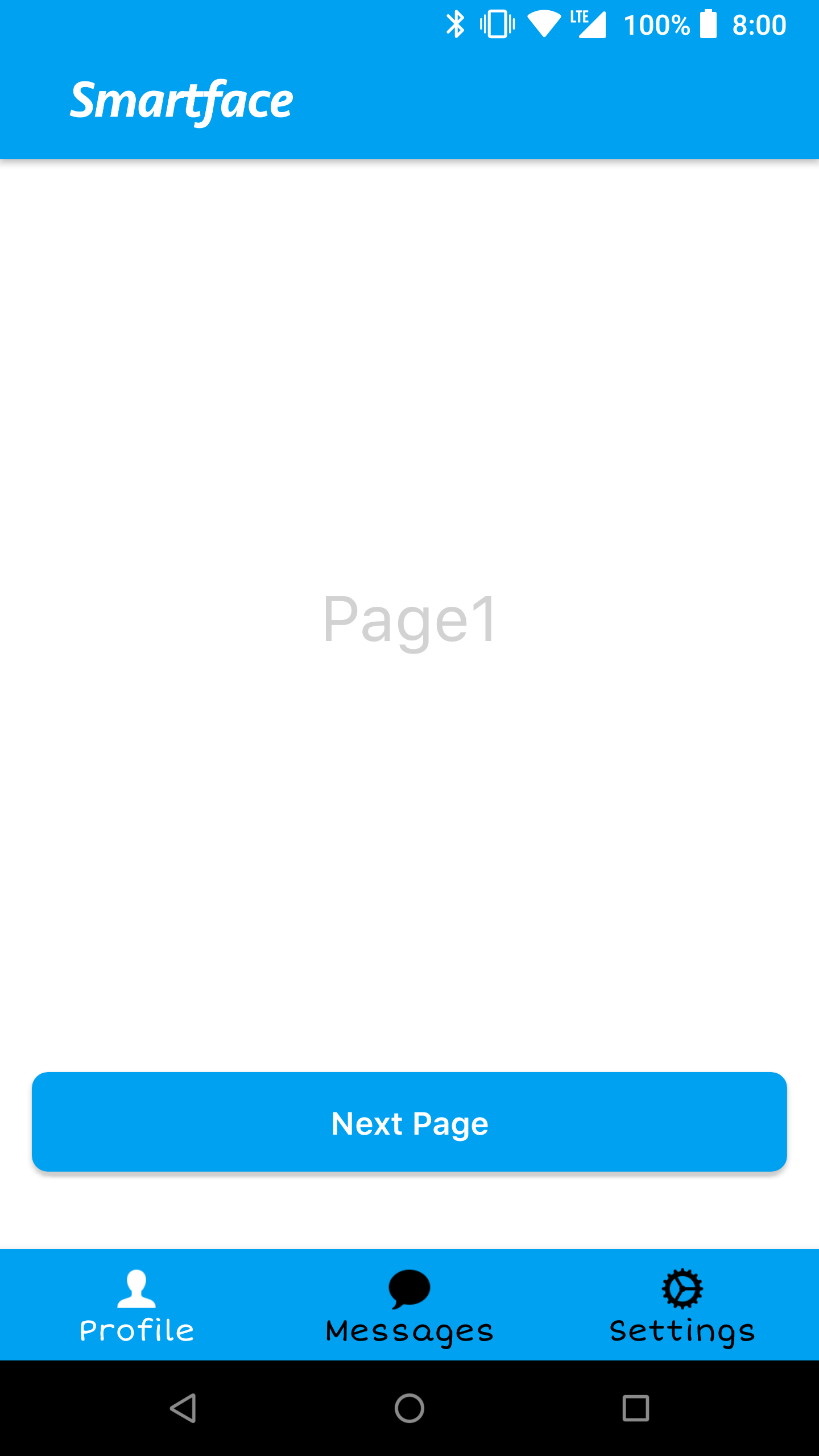
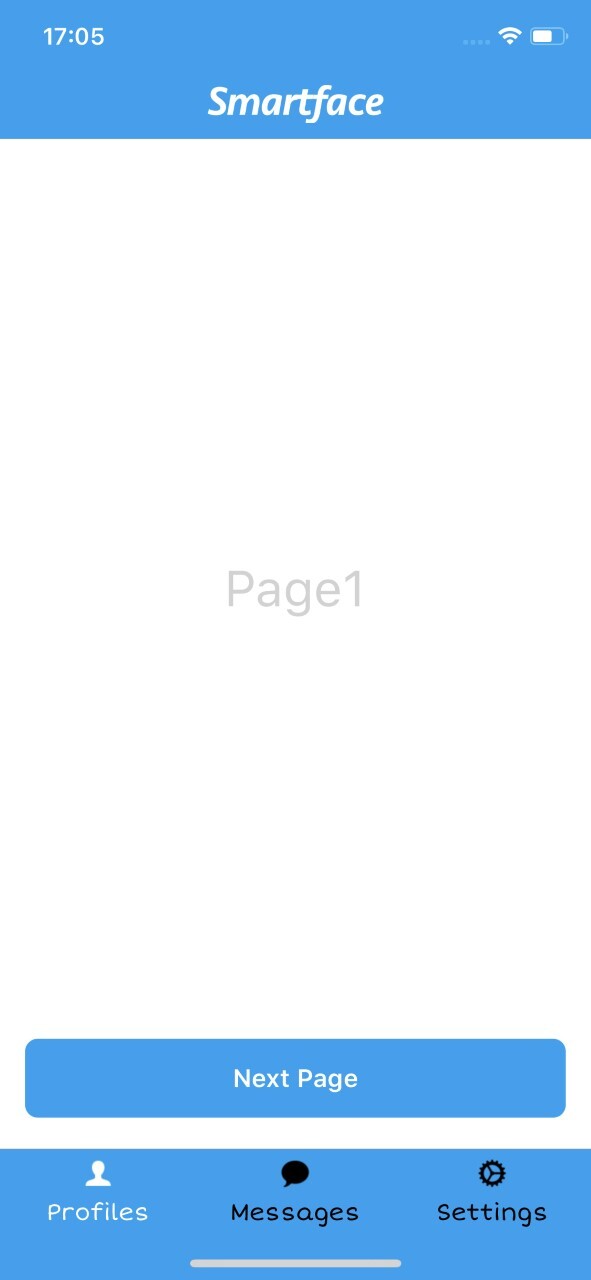
BottomTabBar is an UI object. It is used for navigating between pages using tab bar items. Each tab bar item has title, icon and page. If the individual tab has an Icon, icons must be set two types as selected and normal.
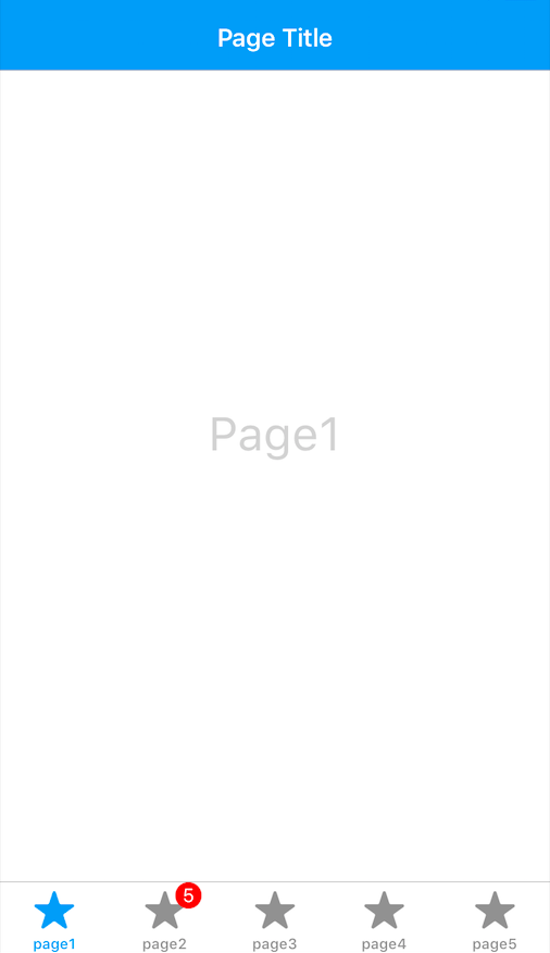
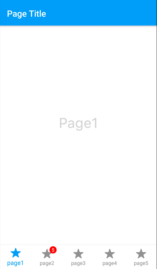
On Android side, you can not add more than five tab bar items to bottom tab bar.
The components in the example are added from the code for better showcase purposes. To learn more about the subject you can refer to:
Adding Component From CodeAs a best practice, Smartface recommends using the WYSIWYG editor in order to add components and styles to your page or library. To learn how to use UI Editor better, please refer to this documentation
UI Editor BasicsCreate 3 different page from UI editor named like
- pgProfile
- pgMessages
- pgSettings
and export them from the pages/index.ts file.
export { default as PgProfile } from "./pgProfile";
export { default as PgMessages } from "./pgMessages";
export { default as PgSettings } from "./pgSettings";
- scripts/routes/tabbar.ts
- scripts/routes/index.ts
- scripts/start.ts
import {
  BottomTabBarRouter,
  NativeStackRouter,
  Route,
} from "@smartface/router";
import Color from "@smartface/native/ui/color";
import * as Pages from "pages";
import Image from "@smartface/native/ui/image";

const bottomTabBarRouter = BottomTabBarRouter.of({
  path: "/btb",
  to: "/btb/tab1/pgProfile",
  homeRoute: 0,
  tabbarParams: () => ({
    ios: { translucent: false },
    itemColor: {
      normal: Color.BLACK,
      selected: Color.WHITE,
    },
    backgroundColor: Color.create("#00A1F1"),
  }),
  items: [
    {
      title: "Profile",
      icon: Image.createFromFile("images://profile.png"),
    },
    {
      title: "Messages",
      icon: Image.createFromFile("images://messages.png"),
    },
    {
      title: "Settings",
      icon: Image.createFromFile("images://settings.png"),
    },
  ],
  routes: [
    // tab1
    NativeStackRouter.of({
      path: "/btb/tab1",
      to: "/btb/tab1/pgProfile",
      routes: [
        Route.of<Pages.PgProfile>({
          path: `/btb/tab1/pgProfile`,
          build(router, route) {
            return new Pages.PgProfile(router, route);
          },
          headerBarParams: () => ({
            visible: true,
          }),
        }),
      ],
    }),
    NativeStackRouter.of({
      path: "/btb/tab2",
      to: "/btb/tab2/pgMessages",
      routes: [
        Route.of<Pages.PgMessages>({
          path: `/btb/tab2/pgMessages`,
          build(router, route) {
            return new Pages.PgMessages(router, route);
          },
          headerBarParams: () => ({
            visible: true,
          }),
        }),
      ],
    }),
    NativeStackRouter.of({
      path: "/btb/tab3",
      to: "/btb/tab3/pgSettings",
      routes: [
        Route.of<Pages.PgSettings>({
          path: `/btb/tab3/pgSettings`,
          build(router, route) {
            return new Pages.PgSettings(router, route);
          },
          headerBarParams: () => ({
            visible: true,
          }),
        }),
      ],
    }),
  ],
});

export default bottomTabBarRouter;
import { NativeRouter } from "@smartface/router";
import Application from "@smartface/native/application";
import TabbarRoute from "./tabbar";

Application.on("backButtonPressed", () => {
  NativeRouter.getActiveRouter()?.goBack();
});

const router = NativeRouter.of({
  path: "/",
  isRoot: true,
  routes: [TabbarRoute],
});

export default router;
import "theme";
import router from "routes";

router.push("/btb");
Please check this guideline before choosing your custom TabBarItem icons.
To save time by loading Tabbar, you can optionally call the constructor function in advance.
BottomTabbar Badge
BottomTabBar Badge has a circular or elliptical background, displayed on top-right to the BottomTabBarItem.
- scripts/start.ts
- scripts/routes/index.ts
import "theme";
import router from "routes";

router.push("/btb");
Don't forget to add the star.png image to the project
import Image from "@smartface/native/ui/image";
import {
  BottomTabBarRouter,
  Route,
  NativeRouter,
  NativeStackRouter,
} from "@smartface/router";
import Color from "@smartface/native/ui/color";
import * as Pages from "pages";
import TabBarItem from "@smartface/native/ui/tabbaritem";

let btbItemMessages = new TabBarItem();
btbItemMessages.title = "Settings";
btbItemMessages.badge.text = "1000";
btbItemMessages.icon = "images://star.png";
btbItemMessages.badge.backgroundColor = Color.RED;
btbItemMessages.badge.textColor = Color.WHITE;
btbItemMessages.badge.visible = true; // default false

if (parseInt(btbItemMessages.badge.text) > 99) {
  btbItemMessages.badge.text = "99+";
}

const router = NativeRouter.of({
  path: "/",
  isRoot: true,
  routes: [
    BottomTabBarRouter.of({
      path: "/btb",
      to: "/btb/tab1/pgProfile",
      homeRoute: 0,

      tabbarParams: () => ({
        ios: { translucent: false },
        itemColor: {
          normal: Color.BLACK,
          selected: Color.WHITE,
        },
        backgroundColor: Color.create("#00A1F1"),
      }),
      items: [
        {
          title: "Profile",
          icon: Image.createFromFile("images://star.png"),
        },
        btbItemMessages,
        {
          title: "Settings",
          icon: Image.createFromFile("images://star.png"),
        },
      ],
      routes: [
        // tab1
        NativeStackRouter.of({
          path: "/btb/tab1",
          to: "/btb/tab1/pgProfile",
          routes: [
            Route.of<Pages.PgProfile>({
              path: `/btb/tab1/pgProfile`,
              build(router, route) {
                return new Pages.PgProfile(router, route);
              },
              headerBarParams: () => ({
                visible: true,
              }),
            }),
          ],
        }),
        NativeStackRouter.of({
          path: "/btb/tab2",
          to: "/btb/tab2/pgMessages",
          routes: [
            Route.of<Pages.PgMessages>({
              path: `/btb/tab2/pgMessages`,
              build(router, route) {
                return new Pages.PgMessages(router, route);
              },
              headerBarParams: () => ({
                visible: true,
              }),
            }),
          ],
        }),
        NativeStackRouter.of({
          path: "/btb/tab3",
          to: "/btb/tab3/pgSettings",
          routes: [
            Route.of<Pages.PgSettings>({
              path: `/btb/tab3/pgSettings`,
              build(router, route) {
                return new Pages.PgSettings(router, route);
              },
              headerBarParams: () => ({
                visible: true,
              }),
            }),
          ],
        }),
      ],
    }),
  ],
});
export default router;
On iOS, when BottomTabBarItem icon's size is big, badge can be positioned wrong by default. You should call move function for fix this problem.
Recommended and default icon size is 25x25. If you want to use bigger or smaller icons, you should set iconSize property.
BottomTabBar Font Change
- scripts/routes/tabbar.ts
- HeaderBar Style Json
import {
  BottomTabBarRouter,
  NativeStackRouter,
  Route,
  NativeRouter,
} from "@smartface/router";
import Color from "@smartface/native/ui/color";
import * as Pages from "pages";
import Image from "@smartface/native/ui/image";
import { themeService } from "theme";
import TabBarItem from "@smartface/native/ui/tabbaritem";
import System from "@smartface/native/device/system";
import AttributedString from "@smartface/native/global/attributedstring";

const tabbarFont = themeService.getNativeStyle(".sf-headerBar").font;

const setBtbItems = () => {
  const BtbItems = [];
  btbItems.forEach((item) => {
    let title = { title: item.title };
    let icon = { icon: Image.createFromFile(`${item.icon}`) };
    let btbItemProperties = { ...title, ...icon };

    const btbItem = new TabBarItem(btbItemProperties);

    if (System.OS === System.OSType.ANDROID) {
      btbItem.android.attributedTitle = new AttributedString({
        string: item.title,
        font: tabbarFont,
      });
    } else {
      btbItem.ios.font = tabbarFont;
    }
    BtbItems.push(btbItem);
  });

  return BtbItems;
};

const btbItems = [
  {
    title: "Profiles",
    icon: "images://profile.png",
  },
  {
    title: "Messages",
    icon: "images://messages.png",
  },
  {
    title: "Settings",
    icon: "images://settings.png",
  },
];

const bottomTabBarRouter = BottomTabBarRouter.of({
  path: "/btb",
  to: "/btb/tab1/page1",
  homeRoute: 0,
  tabbarParams: () => ({
    ios: { translucent: false },
    itemColor: {
      normal: Color.BLACK,
      selected: Color.WHITE,
    },
    backgroundColor: Color.create("#00A1F1"),
    iconSize: 25,
  }),
  items: setBtbItems(),
  // tab1
  routes: [
    // tab1
    NativeStackRouter.of({
      path: "/btb/tab1",
      to: "/btb/tab1/page1",
      routes: [
        Route.of<Pages.Page1>({
          path: `/btb/tab1/page1`,
          build(router, route) {
            return new Pages.Page1(router, route);
          },
          headerBarParams: () => ({
            visible: true,
          }),
        }),
      ],
    }),
    NativeStackRouter.of({
      path: "/btb/tab2",
      to: "/btb/tab2/page2",
      routes: [
        Route.of<Pages.Page2>({
          path: `/btb/tab1/page2`,
          build(router, route) {
            return new Pages.Page2(router, route);
          },
          headerBarParams: () => ({
            visible: true,
          }),
        }),
      ],
    }),
    NativeStackRouter.of({
      path: "/btb/tab3",
      to: "/btb/tab3/page3",
      routes: [
        Route.of<Pages.Page3>({
          path: `/btb/tab3/page3`,
          build(router, route) {
            return new Pages.Page3(router, route);
          },
          headerBarParams: () => ({
            visible: true,
          }),
        }),
      ],
    }),
  ],
});

export default bottomTabBarRouter;
{
  ".sf-headerBar": {
    "masksToBounds": true,
    "visible": true,
    "backgroundColor": "#00a1f1",
    "titleColor": "#ffffff",
    "itemColor": "#ffffff",
    "font": {
      "size": 15,
      "bold": false,
      "italic": false,
      "family": "ShortStack"
    }
  }
}
On Android BottomTabbarItems animates when clicked but badge have no animation. In order to have a better experience disableItemAnimation can be used.
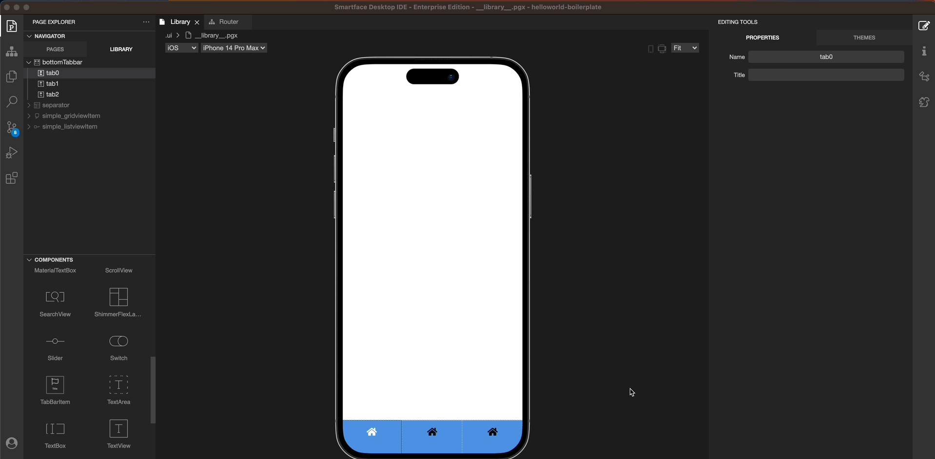
Adding BottomTabBar from Library
Adding a BottomTabBar from the library is remarkably effortless. Once you open the library, you will see the BottomTabBar component.
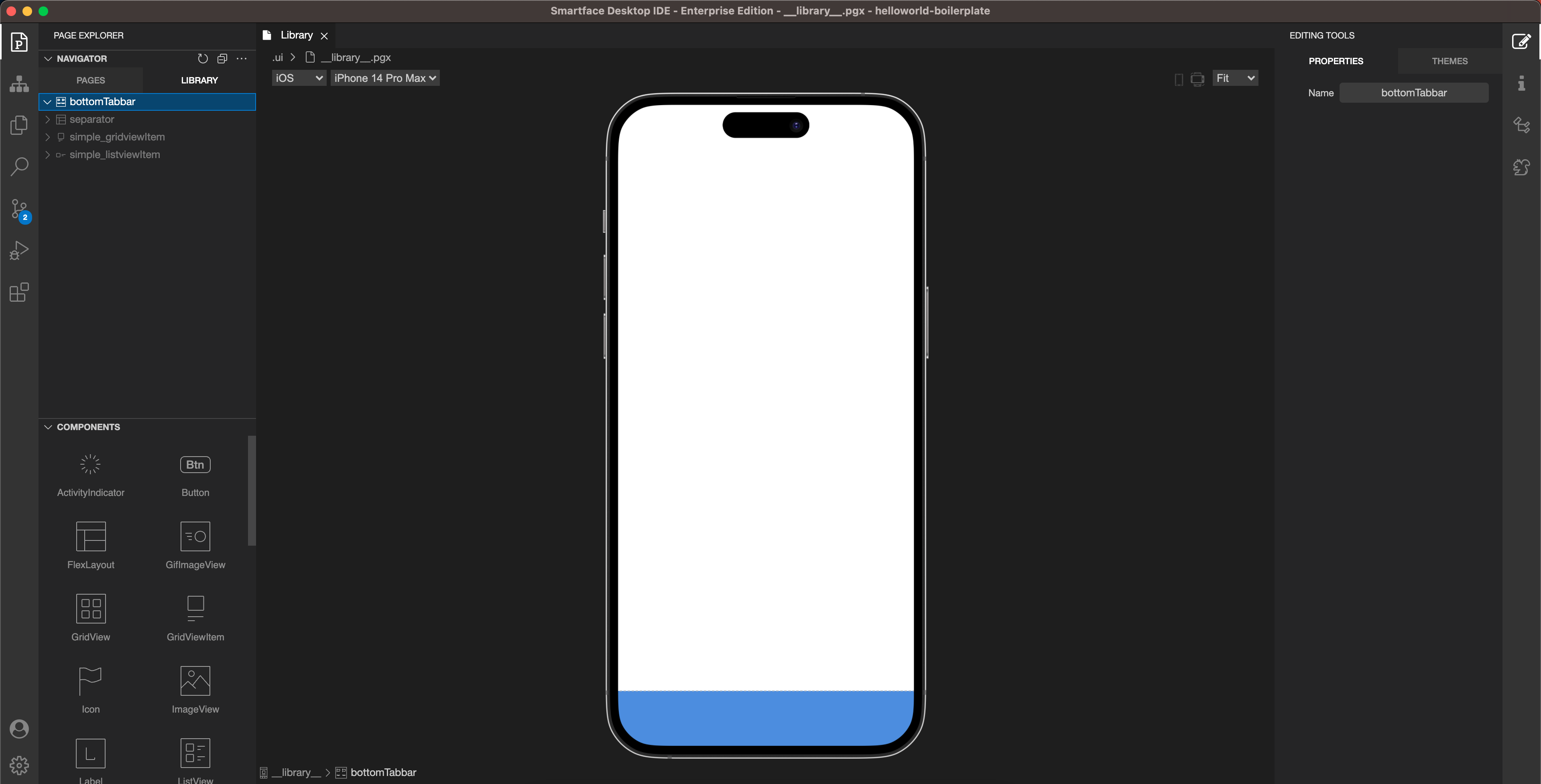
You can configure the BottomTabBar component from the theme section. You have the option to change the color of the selected and unselected items, the background color of the BottomTabBar, and the size of the icons.
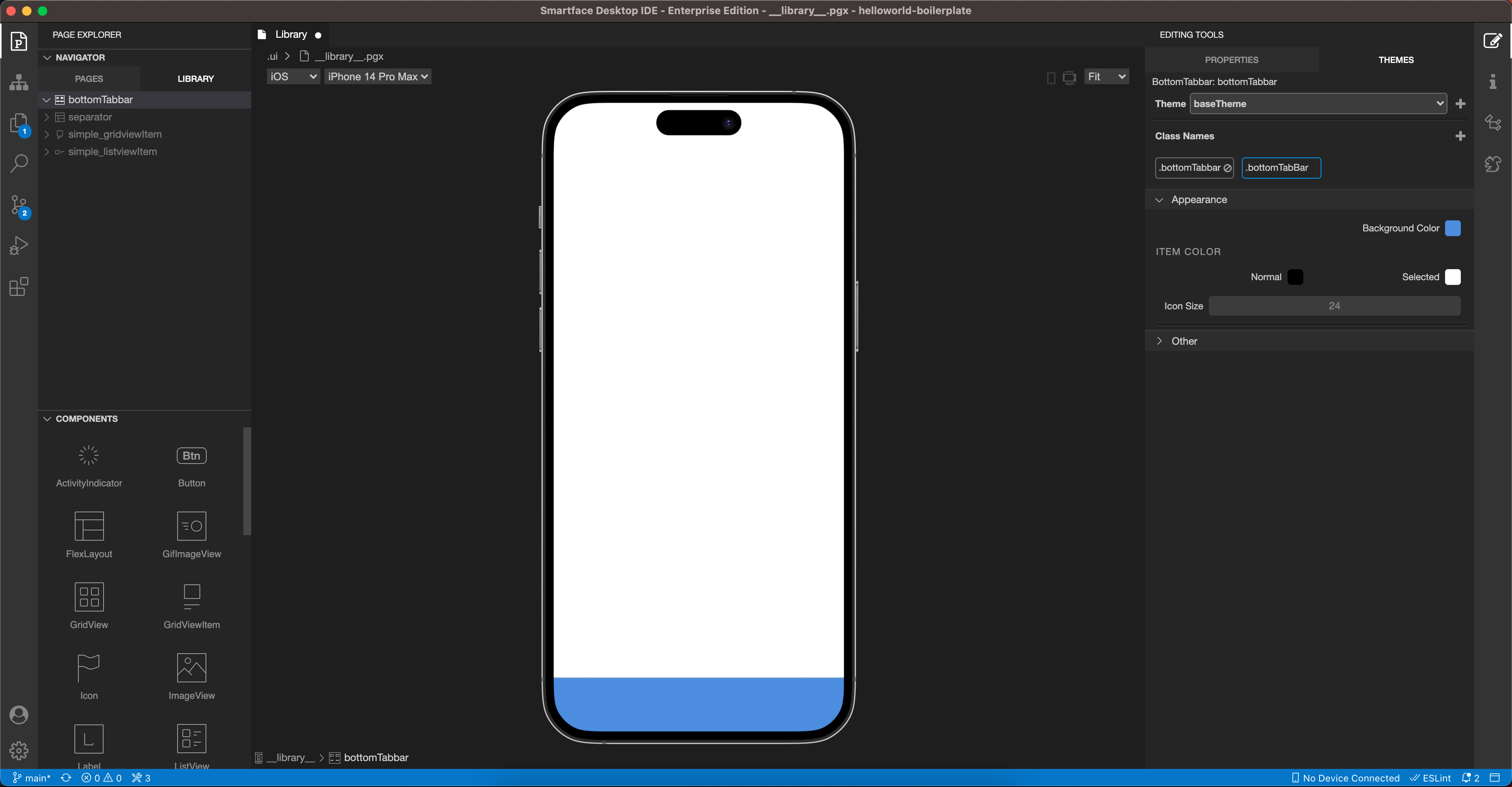
You can add the TabbarItem component by simply dragging it from the components to BottomTabBar.
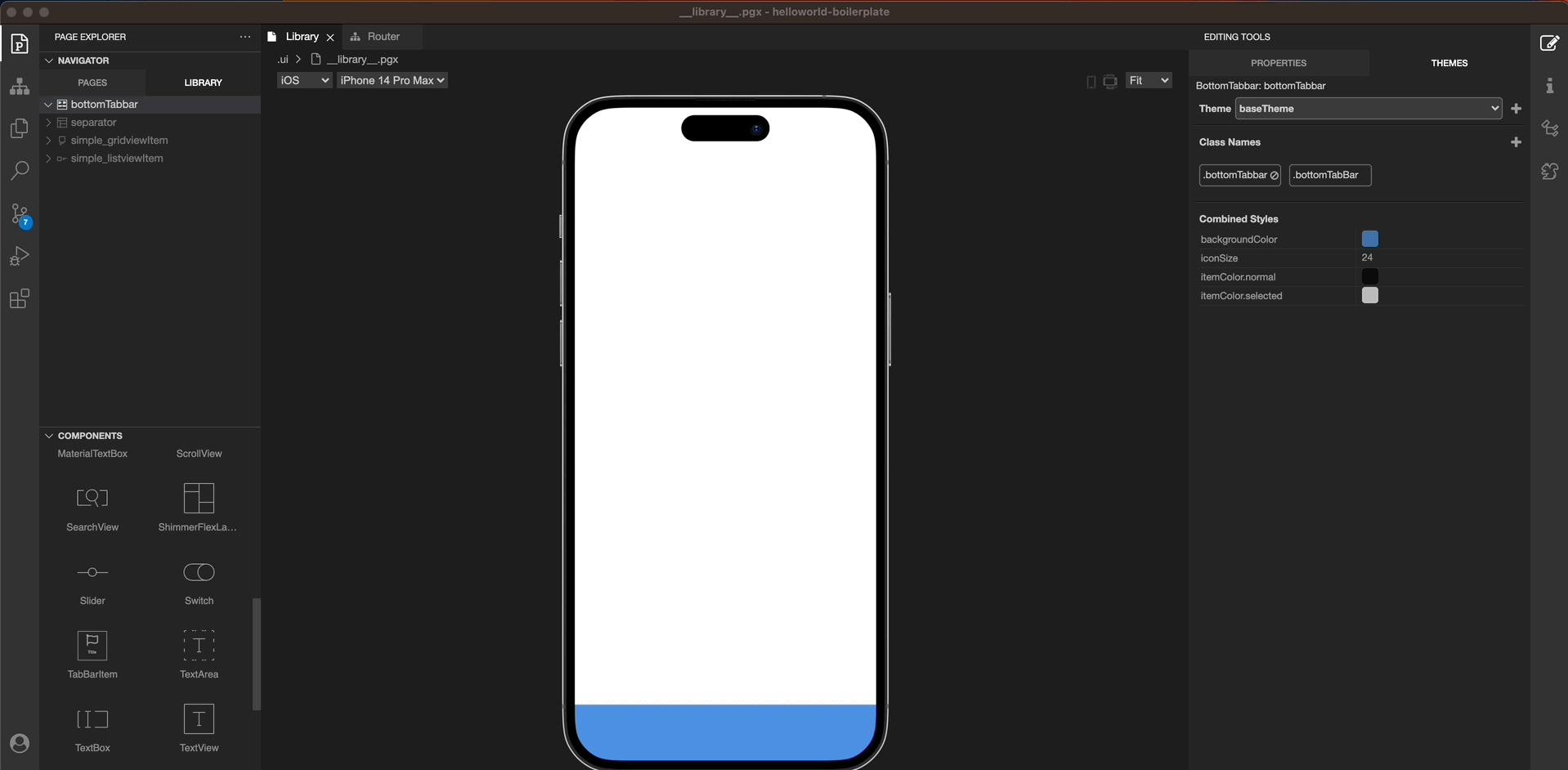
You can add a title and an icon to each TabbarItem from the properties and theme sections respectively.
The BottomTabBar component is compatible with the Router Explorer. If you have a StackRouter added under the BottomTabBar Router, you should add a TabBarItem for each StackRouter.
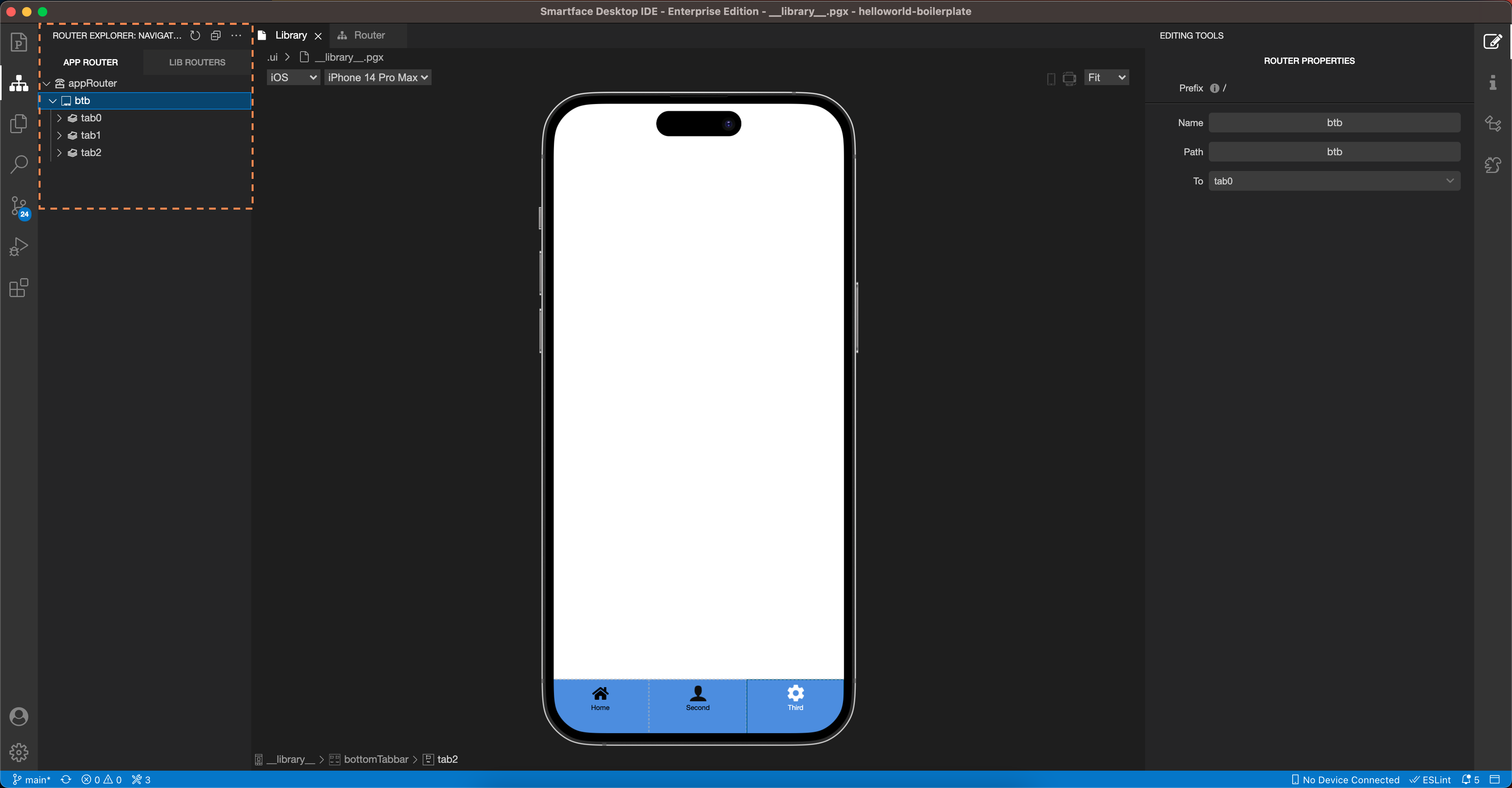
To see the BottomTabBar in your application, all you need to do is change the starting route in the start.ts file.
import "theme";
import router from "router";
router.push("/btb");