Dialog
Overview
API Reference: UI.Dialog
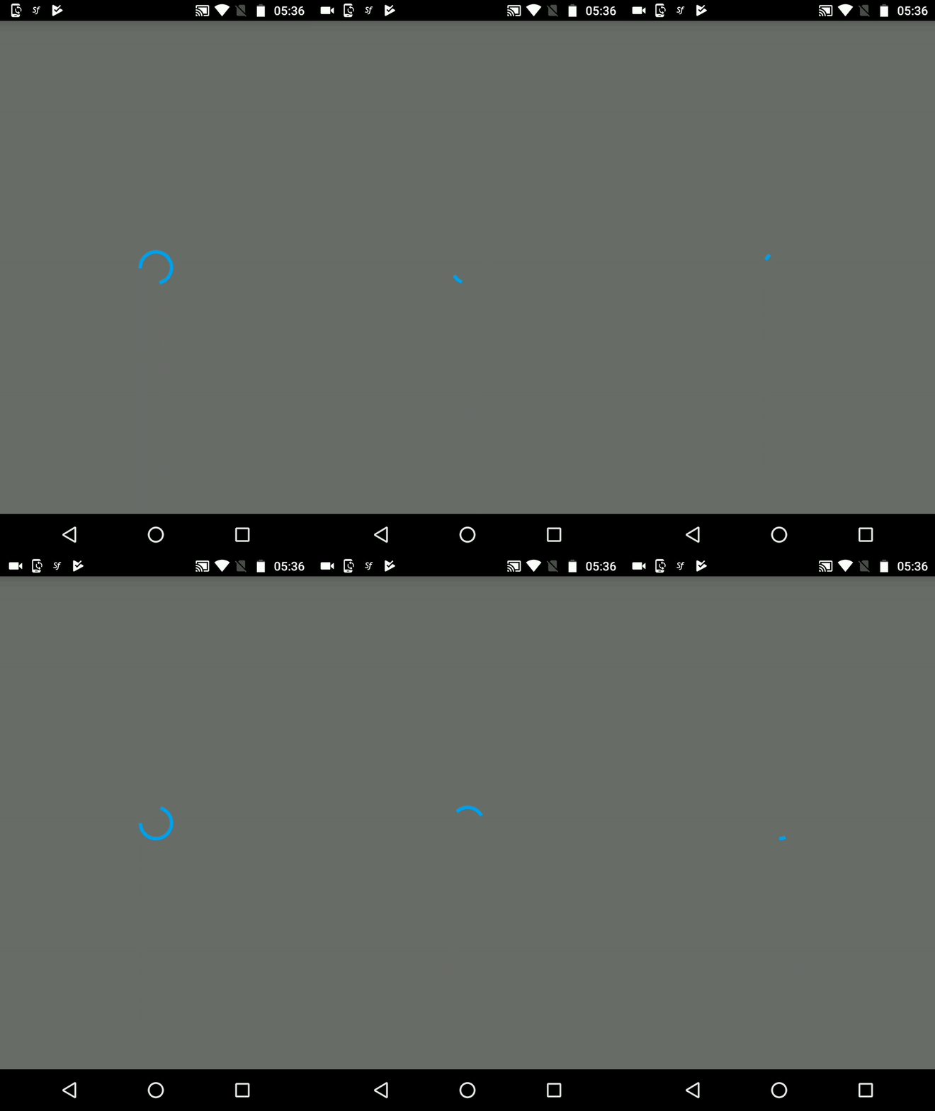
Dialog is a fullscreen layout to display things like activity indicator and etc.
The components in the example are added from the code for better showcase purposes. To learn more about the subject you can refer to:
Adding Component From CodeAs a best practice, Smartface recommends using the WYSIWYG editor in order to add components and styles to your page or library. To learn how to use UI Editor better, please refer to this documentation
UI Editor Basicsimport PageSampleDesign from "generated/pages/pageSample";
import FlexLayout from "@smartface/native/ui/flexlayout";
import Application from "@smartface/native/application";
import System from "@smartface/native/device/system";
import Dialog from "@smartface/native/ui/dialog";
import { DialogStyle } from "@smartface/native/ui/dialog/dialog";
import ActivityIndicator from "@smartface/native/ui/activityindicator";
import { Route, Router } from "@smartface/router";
import { styleableComponentMixin } from "@smartface/styling-context";
import { withDismissAndBackButton } from "@smartface/mixins";
class StyleableActivityIndicator extends styleableComponentMixin(
ActivityIndicator
) {}
//You should create new Page from UI-Editor and extend with it.
export default class Sample extends withDismissAndBackButton(PageSampleDesign) {
myDialog: Dialog;
myActivityIndicator: StyleableActivityIndicator;
constructor(private router?: Router, private route?: Route) {
super({});
}
onShow() {
super.onShow();
const { headerBar } =
System.OS === System.OSType.ANDROID ? this : this.parentController;
Application.statusBar.visible = false;
headerBar.visible = false;
}
onLoad() {
super.onLoad();
this.myDialog = new Dialog({
android: {
themeStyle: DialogStyle.ThemeNoHeaderBar, // Show StatusBar
},
});
this.myDialog.layout.alignItems = FlexLayout.AlignItems.CENTER;
this.myDialog.layout.justifyContent = FlexLayout.JustifyContent.CENTER;
this.myActivityIndicator = new StyleableActivityIndicator();
this.myDialog.layout.addChild(this.myActivityIndicator);
this.myDialog.show();
}
}


When to Use Dialog
When not to use dialog:
- For simple actions like "yes" and "no", alert is better
- For selecting something as pop-up, menu is better
- For selecting date, datepicker is better
- For selecting other stuff, picker is better
When to use dialog:
- If you need a screen wide indicator
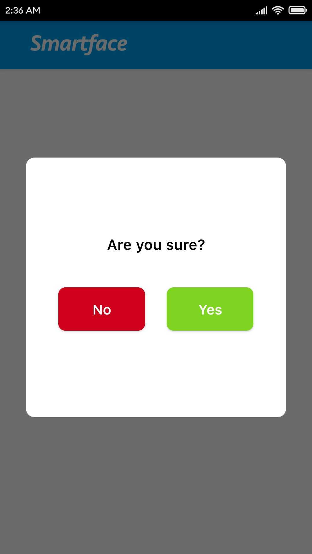
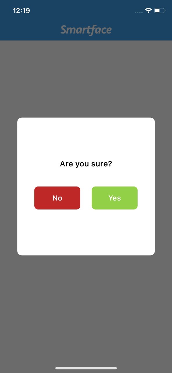
- If you don't like the native components and want to use custom alert or picker etc., you should use dialog and design your component on top of it.
- If you need to blur out the screen without changing anything, dialog is a strong alternative
Dialog is mainly used for rendering custom components on top of the page and should only be used if alert or menu cannot be used.
Custom Dialog Component
The components in the example are added from the code for better showcase purposes. To learn more about the subject you can refer to:
Adding Component From CodeAs a best practice, Smartface recommends using the WYSIWYG editor in order to add components and styles to your page or library. To learn how to use UI Editor better, please refer to this documentation
UI Editor Basics- Dialog UI
- dialog.ts
- Page
{
  "components": [
    {
      "className": ".sf-flexLayout",
      "id": "82bd-a88d-501c-d24b",
      "props": {
        "children": ["e48e-5345-3882-2622"],
        "name": "flDialog",
        "parent": "57f4-201f-4bfc-5fc6"
      },
      "source": {
        "page": "__library__"
      },
      "type": "FlexLayout",
      "userProps": {
        "flexProps": {
          "flexGrow": 1,
          "alignItems": "CENTER",
          "justifyContent": "CENTER",
          "alignSelf": "CENTER"
        }
      }
    },
    {
      "className": ".sf-flexLayout",
      "id": "e48e-5345-3882-2622",
      "props": {
        "children": ["9e30-7755-37fd-c44c", "b6ab-f1a0-ef05-769a"],
        "name": "flWrapper",
        "parent": "82bd-a88d-501c-d24b"
      },
      "source": {
        "page": "__library__"
      },
      "type": "FlexLayout",
      "userProps": {
        "backgroundColor": "rgba( 255, 255, 255, 1 )",
        "borderRadius": 10,
        "flexProps": {
          "alignItems": "CENTER",
          "flexDirection": "COLUMN",
          "justifyContent": "CENTER"
        },
        "height": 300,
        "width": 300
      }
    },
    {
      "className": ".sf-label",
      "id": "9e30-7755-37fd-c44c",
      "props": {
        "children": [],
        "name": "lblText",
        "parent": "e48e-5345-3882-2622",
        "text": "Are you sure?"
      },
      "source": {
        "page": "__library__"
      },
      "type": "Label",
      "userProps": {
        "font": {
          "size": 17,
          "bold": true,
          "italic": false,
          "family": "SFProText",
          "style": "Semibold"
        },
        "text": "Are you sure?",
        "textAlignment": "MIDCENTER",
        "textColor": "rgba( 0, 0, 0, 1 )",
        "width": 150
      }
    },
    {
      "className": ".sf-flexLayout",
      "id": "b6ab-f1a0-ef05-769a",
      "props": {
        "children": ["997f-b48c-f6d9-74c5", "dde6-bffc-3a19-eb15"],
        "name": "flDialogButtonWrapper",
        "parent": "e48e-5345-3882-2622"
      },
      "source": {
        "page": "__library__"
      },
      "type": "FlexLayout",
      "userProps": {
        "flexProps": {
          "flexDirection": "ROW",
          "justifyContent": "SPACE_AROUND",
          "alignItems": "CENTER"
        },
        "height": 100,
        "width": 250
      }
    },
    {
      "className": ".sf-button",
      "id": "997f-b48c-f6d9-74c5",
      "props": {
        "children": [],
        "name": "btnNo",
        "parent": "b6ab-f1a0-ef05-769a",
        "text": "No"
      },
      "source": {
        "page": "__library__"
      },
      "type": "Button",
      "userProps": {
        "backgroundColor": "rgba( 208, 2, 27, 1 )",
        "text": "No",
        "width": 100,
        "height": 45
      }
    },
    {
      "className": ".sf-button",
      "id": "dde6-bffc-3a19-eb15",
      "props": {
        "children": [],
        "name": "btnOk",
        "parent": "b6ab-f1a0-ef05-769a",
        "text": "Yes"
      },
      "source": {
        "page": "__library__"
      },
      "type": "Button",
      "userProps": {
        "backgroundColor": "rgba( 126, 211, 33, 1 )",
        "text": "Yes",
        "width": 100,
        "height": 45
      }
    }
  ]
}
import Dialog from "@smartface/native/ui/dialog";
import FlDialog from "components/FlDialog";
import { themeService } from "theme";
import FlexLayout from "@smartface/native/ui/flexlayout";
import { StyleContextComponentType } from "@smartface/styling-context";
import { DialogStyle } from "@smartface/native/ui/dialog/dialog";

var waitDialog = null;
var activeDialogCounter = 0;

function initWaitDialog() {
  let dialog = new Dialog({
    android: {
      themeStyle: DialogStyle.ThemeNoHeaderBar,
      cancelable: false,
    },
  }) as StyleContextComponentType<Dialog>;
  const component = new FlDialog();

  component.btnOk.on("press", () => {
    console.log("Button Yes Pressed");
    waitDialog.hide();
  });

  component.btnNo.on("press", () => {
    console.log("Button No Pressed");
    waitDialog.hide();
  });

  themeService.addGlobalComponent(component, "flDialog");
  themeService.addGlobalComponent(dialog.layout, "dialog");
  (dialog.layout as StyleContextComponentType<FlexLayout>).dispatch({
    type: "pushClassNames",
    classNames: ".dialog",
  });
  dialog.android.isTransparent = false;
  component.onTouch = () => {
    return true;
  };
  //@ts-ignore
  dialog.layout.addChild(component, "waitDialogComp");

  return dialog;
}

export const showWaitDialog = () => {
  if (!waitDialog) {
    waitDialog = initWaitDialog();
  }
  activeDialogCounter++ === 0 && waitDialog.show();
};

export const hideWaitDialog = (timeout = 0) => {
  if (waitDialog && activeDialogCounter > 0 && --activeDialogCounter === 0) {
    if (timeout) {
      setTimeout(() => waitDialog.hide(), timeout);
    } else {
      waitDialog.hide();
    }
  }
};
import Page1Design from "generated/pages/page1";
import { Route, Router } from "@smartface/router";
import { withDismissAndBackButton } from "@smartface/mixins";
import { hideWaitDialog, showWaitDialog } from "lib/dialog";

export default class Page1 extends withDismissAndBackButton(Page1Design) {
  constructor(private router?: Router, private route?: Route) {
    super({});
  }

  onShow() {
    super.onShow();
    showWaitDialog(); // show dialog

    setTimeout(() => {
      hideWaitDialog(); // hide dialog
    }, 3000);
  }
  onLoad() {
    super.onLoad();
  }
}
For another usage. You can change your Dialog UI based on upper code example. Just remove buttons and text, and place your UI elements what ever you want.
- For example you can use the activityIndicator
- For example you can use the image
Screenshots

