Picker
Overview
API Reference: UI.Picker
Picker is a UI View that allows you to create a list from which the user can pick a single item. There are several usages for Picker.
- add as a child View to layout
- show Picker as a dialog, by calling the show() method
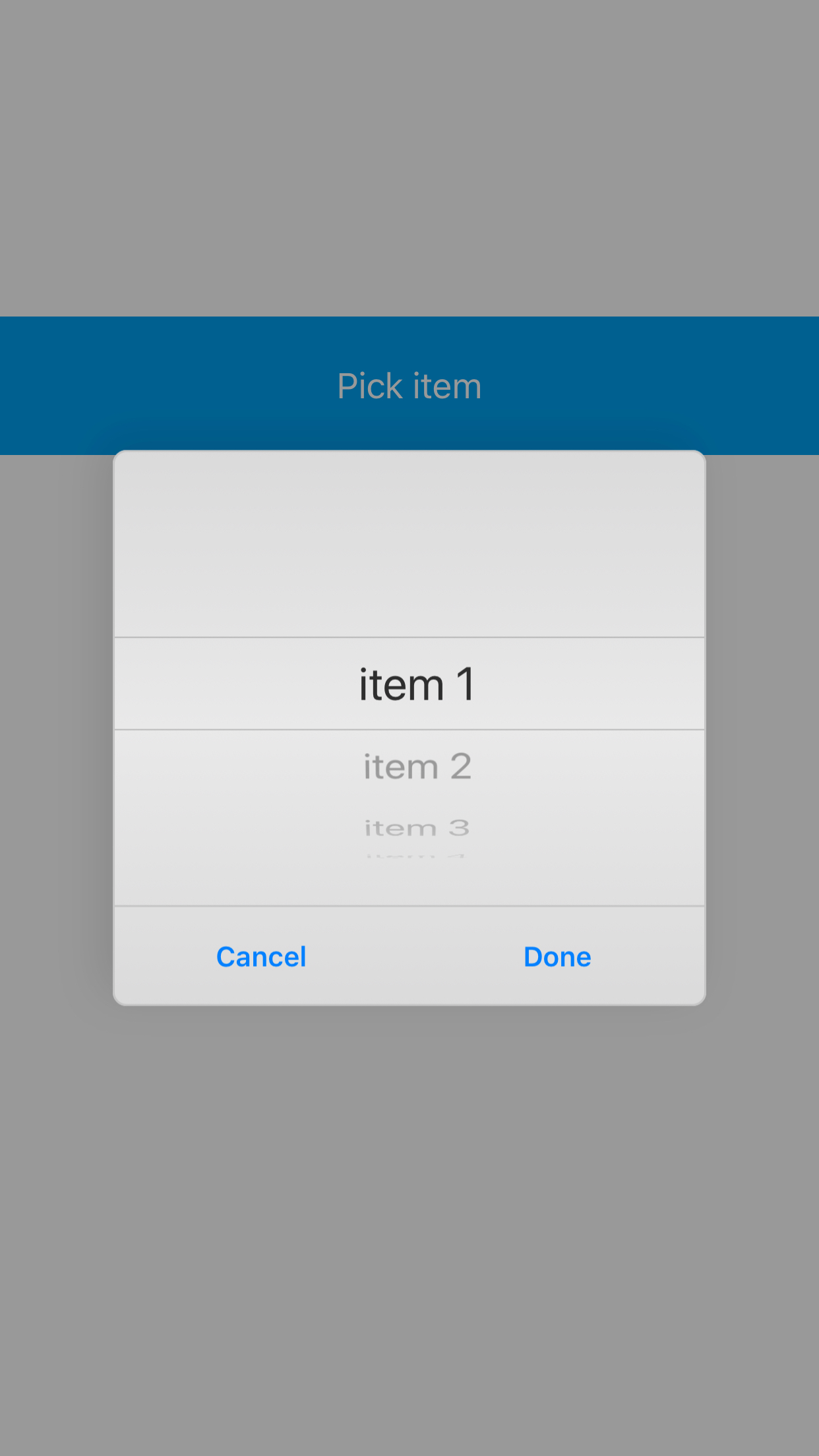
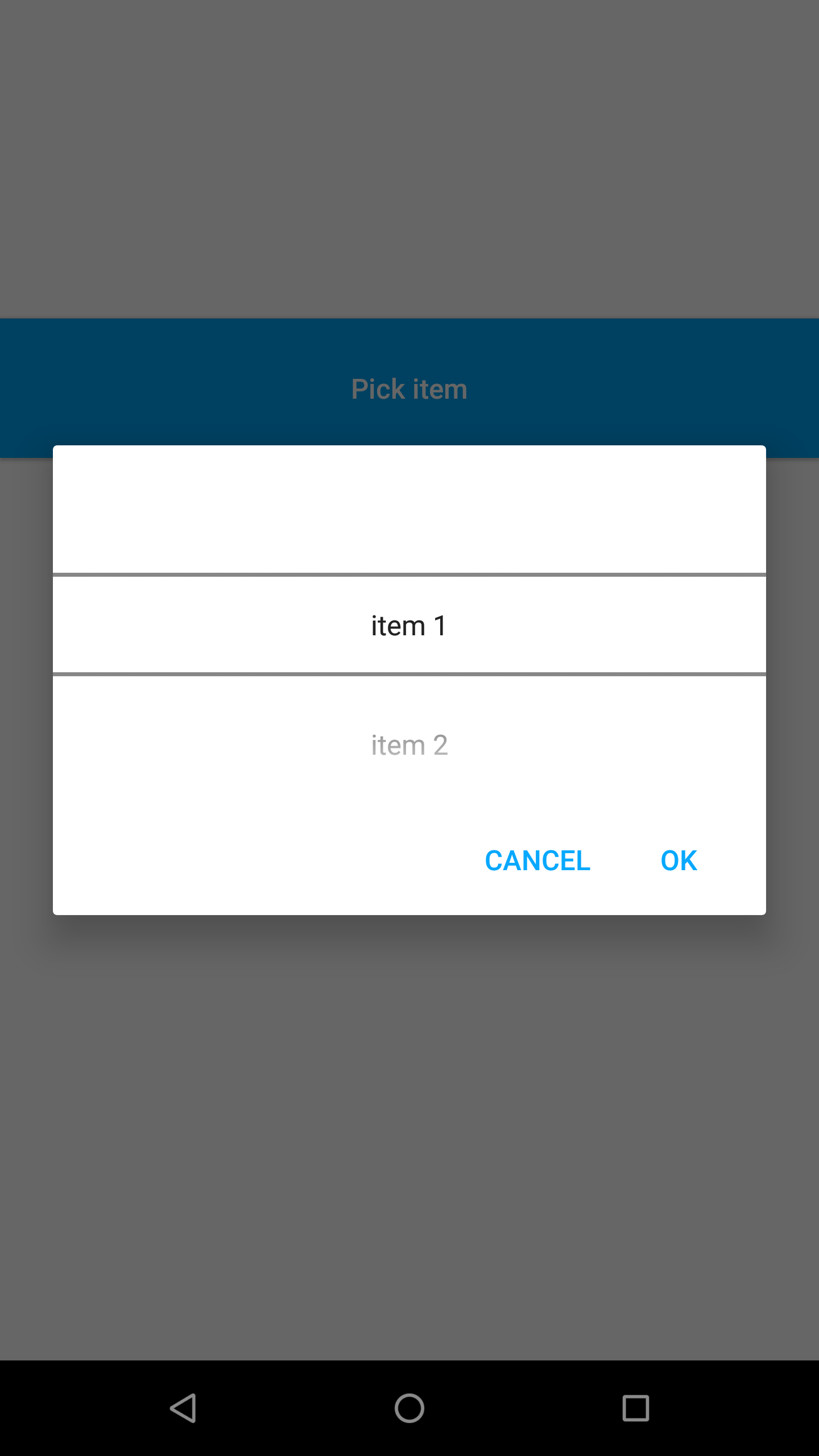
Using with Show
Following example below is showing the picker when user press to a button. Label text is updated after user press Done OR OK buttons.
The components in the example are added from the code for better showcase purposes. To learn more about the subject you can refer to:
Adding Component From CodeAs a best practice, Smartface recommends using the WYSIWYG editor in order to add components and styles to your page or library. To learn how to use UI Editor better, please refer to this documentation
UI Editor Basicsimport PageSampleDesign from "generated/pages/pageSample";
import { Route, Router } from "@smartface/router";
import { styleableComponentMixin } from "@smartface/styling-context";
import Label from "@smartface/native/ui/label";
import Button from "@smartface/native/ui/button";
import Picker from "@smartface/native/ui/picker";
class StyleableButton extends styleableComponentMixin(Button) {}
class StyleableLabel extends styleableComponentMixin(Label) {}
//You should create new Page from UI-Editor and extend with it.
export default class Sample extends PageSampleDesign {
items: string[] = [
//Text values of the picker
"item 1",
"item 2",
"item 3",
"item 4",
"item 5",
];
index: number = 0;
lblSelection: StyleableLabel;
btnPick: StyleableButton;
itemPicker: Picker;
constructor(private router?: Router, private route?: Route) {
super({});
}
// The page design has been made from the code for better
// showcase purposes. As a best practice, remove this and
// use WYSIWYG editor to style your pages.
centerizeTheChildrenLayout() {
this.style.apply({
flexProps: {
flexDirection: "ROW",
justifyContent: "CENTER",
alignItems: "CENTER",
},
});
}
okCallback(params: { index: number }) {
console.log("ok clicked");
this.index = params.index;
this.lblSelection.text = this.items[params.index];
return params;
}
cancelCallback(): void {
console.log("cancel clicked");
}
btnPickOnPress(): void {
console.log(`Showing the picker with index ${++this.index}`);
//@ts-ignore
this.itemPicker.show(
this.okCallback.bind(this),
this.cancelCallback.bind(this)
);
}
onShow() {
super.onShow();
}
onLoad() {
super.onLoad();
this.centerizeTheChildrenLayout();
this.itemPicker = new Picker({
items: this.items,
currentIndex: this.index, //restores previous selection
});
this.lblSelection = new StyleableLabel({
text: "",
});
this.addChild(this.lblSelection, "lblSelection", ".label", {
marginTop: 100,
height: 30,
width: 100,
marginBottom: null,
});
this.btnPick = new StyleableButton({
text: "Pick item",
onPress: this.btnPickOnPress.bind(this),
});
this.addChild(this.btnPick, "btnPick", ".button", {
marginTop: 30,
height: 70,
});
}
}
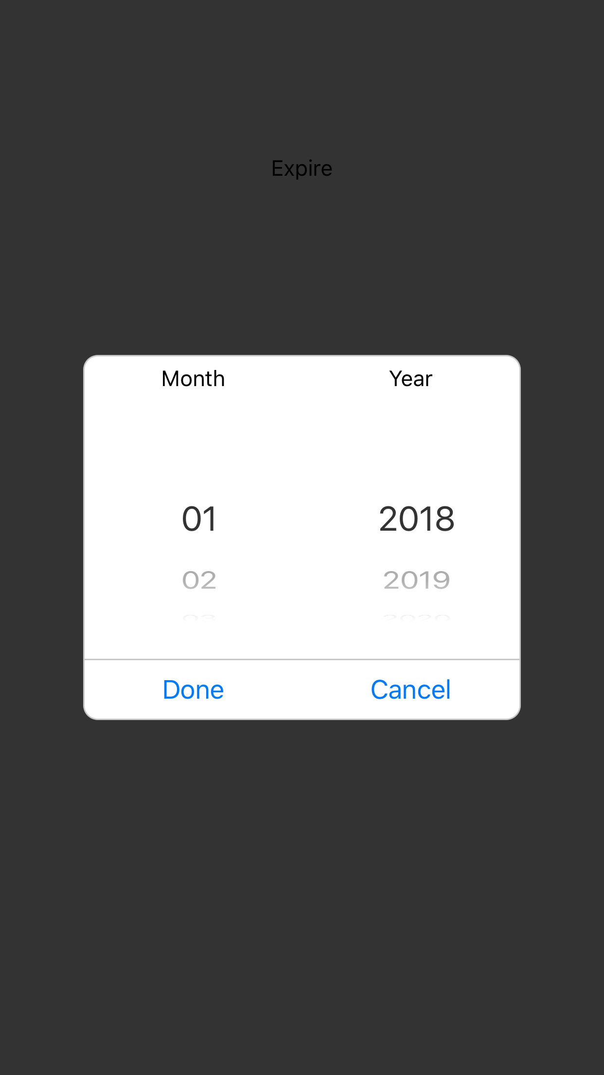
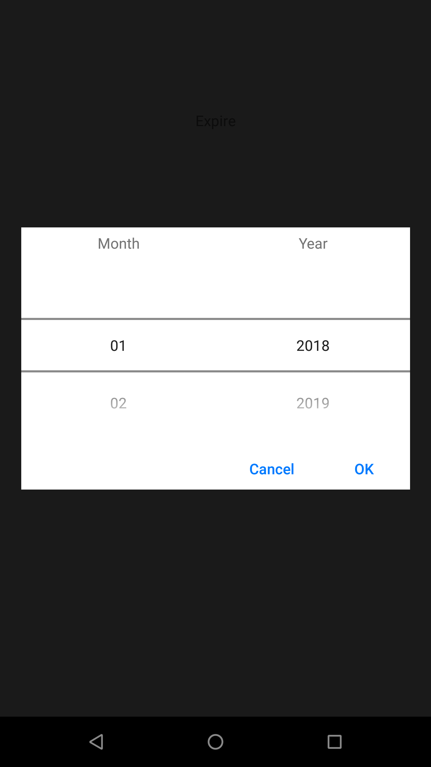
Using as a view
It is also possible to add the picker inside the page layout as a view. It has usages such as in forms or multiple pickers at the same time. In that case, the developer needs to add the Cancel & OK buttons manually.
In the example below, the user is setting the expiration date for the credit card.
The components in the example are added from the code for better showcase purposes. To learn more about the subject you can refer to:
Adding Component From CodeAs a best practice, Smartface recommends using the WYSIWYG editor in order to add components and styles to your page or library. To learn how to use UI Editor better, please refer to this documentation
UI Editor Basicsimport PageSampleDesign from "generated/pages/pageSample";
import { Route, Router } from "@smartface/router";
import {
styleableComponentMixin,
styleableContainerComponentMixin,
} from "@smartface/styling-context";
import Label from "@smartface/native/ui/label";
import Button from "@smartface/native/ui/button";
import Picker from "@smartface/native/ui/picker";
import Screen from "@smartface/native/device/screen";
import Dialog from "@smartface/native/ui/dialog";
import FlexLayout from "@smartface/native/ui/flexlayout";
import System from "@smartface/native/device/system";
import View from "@smartface/native/ui/view";
import TextAlignment from "@smartface/native/ui/textalignment";
import { themeService } from "theme";
class StyleableView extends styleableComponentMixin(View) {}
class StyleableButton extends styleableComponentMixin(Button) {}
class StyleableLabel extends styleableComponentMixin(Label) {}
class StyleableFlexLayout extends styleableContainerComponentMixin(
FlexLayout
) {}
//You should create new Page from UI-Editor and extend with it.
export default class Sample extends PageSampleDesign {
lblExpirationDate: StyleableLabel;
pickerDialog: Dialog;
flPickerDialog: StyleableFlexLayout;
flColumns: StyleableFlexLayout;
dialogLeft: StyleableFlexLayout;
lblMonth: StyleableLabel;
monthPicker: Picker;
dialogRight: StyleableFlexLayout;
lblYear: StyleableLabel;
yearPicker: Picker;
lineButtons: StyleableButton;
flDialogButtons: StyleableFlexLayout;
btnOK: StyleableButton;
btnCancel: StyleableButton;
defaultBlue: string = System.OS === System.OSType.IOS ? "#007AFF" : "#00BFFF";
borderColor: string = "#c7c7c7";
MONTHS: string[] = [
"01",
"02",
"03",
"04",
"05",
"06",
"07",
"08",
"09",
"10",
"11",
"12",
];
YEARS: string[] = ["2018", "2019", "2020", "2021", "2022", "2023"];
constructor(private router?: Router, private route?: Route) {
super({});
}
// The page design has been made from the code for better
// showcase purposes. As a best practice, remove this and
// use WYSIWYG editor to style your pages.
centerizeTheChildrenLayout() {
this.dispatch({
type: "updateUserStyle",
userStyle: {
flexProps: {
flexDirection: "ROW",
justifyContent: "CENTER",
alignItems: "CENTER",
},
},
});
}
showExpirationPicker(): void {
this.pickerDialog.show();
}
okCallback(params: { index: number }): void {
this.lblExpirationDate.text = `${
this.MONTHS[this.monthPicker.currentIndex]
}/${this.YEARS[this.yearPicker.currentIndex]}`;
this.pickerDialog.hide();
}
cancelCallback(): void {
this.pickerDialog.hide();
}
onShow() {
super.onShow();
const { headerBar } = this;
}
onLoad() {
super.onLoad();
this.centerizeTheChildrenLayout();
this.lblExpirationDate = new StyleableLabel({
text: "Expire",
onTouchEnded: this.showExpirationPicker.bind(this),
});
this.addChild(this.lblExpirationDate, "lblExpirationDate", ".sf-label", {
marginTop: 100,
height: 30,
width: 100,
textAlignment: "MIDCENTER",
});
this.pickerDialog = new Dialog();
themeService.addGlobalComponent(
this.pickerDialog.layout,
"pickerDialogLayout"
);
// @ts-ignore
this.pickerDialog.layout.dispatch({
type: "updateUserStyle",
userStyle: {
backgroundColor: "rgba(80, 0, 0, 0)",
flexProps: {
alignItems: "CENTER",
justifyContent: "CENTER",
flexDirection: "ROW",
},
},
});
this.flPickerDialog = new StyleableFlexLayout();
themeService.addGlobalComponent(
this.flPickerDialog,
"flPickerDialogLayout"
);
// @ts-ignore
this.pickerDialog.layout.addChild(
this.flPickerDialog,
"flPickerDialog",
".sf-flexLayout",
Object.assign(
{
height: 250,
width: Screen.width - 40,
backgroundColor: "#FFFFFF",
borderRadius: 0,
borderColor: this.borderColor,
borderWidth: 0,
},
System.OS === System.OSType.IOS
? {
borderRadius: 10,
borderWidth: 1,
width: 300,
}
: {}
)
);
this.flColumns = new StyleableFlexLayout();
this.flPickerDialog.addChild(
this.flColumns,
"flColumns",
".sf-flexLayout",
{
flexProps: {
flexDirection: "ROW",
},
flexGrow: 1,
marginBottom: 15,
}
);
this.dialogLeft = new StyleableFlexLayout({
flexGrow: 1,
});
this.flColumns.addChild(this.dialogLeft, "dialogLeft", ".sf-flexLayout", {
width: null,
height: null,
flexGrow: 1,
});
this.lblMonth = new StyleableLabel({
text: "Month",
});
this.dialogLeft.addChild(this.lblMonth, "lblMonth", ".sf-label", {
width: null,
height: 30,
textAlignment: "MIDCENTER",
});
this.monthPicker = new Picker({
items: this.MONTHS,
});
this.dialogLeft.addChild(this.monthPicker, "monthPicker", null, {
width: null,
flexGrow: 1,
});
this.dialogRight = new StyleableFlexLayout({
flexGrow: 1,
});
this.flColumns.addChild(this.dialogRight, "dialogRight", ".sf-flexLayout", {
width: null,
height: null,
flexGrow: 1,
});
this.lblYear = new StyleableLabel({
text: "Year",
height: 30,
textAlignment: TextAlignment.MIDCENTER,
});
this.dialogRight.addChild(this.lblYear, "lblYear", ".sf-label", {
width: null,
height: 30,
textAlignment: "MIDCENTER",
});
this.yearPicker = new Picker({
items: this.YEARS,
flexGrow: 1,
});
this.dialogRight.addChild(this.yearPicker, "yearPicker", null, {
width: null,
height: null,
flexGrow: 1,
});
this.lineButtons = new StyleableButton();
if (System.OS === System.OSType.IOS)
this.flPickerDialog.addChild(
this.lineButtons,
"lineButtons",
".sf-view",
{
width: null,
height: 1,
backgroundColor: this.borderColor,
}
);
this.flDialogButtons = new StyleableFlexLayout();
this.flPickerDialog.addChild(
this.flDialogButtons,
"flDialogButtons",
".sf-flexLayout",
Object.assign({
height: 40,
flexProps: {
flexDirection: "ROW_REVERSE",
justifyContent: "FLEX_START",
alignItems: "FLEX_START",
},
})
);
this.btnOK = new StyleableButton({
text: System.OS === System.OSType.IOS ? "Done" : "OK",
onPress: this.okCallback.bind(this),
});
this.flDialogButtons.addChild(
this.btnOK,
"btnOK",
".sf-button",
Object.assign(
{
width: null,
height: null,
backgroundColor: "rgba(0,0,0,0)",
textColor: this.defaultBlue,
flexGrow: NaN,
},
System.OS === System.OSType.IOS ? { flexGrow: 1 } : {}
)
);
this.btnCancel = new StyleableButton({
text: "Cancel",
onPress: this.cancelCallback.bind(this),
});
this.flDialogButtons.addChild(
this.btnCancel,
"btnCancel",
".sf-button",
Object.assign(
{
width: null,
height: null,
backgroundColor: "rgba(0,0,0,0)",
textColor: this.defaultBlue,
flexGrow: NaN,
},
System.OS === System.OSType.IOS ? { flexGrow: 1 } : {}
)
);
}
}