MaterialTextBox
API Reference: UI.MaterialTextBox
Material text field with consistent behavior on iOS and Android.
Feature Usage
SHOW/HIDE
On the MaterialTextBox utility, there was a showHideEnabled property to dynamically add Show and Hide buttons to the right of the component.
Unfortunately, this feature will no longer there. To implement the feature on your own code, you can use rightLayout property.
// let's say mtbPassword is our name for materialtextbox

initRightLayout() {
    this.mtbPassword.isPassword = true; //This property can also be assigned from UI Editor
    const rightLayout = new FlexLayout({
        flexGrow: 1,
        alignContent: FlexLayout.AlignContent.FLEX_END
    });
    const label = new Label({
        text: 'Show',
        textAlignment: TextAlignment.MIDRIGHT,

    });
    rightLayout.onTouch = () => {
        const isPassword = this.mtbPassword.isPassword;
        this.mtbPassword.isPassword = !isPassword; //Toggle the variable
    label.text = isPassword ? 'Hide' : 'Show';
        return false;
    };
    rightLayout.addChild(label);
    this.mtbPassword.rightLayout = {
        view: rightLayout,
        width: 60, //Those values might change depending on your right layout
        height: 20 //Those values might change depending on your right layout
    };
}
Clear All
Same as SHOW/HIDE, this feature is also removed. To implement the feature on your own code, you can use rightLayout property.
// let's say mtbLogin is our name for materialtextbox

    initRightLayout() {
        const rightLayout = new FlexLayout({
            flexGrow: 1,
            alignContent: FlexLayout.AlignContent.FLEX_END
        });
        const label = new Label({
            text: 'Clear All',
            textAlignment: TextAlignment.MIDRIGHT,
        });
        rightLayout.onTouch = () => {
            this.mtbExample.text = '';
            return false;
        };
        rightLayout.addChild(label);
        this.mtbLogin.rightLayout = {
            view: rightLayout,
            width: 60, //Those values might change depending on your right layout
            height: 20 //Those values might change depending on your right layout
        };
    }
Dropdown Click
Dropdown click is useful when you want to have a textbox experience but don't want users to write anything on it.
This feature is also removed in favor of the new component.
We do not recommend using this method for your dropdown actions. We recommend using inputview or designing your own mock materialtextbox component as library component and using that as dropdown instead.
initRightLayout() {
    const rightLayout = new FlexLayout({
        flexGrow: 1,
        alignContent: FlexLayout.AlignContent.FLEX_END,
      });
      this.mtbLogin.onTouch = () => {
        // Android will trigger here. This will not trigger itself on iOS.
        alert("dropdown pressed"); //Your code here
        this.mtbLogin.text = "after dropdown"; //Please note that you might get scope errors and this.mtbText might not work. Therefore, please assign it to another variable instead, or you can bind the function to this.
        return true; //Important for touch to be consumed
      };
      this.mtbLogin.onEditBegins = () => {
        // Here will not be triggered on Android. onTouch will be disabled on iOS due to input taking focus, therefore we call onTouch ourselves here.
        this.mtbLogin.onTouch();
        return false; //This is important
      };
      const imageview = new ImageView({
        flexGrow: 1,
        tintColor: Color.BLACK,
        alignSelf: FlexLayout.AlignSelf.FLEX_END,
         // also make sure this name exists or create a new one for your dropdown arrow
      });
      imageview.image = Image.createFromFile("images://smartface.png"),
      rightLayout.addChild(imageview);

      this.mtbLogin.rightLayout = {
        view: rightLayout,
        width: 60, //Those values might change depending on your right layout
        height: 20 //Those values might change depending on your right layout
    };
}
Features
- Material design guidelines compliance
- Consistent look and feel on iOS and Android
- Animated state transitions (normal & error)
- Customizable font size and colors
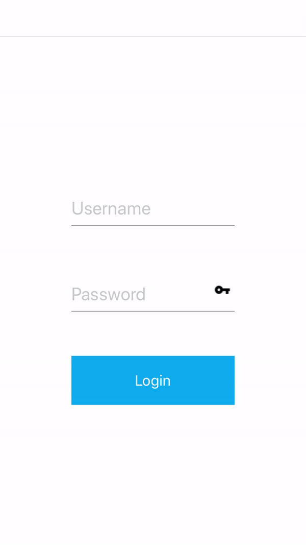
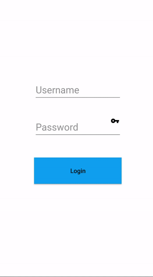
Example
There is an example down below showing a login scenario.
The components in the example are added from the code for better showcase purposes. To learn more about the subject you can refer to:
Adding Component From CodeAs a best practice, Smartface recommends using the WYSIWYG editor in order to add components and styles to your page or library. To learn how to use UI Editor better, please refer to this documentation
UI Editor Basicsimport PageSampleDesign from "generated/pages/pageSample";
import { Route, Router } from "@smartface/router";
import {
styleableComponentMixin,
styleableContainerComponentMixin,
} from "@smartface/styling-context";
import Color from "@smartface/native/ui/color";
import Application from "@smartface/native/application";
import FlexLayout from "@smartface/native/ui/flexlayout";
import ImageView from "@smartface/native/ui/imageview";
import Button from "@smartface/native/ui/button";
import MaterialTextBox from "@smartface/native/ui/materialtextbox";
import { ImageFillType } from "@smartface/native/ui/imageview/imageview";
import KeyboardType from "@smartface/native/ui/shared/keyboardtype";
class StyleableButton extends styleableComponentMixin(Button) {}
class StyleableMaterialTextBox extends styleableComponentMixin(
MaterialTextBox
) {}
class StyleableImageView extends styleableComponentMixin(ImageView) {}
class StyleableFlexLayout extends styleableContainerComponentMixin(
FlexLayout
) {}
//You should create new Page from UI-Editor and extend with it.
export default class Sample extends PageSampleDesign {
flWrapper: StyleableFlexLayout;
imgShow: StyleableImageView;
mtbPassword: StyleableMaterialTextBox;
mtbUsername: StyleableMaterialTextBox;
btnLogin: StyleableButton;
constructor(private router?: Router, private route?: Route) {
super({});
}
// The page design has been made from the code for better
// showcase purposes. As a best practice, remove this and
// use WYSIWYG editor to style your pages.
centerizeTheChildrenLayout() {
this.dispatch({
type: "updateUserStyle",
userStyle: {
flexProps: {
flexDirection: "ROW",
justifyContent: "CENTER",
alignItems: "CENTER",
},
},
});
}
onShow() {
super.onShow();
Application.statusBar.visible = false;
this.headerBar.visible = false;
}
onLoad() {
super.onLoad();
this.centerizeTheChildrenLayout();
this.flWrapper = new StyleableFlexLayout();
this.imgShow = new StyleableImageView({
height: 20,
imageFillType: ImageFillType.ASPECTFIT,
});
this.imgShow.image = "images://smartface.png";
this.mtbUsername = new StyleableMaterialTextBox({
hint: "Username",
onActionButtonPress: (e) => this.mtbPassword.requestFocus(),
});
this.mtbUsername.on("textChanged", (e) => {
// Reset error message
this.mtbUsername.errorMessage = "";
});
this.mtbPassword = new StyleableMaterialTextBox({
hint: "Password",
onActionButtonPress: (e) => this.mtbPassword.removeFocus(),
});
this.mtbPassword.isPassword = true;
this.mtbPassword.on("textChanged", () => {
this.mtbPassword.errorMessage = "";
});
this.mtbPassword.android.rippleEnabled = true;
this.mtbPassword.android.rippleColor = Color.RED;
this.mtbPassword.rightLayout = { view: this.imgShow, width: 30 };
this.btnLogin = new StyleableButton({
text: "Login",
onPress: (): void => {
// If username or password doesn't exist, show error message
let usernameExists = !!this.mtbUsername.text;
let passwordExists = !!this.mtbPassword.text;
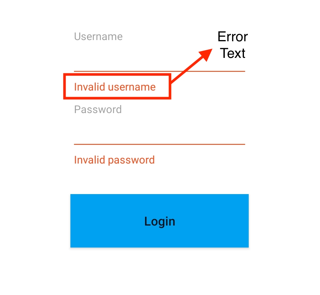
!usernameExists && (this.mtbUsername.errorMessage = "Invalid username");
!passwordExists && (this.mtbPassword.errorMessage = "Invalid password");
},
});
this.mtbUsername.ios.clearButtonEnabled = true;
this.mtbUsername.keyboardType = KeyboardType.DEFAULT;
this.mtbPassword.ios.clearButtonEnabled = true;
this.addChild(this.flWrapper, "flWrapper", ".flexLayout", {
flexProps: {
alignItems: "CENTER",
},
height: 300,
});
this.flWrapper.addChild(
this.mtbUsername,
"mtbUsername",
".materialTextBox",
{
width: 200,
}
);
this.flWrapper.addChild(
this.mtbPassword,
"mtbPassword",
".materialTextBox",
{
width: 200,
}
);
this.flWrapper.addChild(this.btnLogin, "btnLogin", ".button", {
top: 20,
height: 60,
width: 200,
backgroundColor: "#00A1F1",
});
}
}
- If height isn't specified in iOS, it is considered as the minimum height required. Android always requires height.
- If width isn't specified, looks tight than required in Android and iOS matches it parent width.
- Recall that you can define OS specific styles using rules with UI Editor.
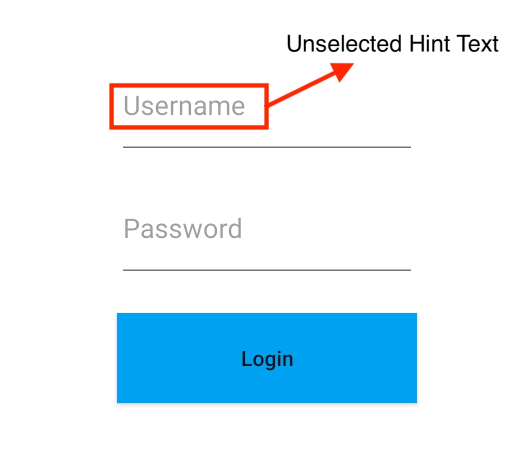
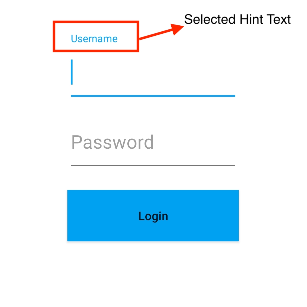
Adjusting Text Size
There are three labels of the size that can be modified.
Unselected Hint Text
- Modify labelsFont size proeperty.
mtbUsername.labelsFont = Font.create(Font.DEFAULT, 22, Font.NORMAL);
//Font size >> 22dpi
The font size used in the Material Textboxes can be set to a specific value through the style.xml file. These changes can be observed in the published app, not on emulator.
<resources>
    <style name="SFMaterialTextBoxHintAppearance" parent="TextAppearance.Design.Hint" >
        <item name="android:textSize">40dp</item>
    </style>
    <style name="SFMaterialTextBoxErrorTextAppearance" parent="TextAppearance.Design.Error" >
        <item name="android:textSize">10dp</item>
    </style>
</resources>
Selected Hint Text Size
- Modify style.xml file below
SFMaterialTextBoxHintAppearance.
Error Text Size
- Modify style.xml file below
SFMaterialTextBoxErrorTextAppearance.
Colors
There are total of 4 main colors of MaterialTextBox
- Color of text shown in default
- Color of line under the text where user is able to edit
- Color of hint which appears at the top
- Color of the cursor (not changeable for both platforms)
Also 3 different states of MaterialTextBox
- Default state, when user didn't interact with MaterialTextBox
- Selected state, when is focused on MaterialTextBox
- Error state, when errorMessage is shown
Changing Colors
Currently some colors are not changeable on both platforms. Here is what you may change:
- On Both Platforms
- LineColor
Note that, this property takes objects of UI.Color and when error message appears, errorColor will be set for lineColor and it won't be changed until the enableErrorMessage is set to false on Android. - ErrorColor
- TextColor
- characterRestrictionColor
Note that, in order to use this property, you need to set characterRestriction to true, in constructor. - iOS Only
- To change the background color of selection, use the selectedHintTextColor property.
Tips & Tricks
- The Android only property, enableErrorMessage is not mandatory to use, but recommended. Not assigning it may cause unexpected results. Enabling error and counter in initialization time that will draw space for those views. By default disabling error messages causes a little bit bounce, in order to handle must be set enable out of the gate then assign.
- It is not recommended to use flexGrow on both Android and iOS.
- To change the keyboard appearance when it is touched on MaterialTextBox, refer here.
Currently there is no way to change font size on Android while using labelsFont property. Any given font size parameter will be ignored.