Switch
API Reference: UI.Switch
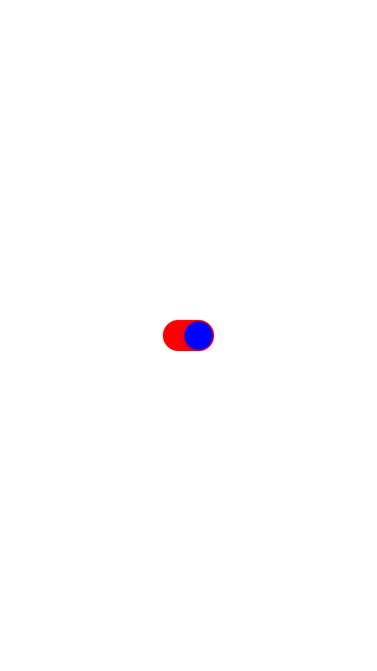
Switch is a two-state toggle button. Switch allows the user to select between two options. (e.g. on/off)
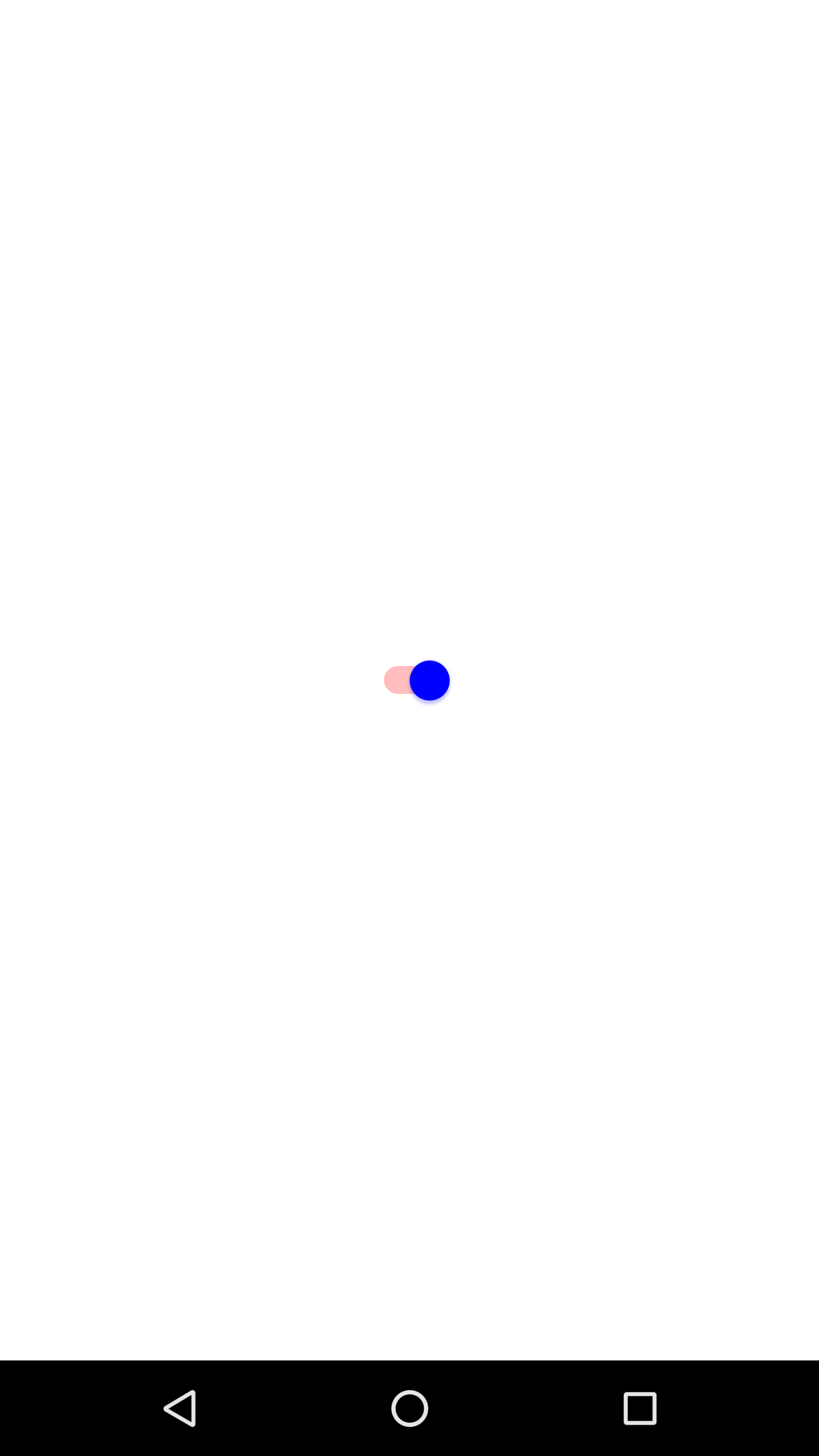
The default of thumbOnColor is green on Android and null on iOS. If this is set on iOS, the switch grip will lose its drop shadow. For iOS, If you want to use default of this property, you should set null.
The default of toggleOnColor is gray on Android and green on iOS.
The components in the example are added from the code for better showcase purposes. To learn more about the subject you can refer to:
Adding Component From CodeAs a best practice, Smartface recommends using the WYSIWYG editor in order to add components and styles to your page or library. To learn how to use UI Editor better, please refer to this documentation
UI Editor Basicsimport PageSampleDesign from "generated/pages/pageSample";
import { Route, Router } from "@smartface/router";
import { styleableComponentMixin } from '@smartface/styling-context';
import Application from "@smartface/native/application";
import Switch from "@smartface/native/ui/switch";
import Color from "@smartface/native/ui/color";
class StyleableSwitch extends styleableComponentMixin(Switch) {}
//You should create new Page from UI-Editor and extend with it.
export default class Sample extends PageSampleDesign {
mySwitch: StyleableSwitch;
constructor(private router?: Router, private route?: Route) {
super({});
}
// The page design has been made from the code for better
// showcase purposes. As a best practice, remove this and
// use WYSIWYG editor to style your pages.
centerizeTheChildrenLayout() {
this.dispatch({
type: "updateUserStyle",
userStyle: {
flexProps: {
flexDirection: 'ROW',
justifyContent: 'CENTER',
alignItems: 'CENTER'
}
}
})
}
onShow() {
super.onShow();
const { headerBar } = this;
Application.statusBar.visible = false;
headerBar.visible = false;
}
onLoad() {
super.onLoad();
this.centerizeTheChildrenLayout();
this.mySwitch = new StyleableSwitch({
thumbOnColor: Color.BLUE,
toggleOnColor: Color.RED,
});
this.addChild(this.mySwitch, "mySwitch", ".sf-switch", {
thumbOnColor: "#0000FF",
toggleOnColor: "#FF0000",
});
}
}
thumbOffColor and toggleOffColor
On Android, those two properties can be used without a problem. However, due to restrictions by Apple, those properties are not allowed to be set on iOS directly. To overcome this, you can use a workaround to set it manually, like example given below:
let switch1: Switch = new Switch();
switch1.left = 100;
(switch1.nativeObject.backgroundColor = Color.GREEN.nativeObject),
  "backgroundColor";
switch1.nativeObject.layer.cornerRadius = switch1.nativeObject.frame.height / 2;
this.layout.addChild(switch1, "mySwitch", ".sf-switch", {
  toggleOnColor: "#FF0000",
});
Using this workaround is not advised by Smartface, since Switch implementation may be changed on newer iOS versions, use at your own risk.
Setting switch themes on style
Since setting thumbOnColor on iOS will make switch lose its drop shadow and toggleOffColor and thumbOffColor doesn't exist on iOS, you can use following theme sample to overcome common quirks.
".switch": {
  "toggleOnColor": "rgba( 0, 161, 241, 1 )",
  "android": {
    "toggleOffColor": "rgba( 0, 161, 241, 1 )",
    "thumbOffColor": "rgba(255, 255, 255, 1)"
  },
  "+Device:Device.os === \"Android\"": {
  "thumbOnColor": "rgba( 255, 255, 255, 1 )"
  }
}